|
0 Comments
Hey guys,
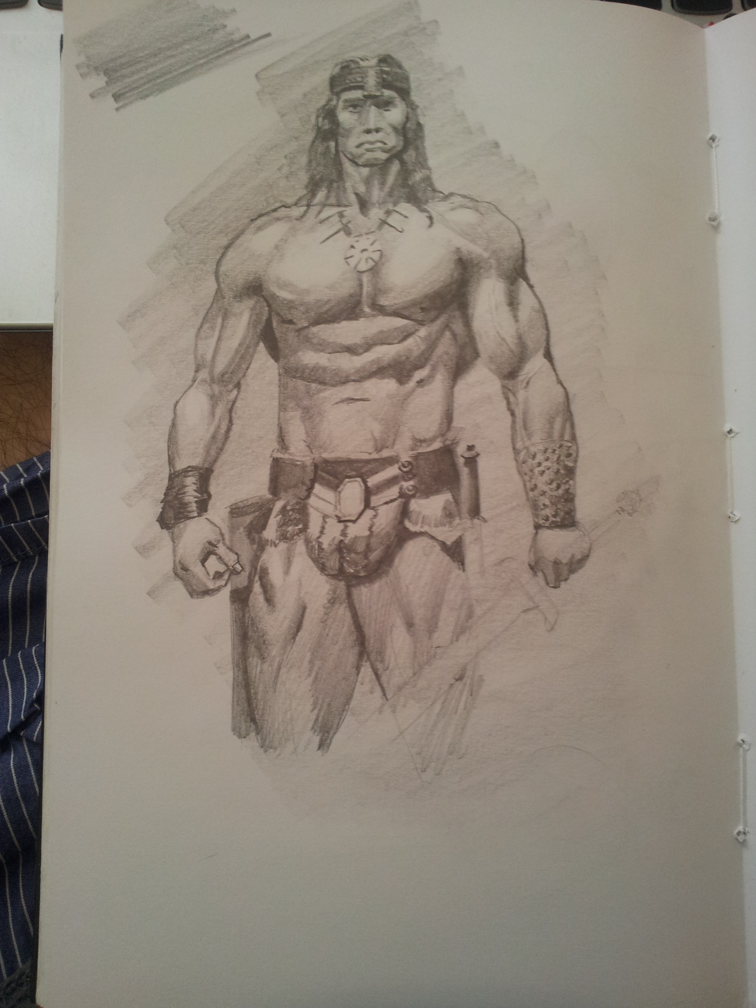
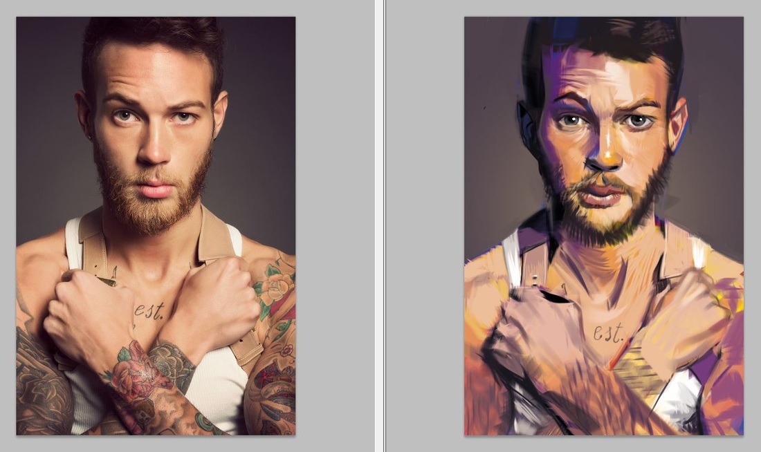
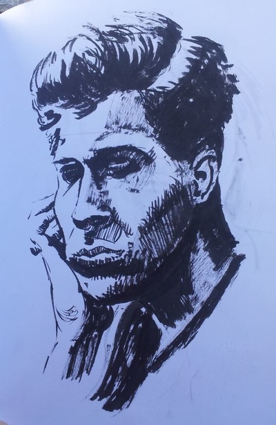
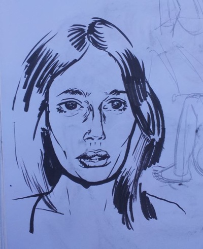
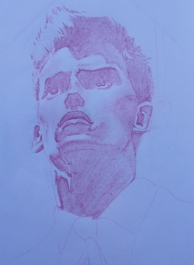
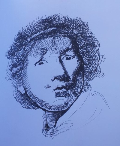
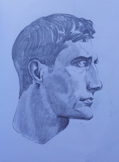
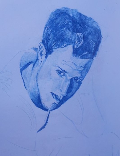
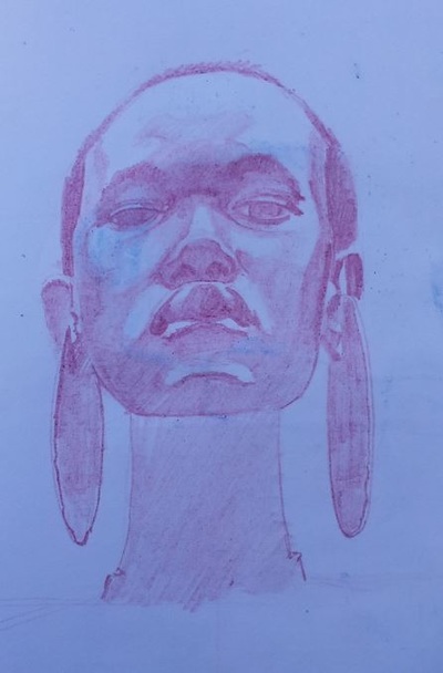
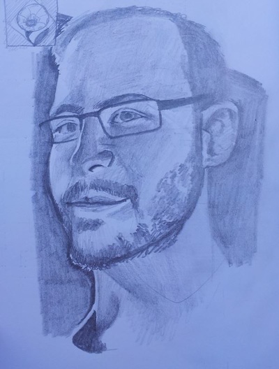
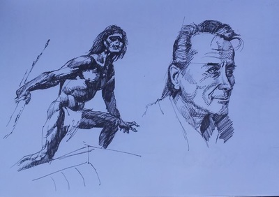
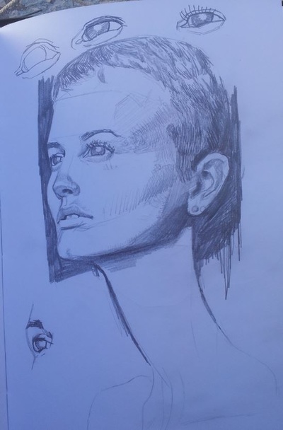
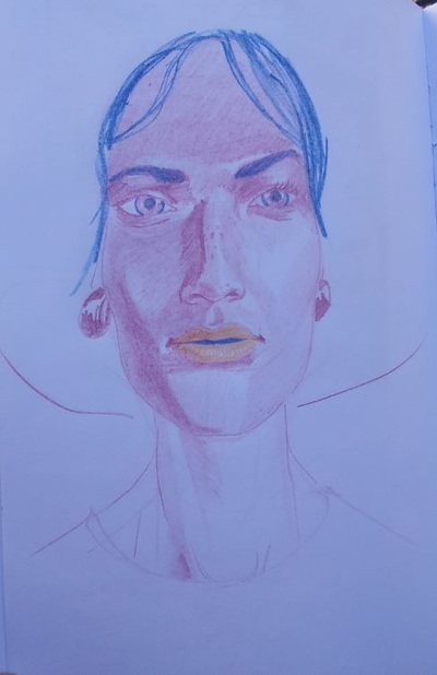
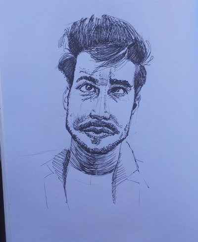
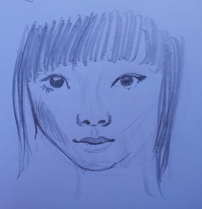
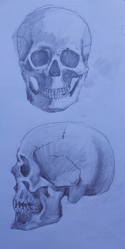
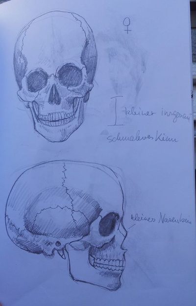
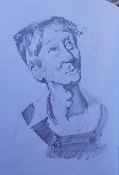
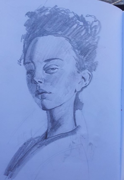
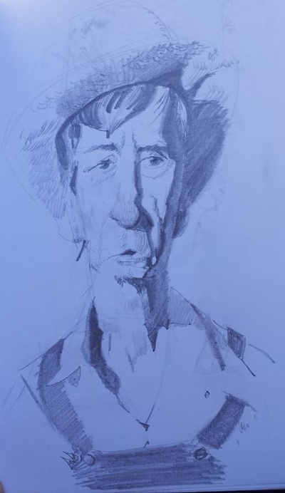
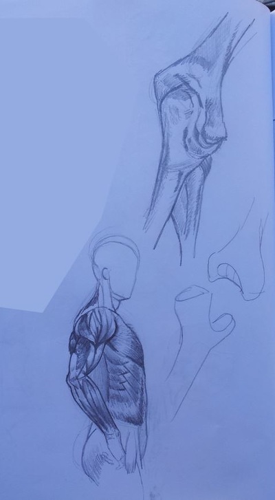
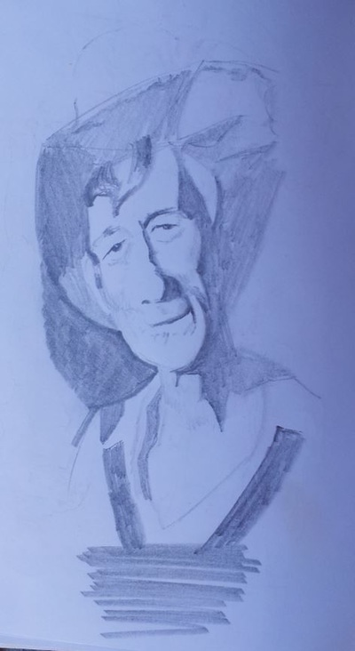
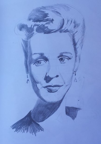
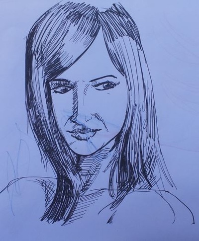
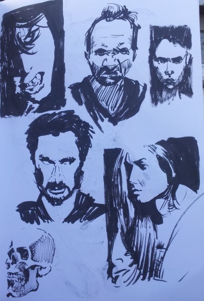
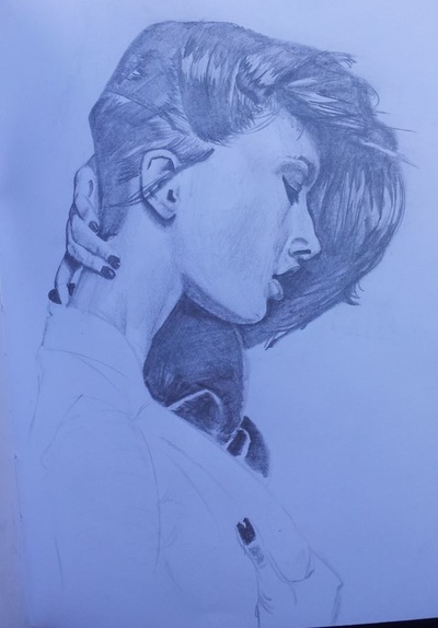
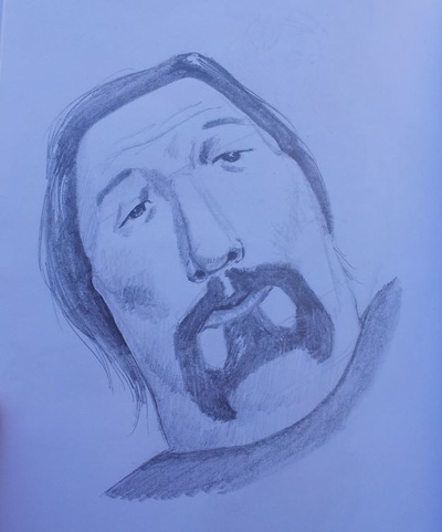
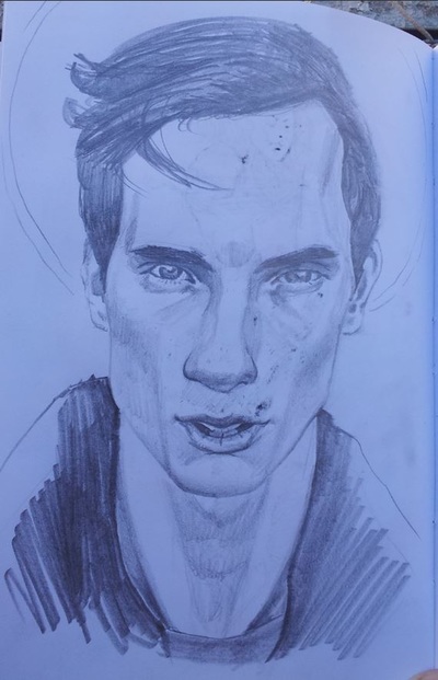
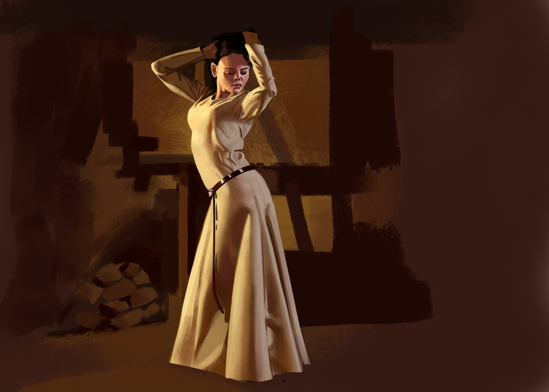
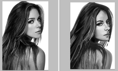
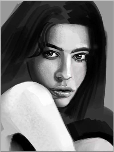
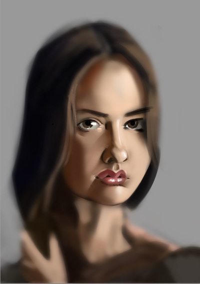
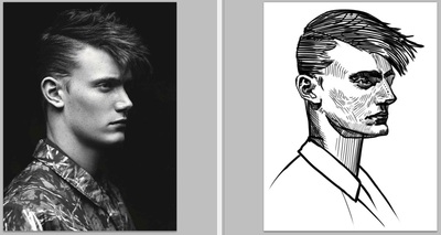
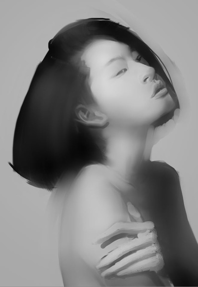
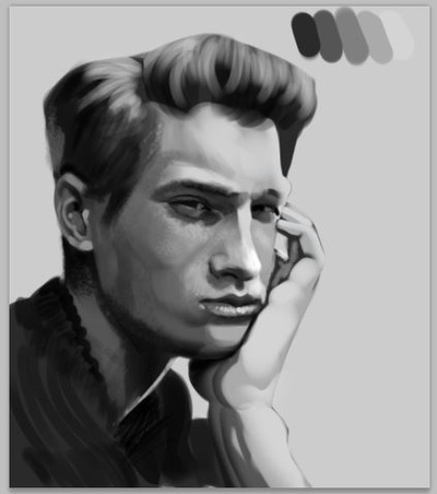
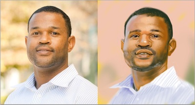
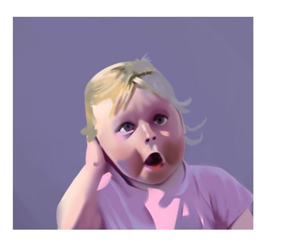
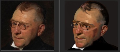
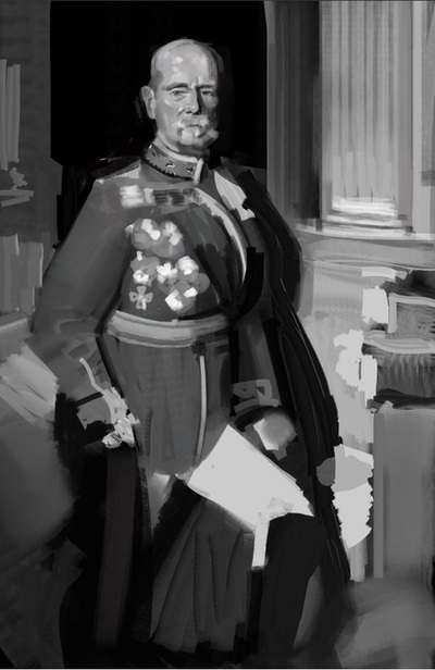
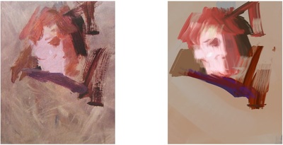
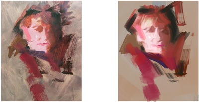
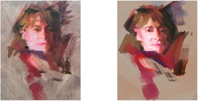
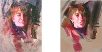
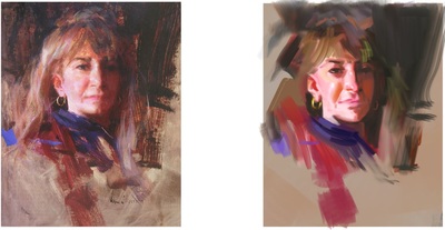
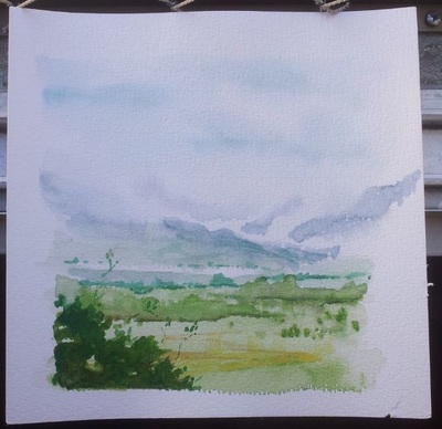
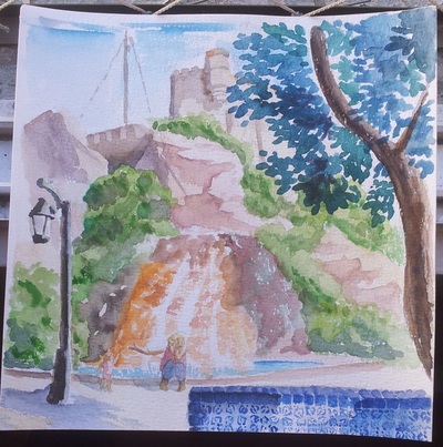
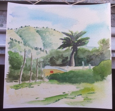
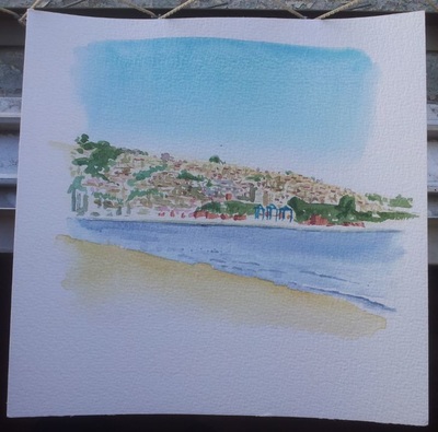
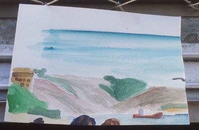
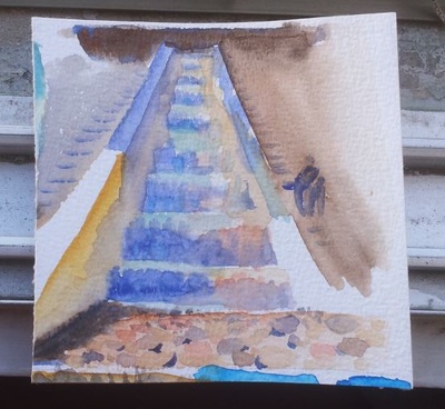
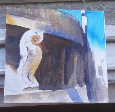
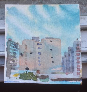
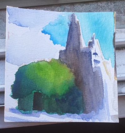
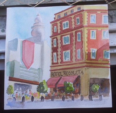
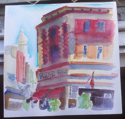
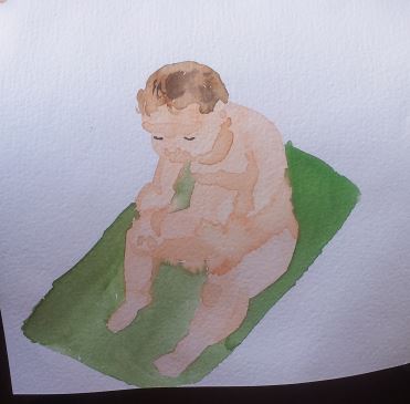
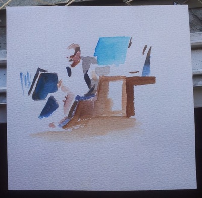
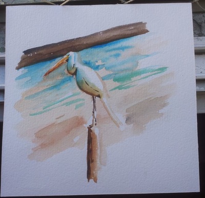
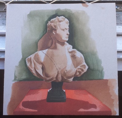
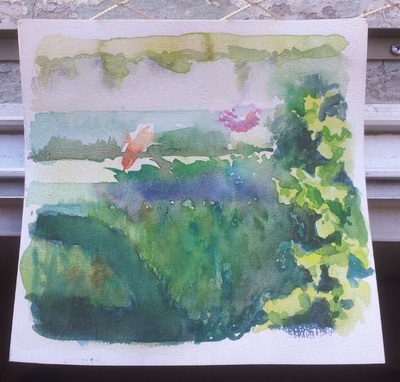
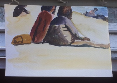
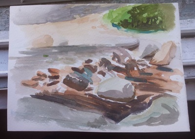
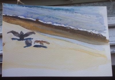
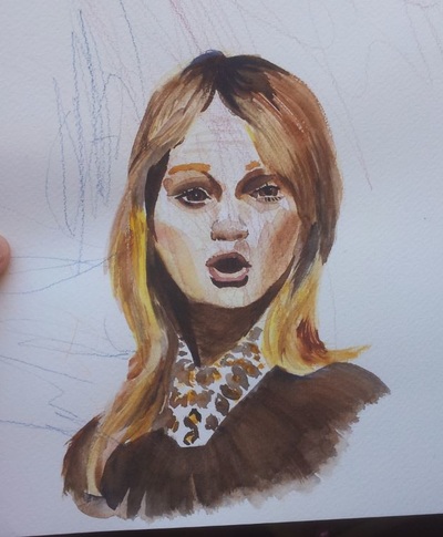
I tried something new with this painting. I recently learned a cool watercoloring-technique where you map certain colors to certain values. Yellow is light gray, red is medium grey, blue is dark grey. Then I started painting using those colors in the beginning and translating the values I saw in the source into the colors mapped for that value. Of course I had to simplify the values I saw first. After a while I realized that using blue wouldn't cut it for the darkest darks and yellow wouldn't suffice to be the lightest lights. At least not for what I intended, which was a full range of values. So I used black and white too. Also with this I used a custom made brush especially for cross-hatching. And I worked loosely and fast, overpainting all the time. Now that I look at it, I see a lot of "mistakes", but it was fun and I like the vibrancy of the colors. If you are interested in the water-coloring-technique, check out this guy's channel: https://www.youtube.com/watch?v=ueAOPEUk8mw Cheers and have a great week :) Edit: I should mention that this was done in CMYK - mode because I was annoyed by a lot of colors, looking like they where glowing from the inside. Sometimes, this may be desired, but I find that more often than not it makes paintings like a bit fake. Try it if you haven't, do a painting in CMYK and tell me how you like it. In Photoshop go to: Image > Mode > CMYK Color, to change the setting. Have fun! Hey guys, I finally photographed my recent sketchbook activity. It always great to have a huge post with a lot of sketches, drawings and paintings. So here it goes: What started out as INK-tober (one ink-drawing a day for the whole October) changed into face-tober for me. I was reading "Creative Illustration" by Andrew Loomis and I think pretty close to the end he writes: "get used to drawing a face every day". So I did. I didn't flesh them all out, some are better than others, but I still did it. I changed from pencil, to ink to water-color, to digital, to colored pencils and back, to switch things up. What I found was, that once started, the urge to make it better and better grew from day to day. And more so when not doing digital work. I don't know what it is, but working with traditional media takes away the pressure to make it look photoreal, I guess. And photoreal is what I usually shoot for in studies, not that I am hitting that goal every time. So then I tried to get rid of that pressure, to more enjoy the studies, since enjoying something makes it easier to learn from it, or so I read. So I kept the digital studies looser sometimes or left brushmarks showing. Anyway I do like my new little habbit, I hope you find something you like too. I learned that a lot of times, my placement of features was off. Especially in the beginning. It got better, by doing more guidelines, like horizontal or vertical lines going out from one feature. Doing them mentally sometimes is enough. Again I found that I had more resistance doing guidelines in digital, don't know why that is. Here the digital portraits / studies of faces. A Richard Schmidt step by step study. These are all the water-color-paintings I did so far in Chile. Ida "helped" with the portrait of the lady at the very end. Most are from life, colors are fun ;) Reference taken from:
http://portraitsfordrawing.tumblr.com/ http://artistsnetworks.com/tutorials/portrait_demo.html http://www.alexhays.com/loomis/Andrew%20Loomis%20-%20Creative.Illustration.pdf |
This is my blog. I will share information about workflow, my insights into image-making or just general thoughts and rants about being an artist. Archives
February 2024
Categories |
 RSS Feed
