|
Hey guys, I wanted to share some of the studies I did over the last weeks. They are all from James Gurney's book "Color and Light". You should buy it, if you don't already own it, it is pure gold and I always grab for it while painting something to remember myself of all those principles and things. The first one is of Overcast Light - this happens when the sky is full with clouds - the light gets diffuses by the clouds and mostly colorless - the light gets in most of the shadows so they are diffused too - it is good for complex scenes, because you don't have to think a lot about shadow shapes - also the color of the objects is mostly local-color In "Light - for visual artists" by Richard Yot, it says three more important things: - light on overcast days becomes bluer as the sun sets - reflections on surfaces are coming from the whole sky so they too are softer than on sunny days - the colors are quite saturated, because the are so little colors from the light mixing in 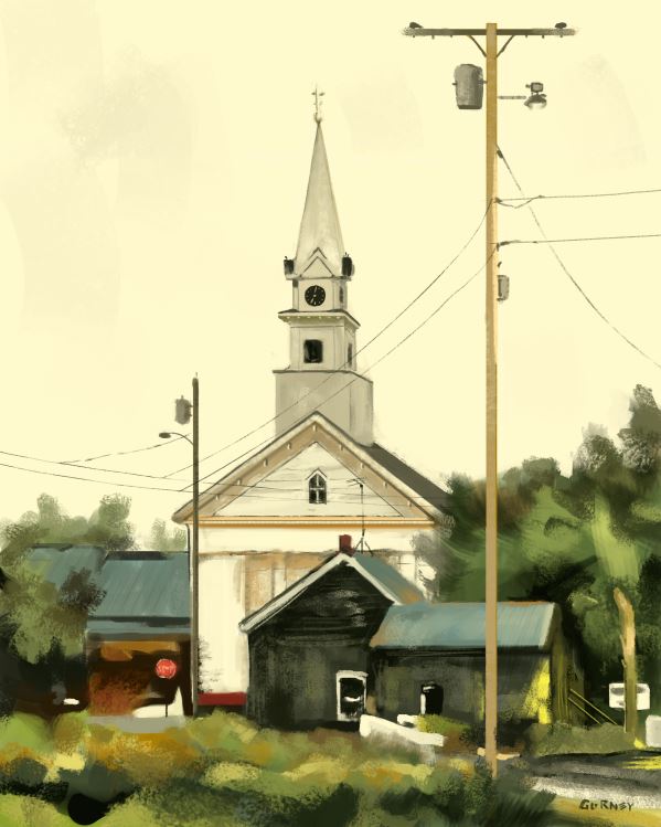 Window Light - the natural light coming in from the window is usually cool, because it comes either from the sky (blueish) or from clouds (of course, if there is an artificial source, it can be every color) - the underplanes are often hit by the surfaces outside (dirt, grass, concrete, etc.) so it is important to consider this - the light from inside the room depends on the source but it is usually warm (lightbulb, fire), so it gives a nice contrast to the cool from the outside 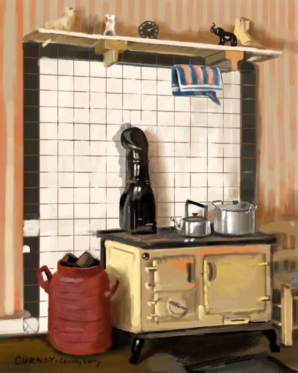 Candlelight / Firelight - it is warm - it falls off really fast. James Gurney even quotes a calculation for the falloff, called the "inverse square law" http://en.wikipedia.org/wiki/Inverse-square_law. - around the flame is often times smoke that gets illuminated and forms a halo  some watercolors of the same page. My scanner is not the best, so this will have to do right now. 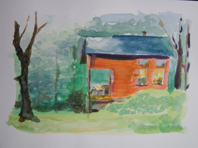 this is from the book's cover 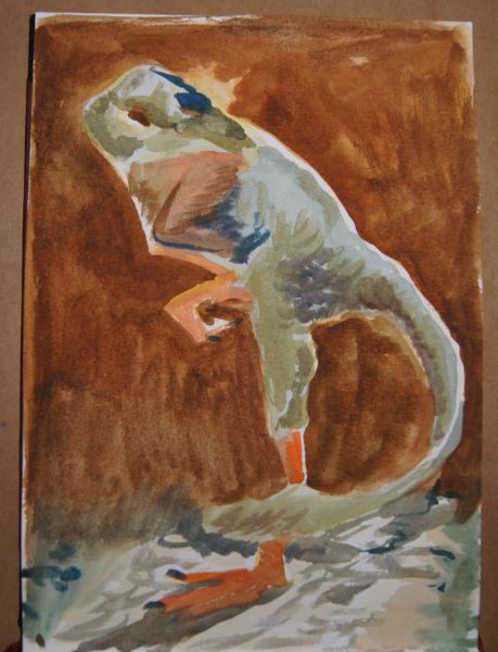 I will keep up the Gurney-studies, because they really help me to understand the content of the book better. Check back soon for more. :)
Cheers, Flo
8 Comments
this is the WIP for the final assignment for Jason Seiler's class. I have until the 23rd to finish this.  Hey guys, I am uploading a bunch of the assignments for the Schoolism class under Nathan Fowkes at once, so you get a good overview of what I was doing the last weeks. Week 2 We got a 3D render-image and we were supposed to add a cool and a warm light contrasting each other. I did a Rembrandt-study before starting out, to get an idea of some of the materials a soldier/knight would wear. 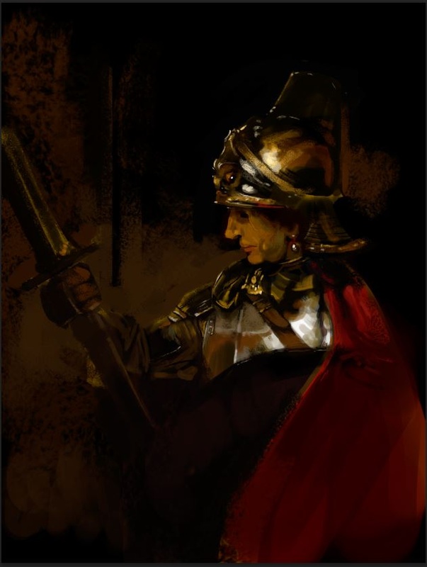 So this was my final assignment: 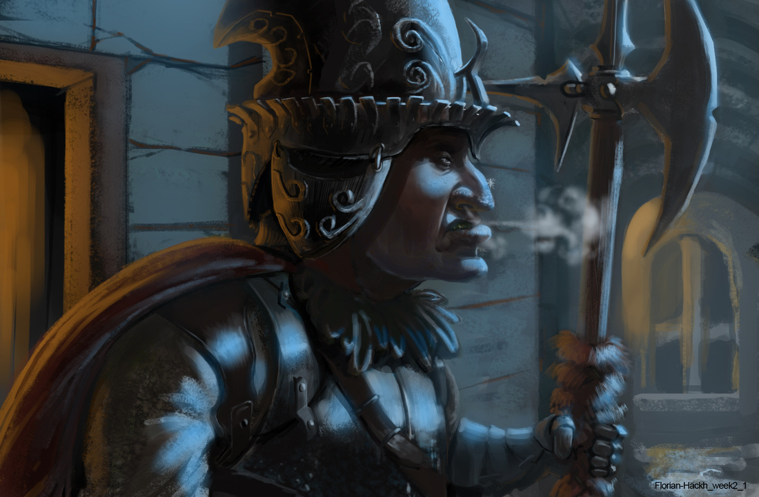 Mr Fowkes mentioned that I did render every material the same way, as you can see on the cloth of the arm and for instance the leather and the metal. They all have the same value range, so they don't look different enough to really read as different materials. Also my local colors are all quite greyish and desaturated and they don't react correctly to the color of light. Another problem was, that I didn't show enough of subsurface scattering in the skin to really make it look like being alive. So here is the overpaint by Mr Fowkes. 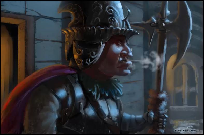 Week 3 This week we were supposed to create a scene with a warm/cool color contrast and paint it 5 times at least with different warm/cool contrasts. After doing 4 or 5, I watched the critique-sessions of other students and I realized that I only shifted the hues and not the values, saturation and so on. Hue is only one aspect of color, so I did 5 more. Before starting out I designed a forest creature that I put in the scene later. 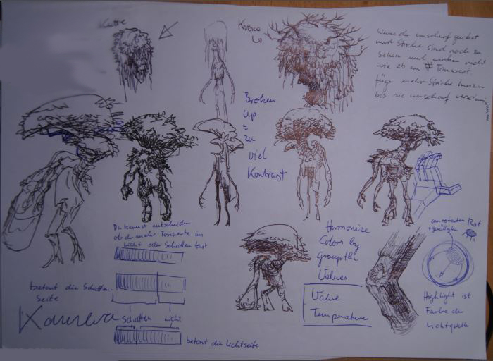 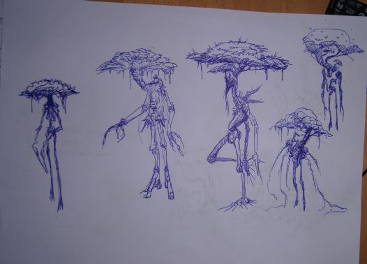 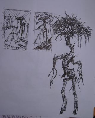 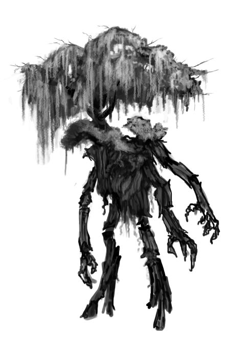 These are the final 6 versions (+1 value version and a ref / study-sheet) of my scene. 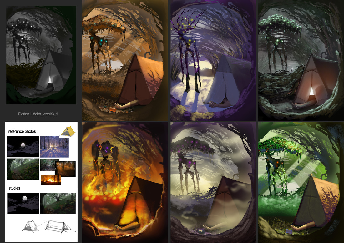 The main critique-point was that I didn't use local colors enough. In every image the local color (the color of the object in neutral light) is more or less grey. So actually a bit like in the assignment of week 2, so for the next time I really didn't want to make the same mistake again. Week 4 This time the goal was to create a scene and change the colors to get different emotional reactions from the image. To get a bit into the mood I did some small color roughs. The idea is to take 2 complementary colors and make an image only with those 2 colors. The main trick is to mix the 2 colors in most of the places because complementary colors desaturate one another so you can leave only a few saturated areas in your image. That way the image doesn't look garish. Since Ida was born during this weeks assignment, I tried to keep it simple and get back to my family fast. 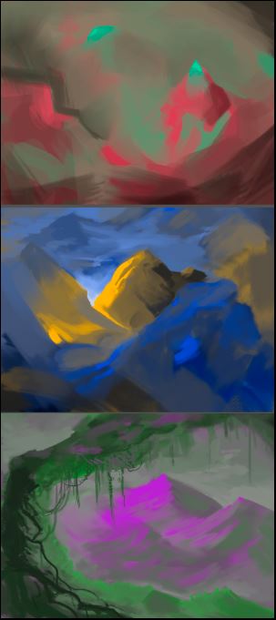 This was this week's assignment: 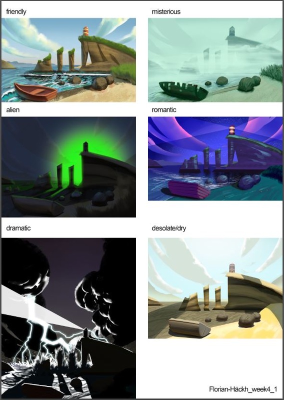 This time Mr Fowkes said, that he missed contrasts of cool and warm at some places. He also did a quick demo of choosing appropriate colors for clouds since in my "friendly" picture, the clouds only go from white to blue. So I missed the opportunity to add a nice warm / cool contrast. So next time I wanted to focus more on those. Week 5 This is the latest piece, I only uploaded it yesterday and I didn't get a feedback on it yet. I had some really great critiques allready by some of my friends, so I am looking forward very to hear what Mr Fowkes has to say about it. 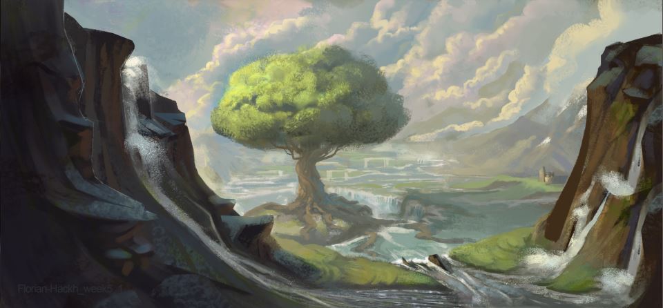 It happened! Our sweet, little daughter Ida was born at 28th of January 2015. I am sooo very happy! I can't even begin to describe how the birth was emotionally for me, words fall short to describe it. And the joy I felt when I saw her the first time is also not possibly conceived by words. Still, what I can say is, that the three of us arrived safely at our home, where we spent our first night together. I am looking forward to many more. My father said to me at the telephone, that "a real artist makes a drawing of their child on the first day they see it". Well, these are not from the first day but the second, guess I am not a real artist then ;) 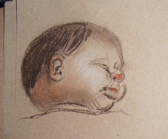   And here she is in all of her beauty :) 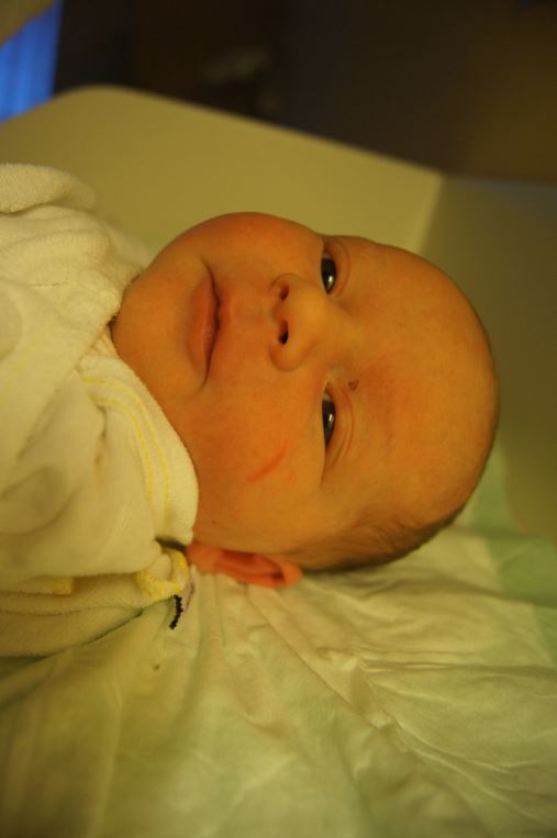 |
This is my blog. I will share information about workflow, my insights into image-making or just general thoughts and rants about being an artist. Archives
February 2024
Categories |
 RSS Feed
