|
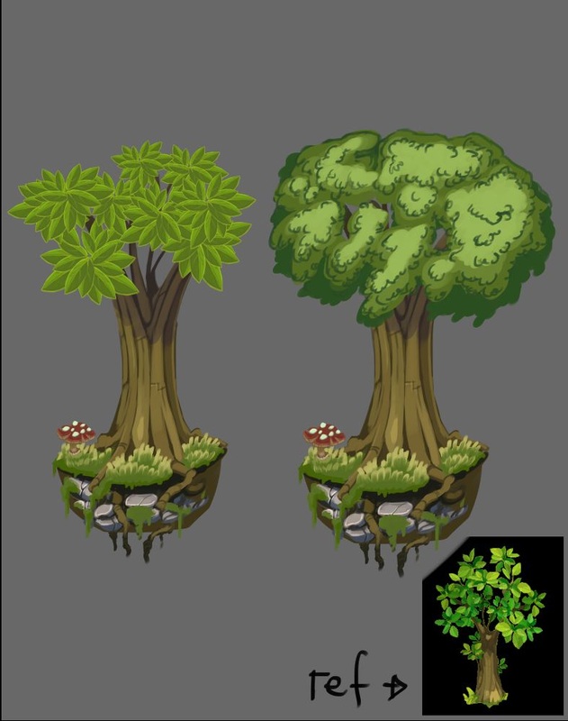
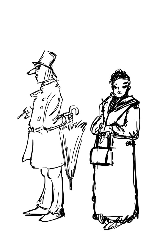
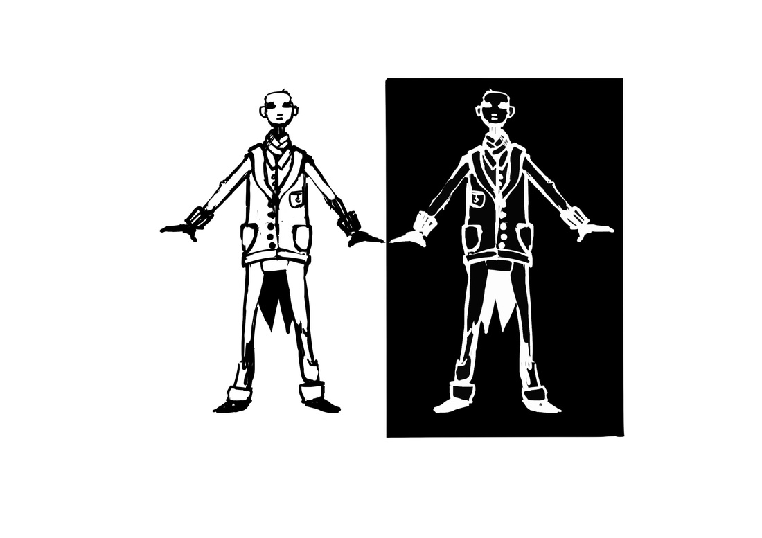
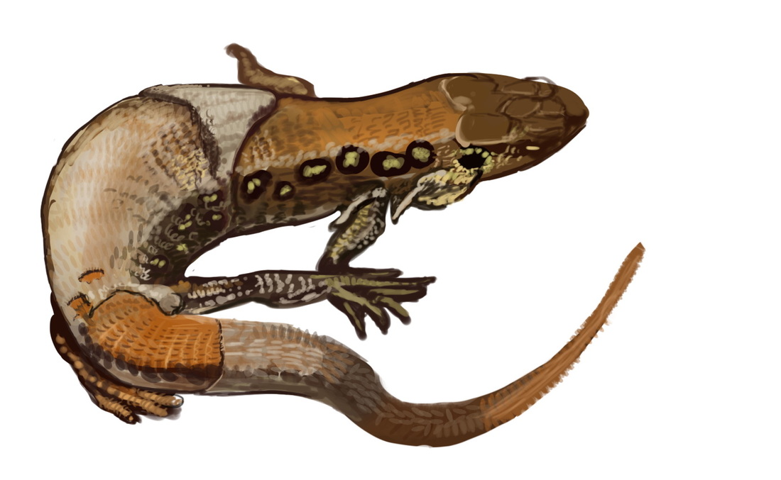
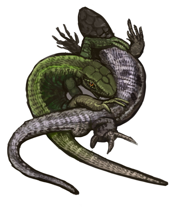
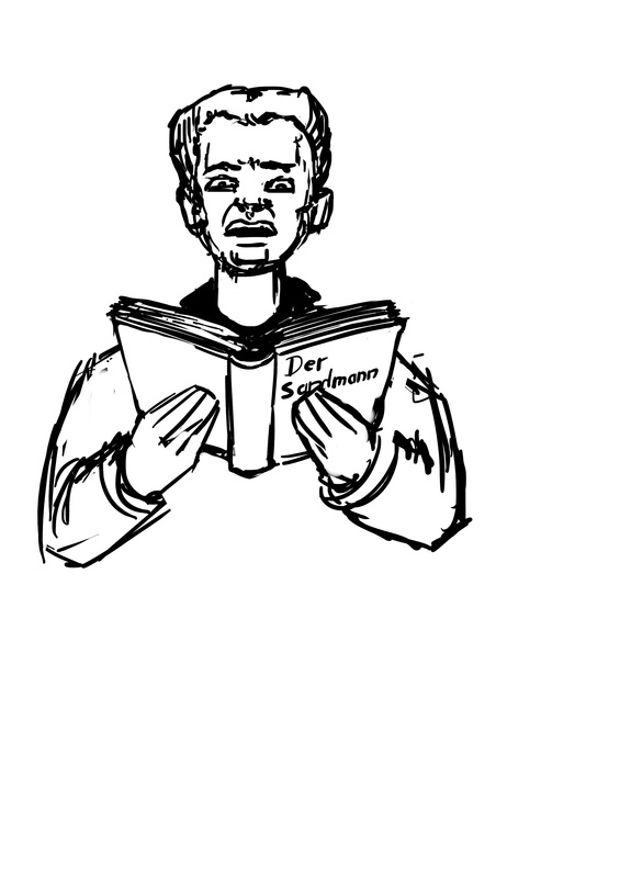
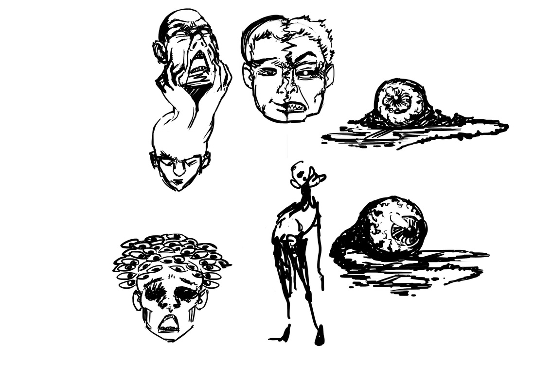
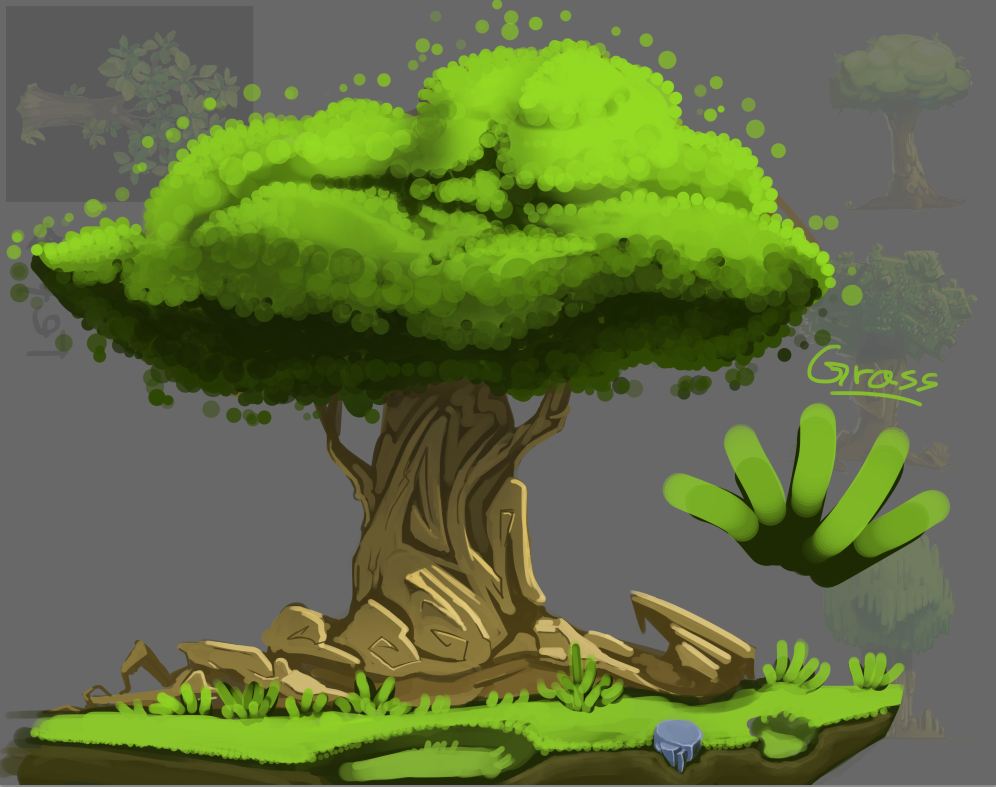
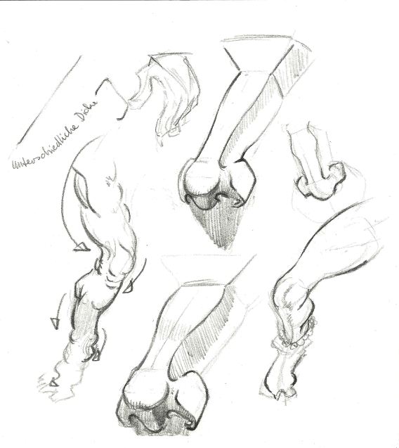
yeah, the studio i am working at gave me green light for releasing some pictures i made for them. So here they are, all of them were done for Sofatutor.com. most (if not all of them) were done with some studying involved. be it for proportions, colors, anatomy or material (or something else i forgot).  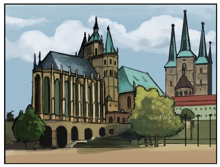   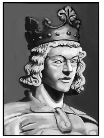 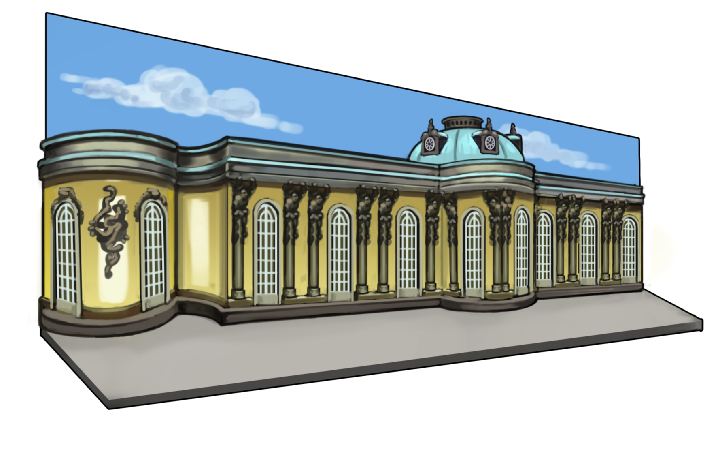  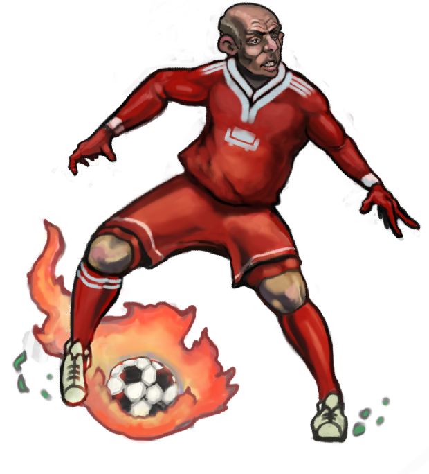  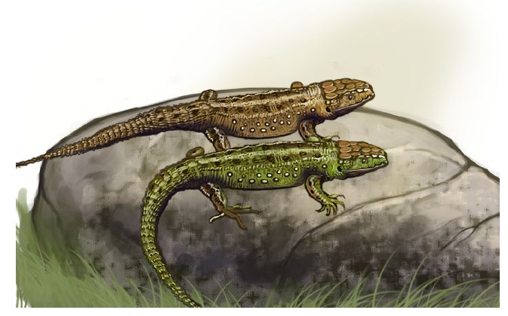 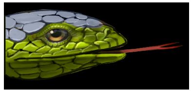 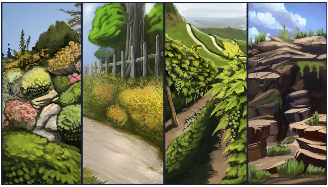 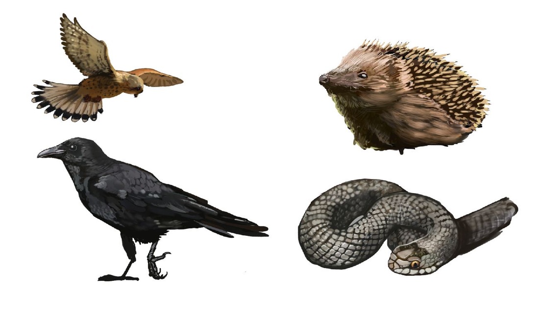 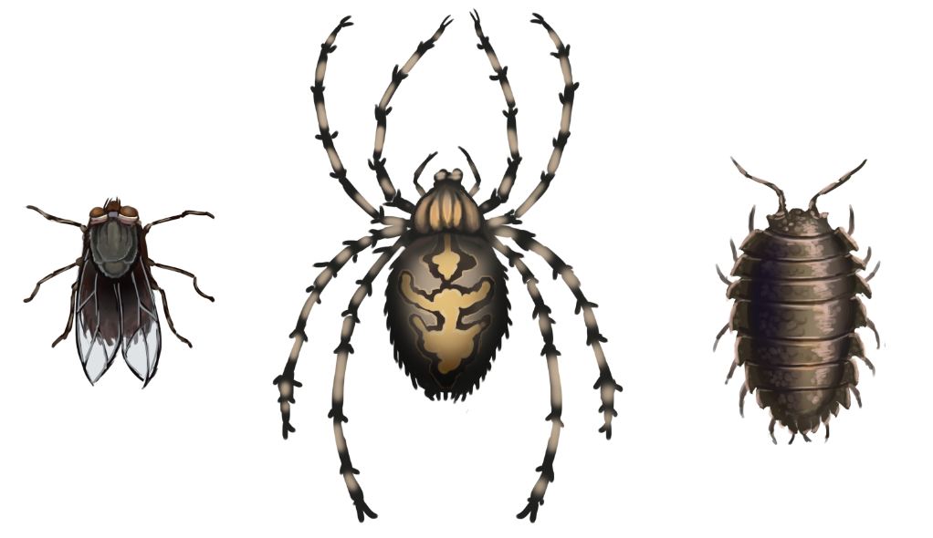 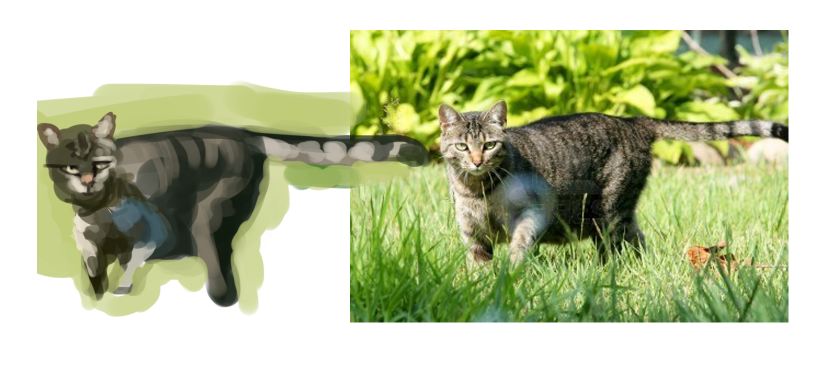 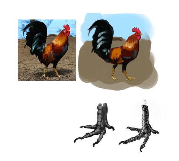             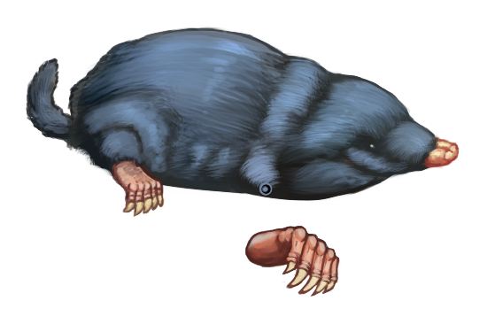 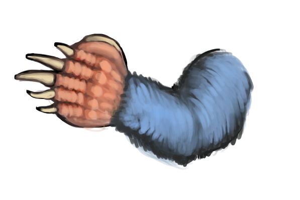 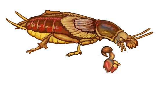 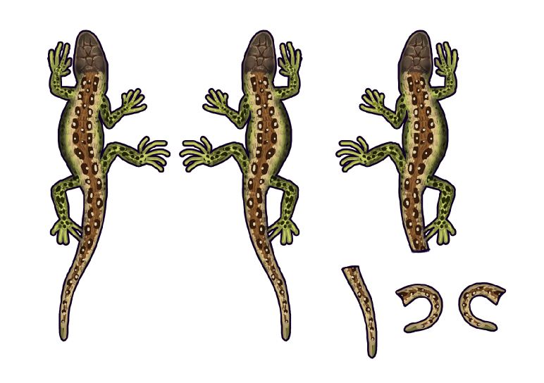    a new style exploration this time. 100% opacity and only size jitter and then working with only 3 different colors per element (leafs, bark, grass, earth, stones). after that i added some yellow light and purple shadows on overlay and multiply layer. it gives really graphical results, which i like at the moment. 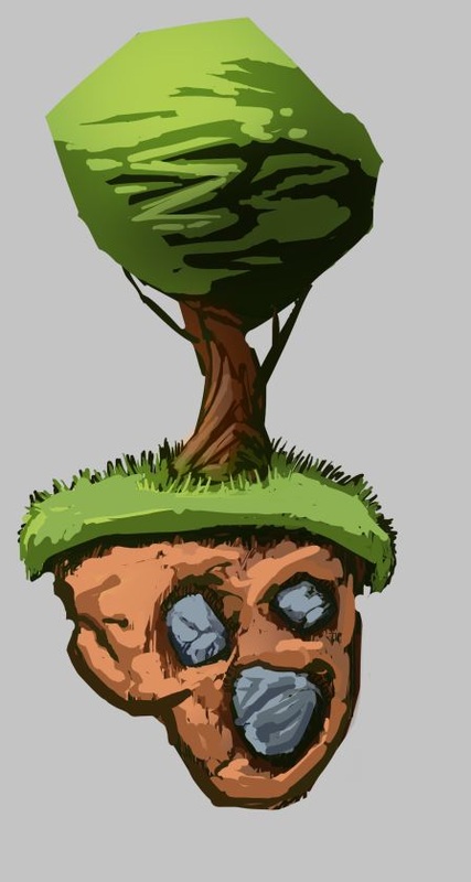 hey guys, some pencil things. i think i am onto something important (for me) about line work. I find that the more I try to find good examples of linework I start to see some interesting things. for example when i have the lines that describe a form darker than the lines i use to wrap around the form or to shade the form, i like the result more. that way the form describing lines functions as sort of a terminator or core shadow, like on this page with the nose in the middle: 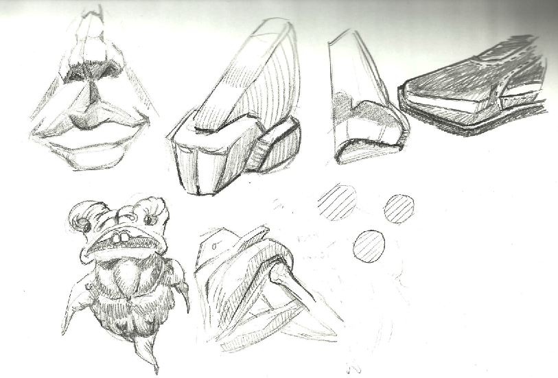 also it feels more controlled if i start with straight lines and add curves later, like on this page with the ears: 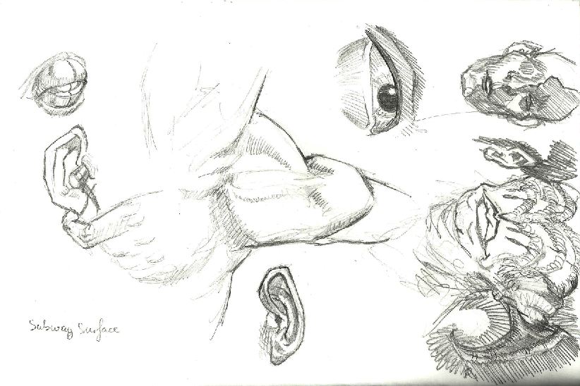 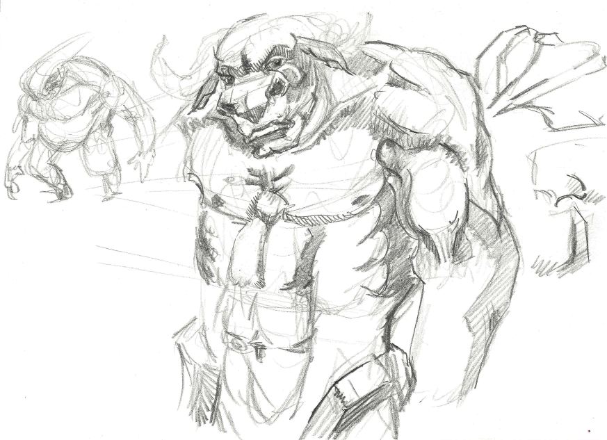 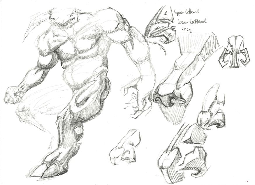 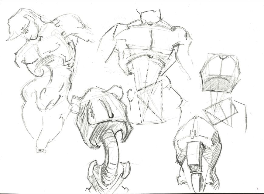 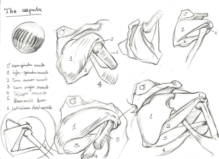 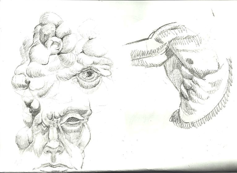 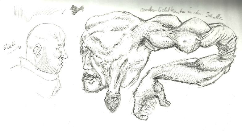 so still i feel that i haven't cracked the code (if there is one), but i feel like a have found another piece of the bigger picture.
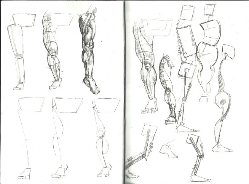
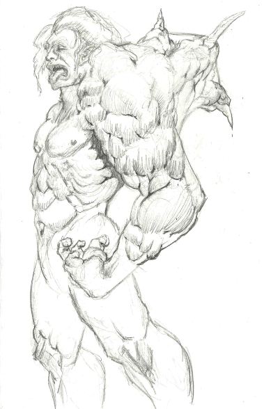
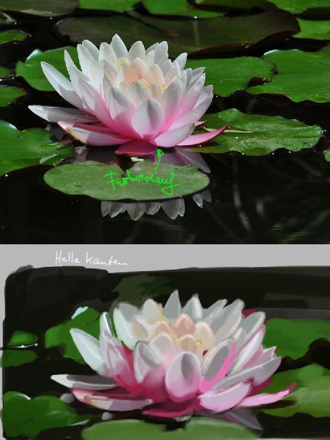
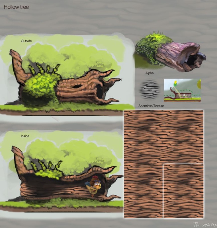
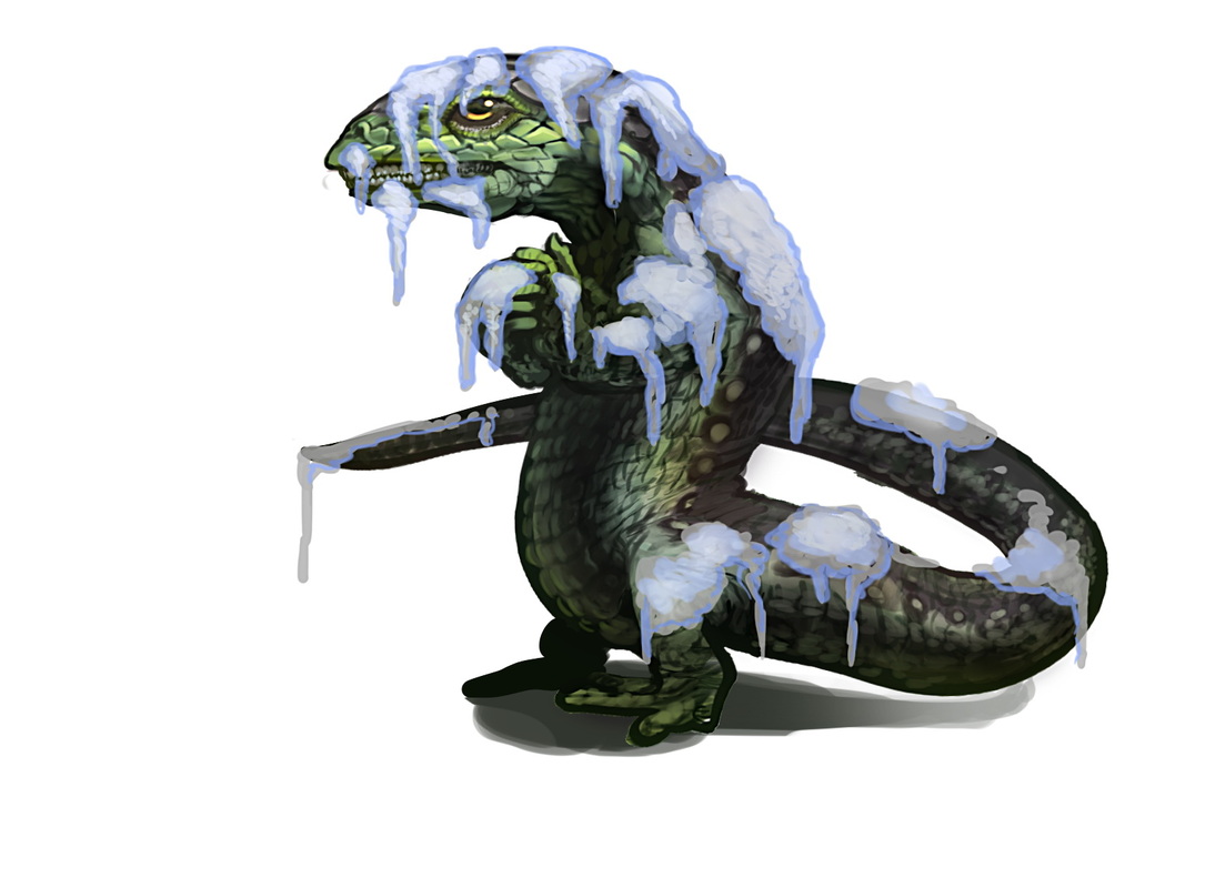
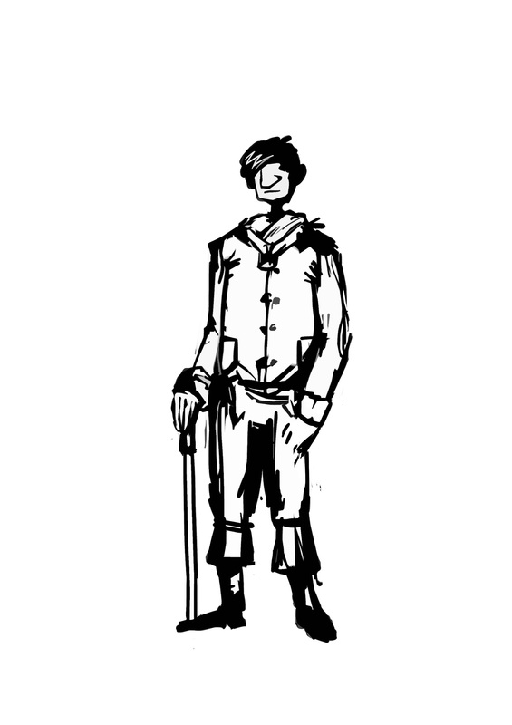
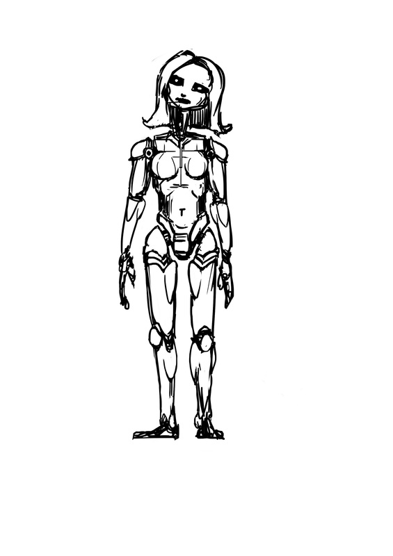
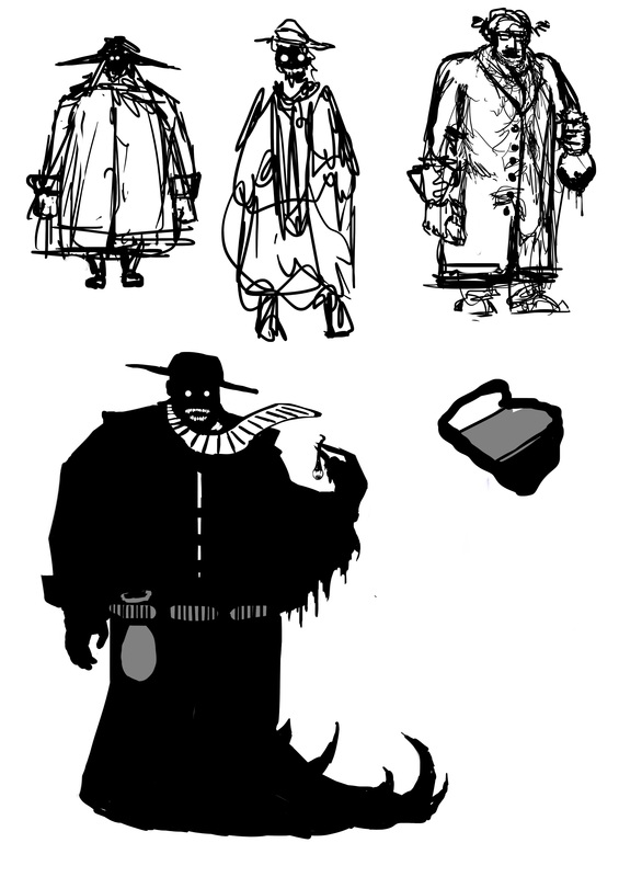
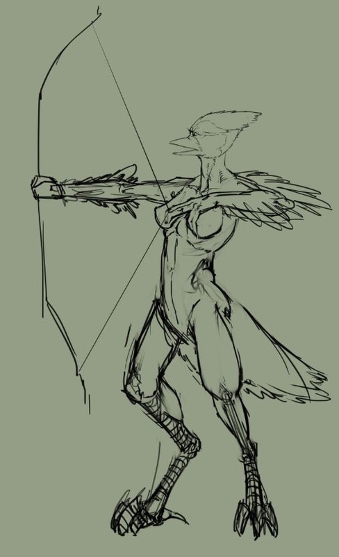
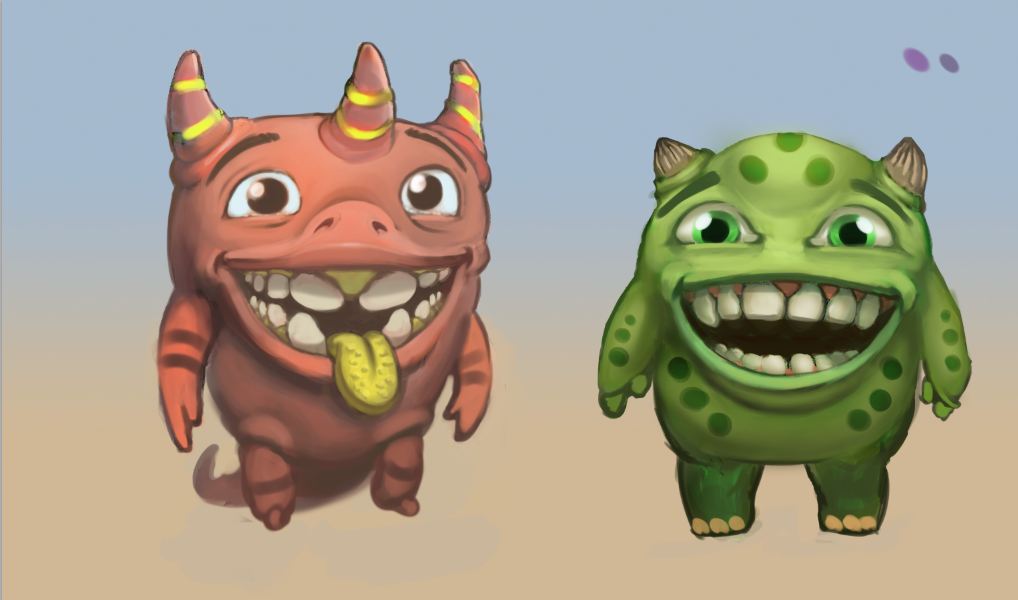
cheers, flo hey guys, small update with some anatomy studies, sketches, a quick study of a sea flower and some concepts for the game project. cheers, Flo 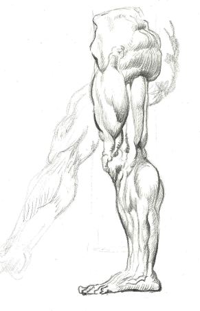
|
This is my blog. I will share information about workflow, my insights into image-making or just general thoughts and rants about being an artist. Archives
February 2024
Categories |

 RSS Feed
