|
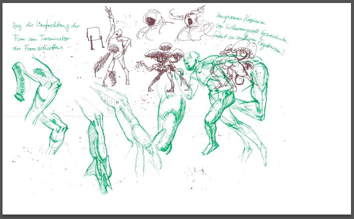
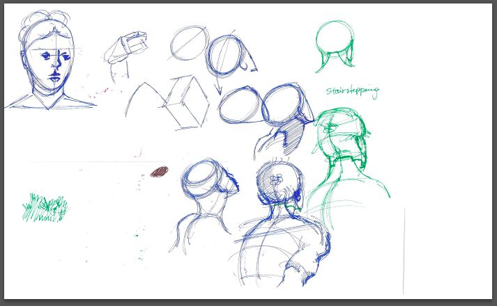
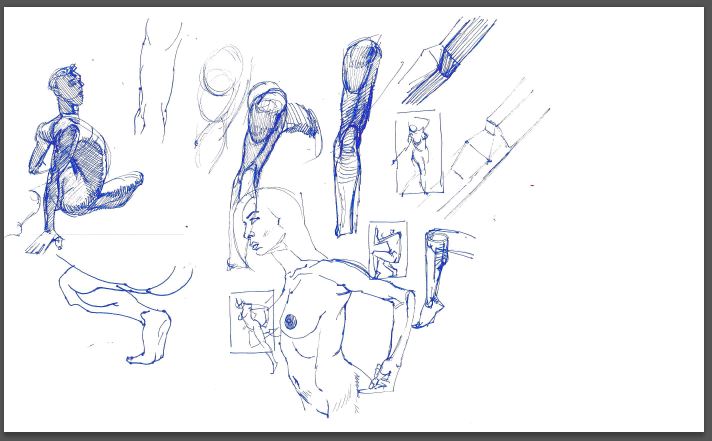
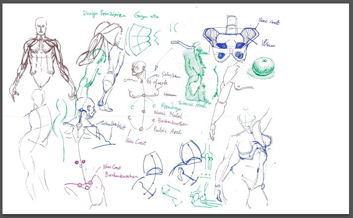
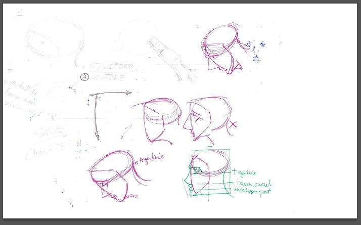
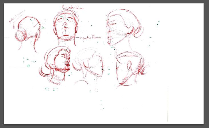
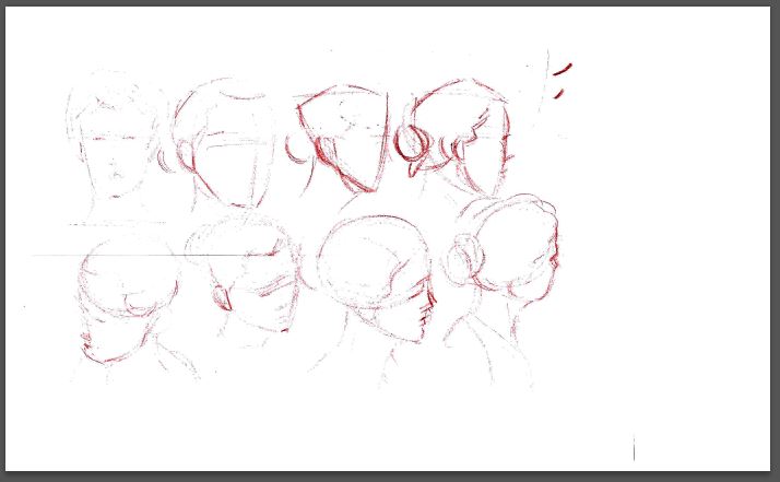
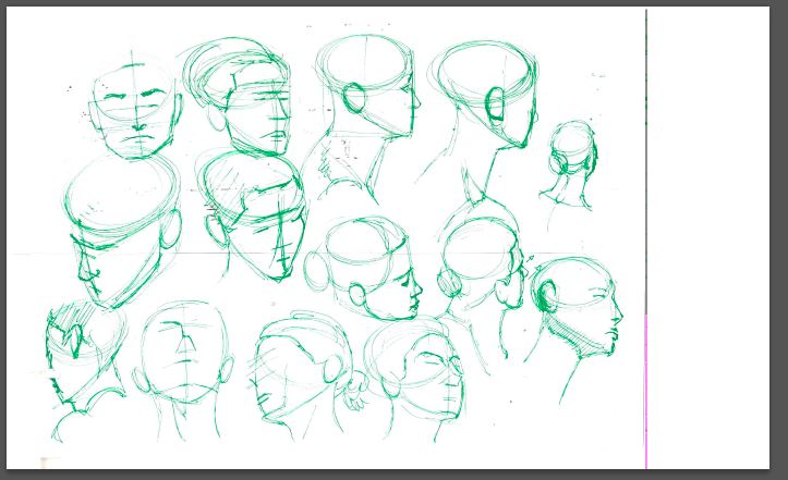
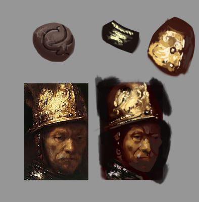
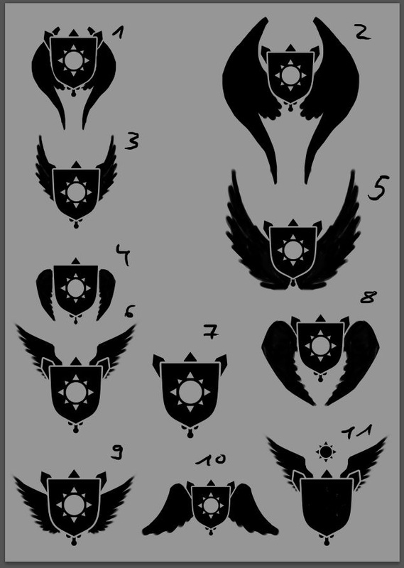
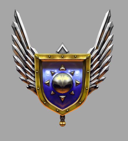
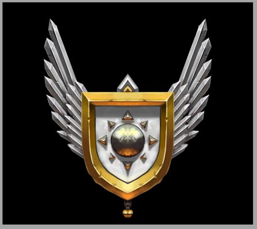
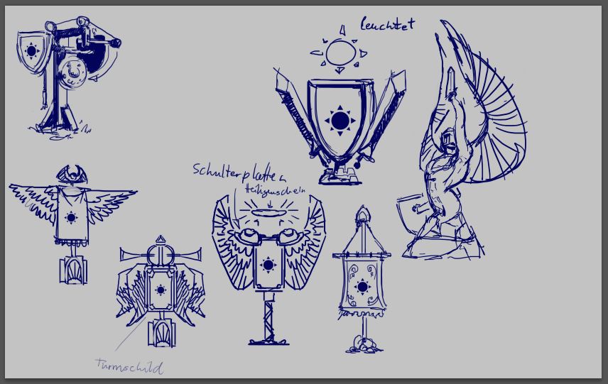
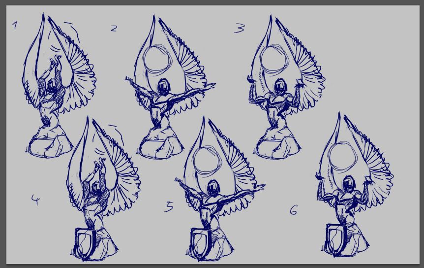
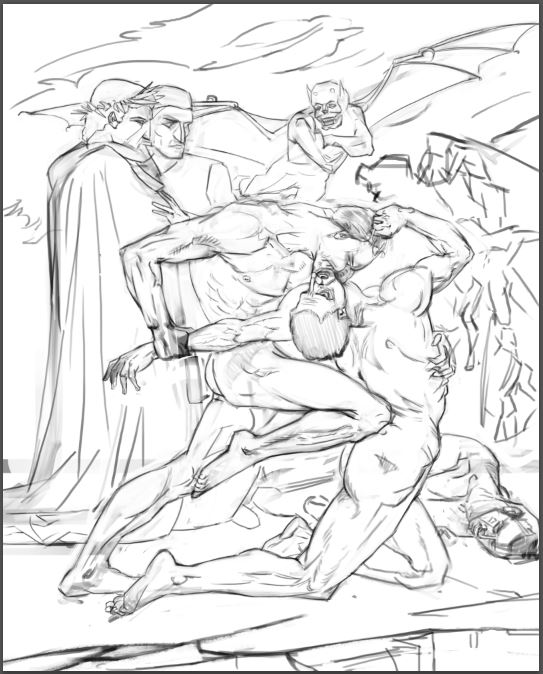
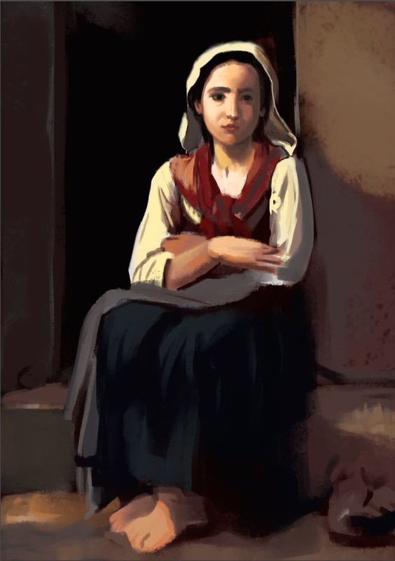
Hey guys, here some studies I did over the last couple of days. Mainly figure and head drawing since I struggle with that the most at the moment and I try to always work into those weaknesses. My buddy Milan also showed me an awesome youtube video by Steve Houston. Check it out if you don't already know it: https://youtu.be/2T7cDY7YDsg It takes a while to work through it but the information is really great, I can totally recommend doing it. This is the newest projekt for the game. We started to talk about the crests of the different factions. Much like these: http://wowwiki.wikia.com/wiki/Crests Those things are great, because I have to think about, what makes the faction stand out on a more abstract level. So first I had to make a list of words that describe the faction like "defensive, light, knights, self-righteous (to throw something negative in the mix), etc." Then I checked out the crests by the WoW factions and did some research there. Then I sketched my first ideas down. After that I went into PS and did silhouettes for the crest. After getting feedback I started painting, got feedback, painted some more, until everybody was happy with the result. What I learned: there is a truth about values, that I don't quite get yet. It's about the difference from the blue crest to the white. Like Tobi (one of the 4 guys working on the game) said, the blue one looks somehow dirty, muddy, dowdy... whatever. The white one has more mid-values and therefor it is possible to add more saturation, like in the shadow-side of the gold framing of the shield. Maybe it is because all the contrasts in the blue shield are very strong, whereas they aren't that strong in the white one. Except in the highlights and occlusion shadows. I recorded the whole process, so when Martin (another one of the 4 guys working on the game) cuts it, I can upload it here. The final piece isn't quite final, now that I see it. But it's good enough for now. Cheers, Flo 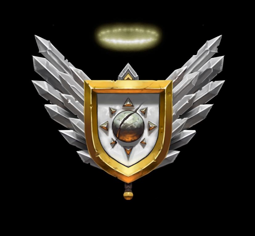 edit: here is the final crest. I balanced some of the battlemarks with more battlemarks, so it didn't shift weight towards one side and I increased the resolution by a factor of 2. That meant going in and tightening up some edges, so maybe next time I start with a bigger resolution. Also I added some contrasts-points here and there, mainly in the swords and I broke up the symmetry some more. Hope you like it! The next one will be the crest for the green faction! Can't wait to start on it, this process is really fun! :) Cheers 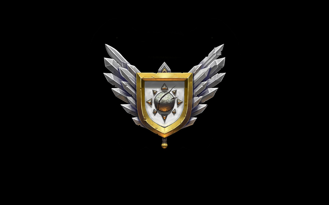 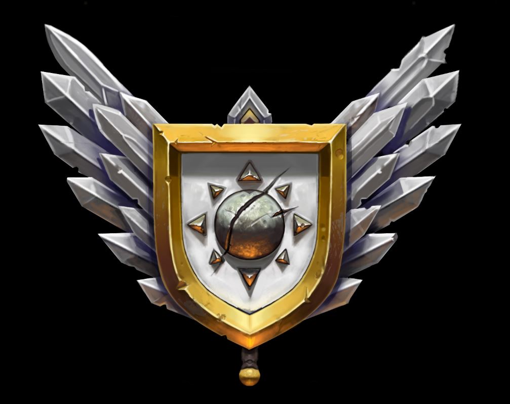 edit edit: after receiving some great feedback by our 3D guy, I changed some of the proportions and rearranged the swords. Also I encreased the filesize and added some more secondary lighting from below. 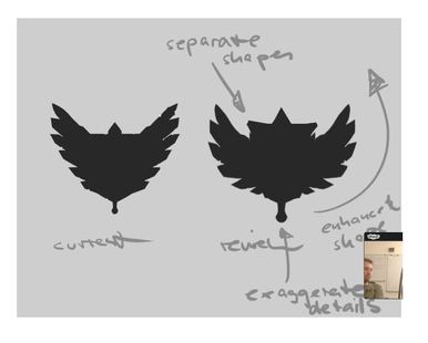 This is how great feedback looks like to me :) 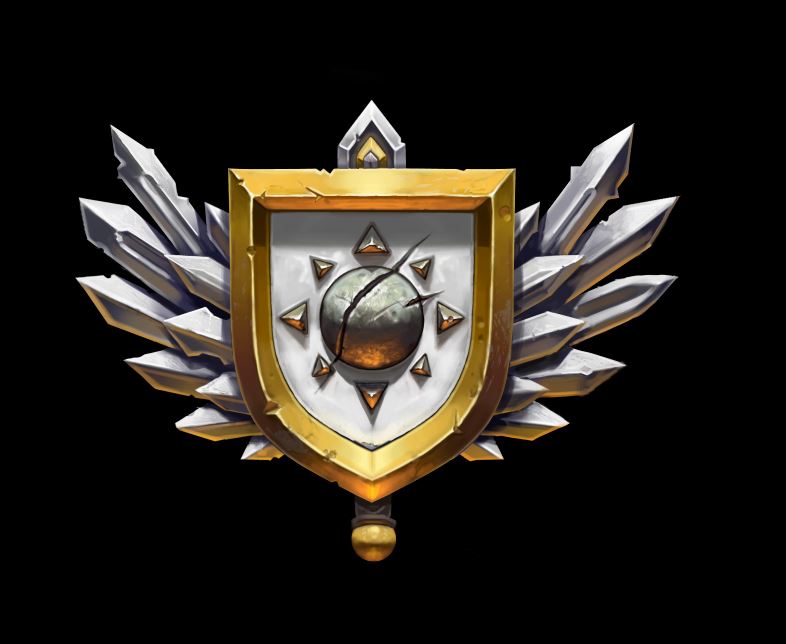
0 Comments
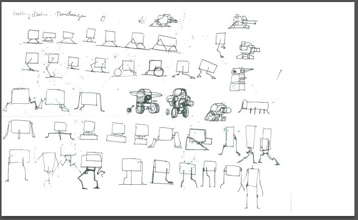
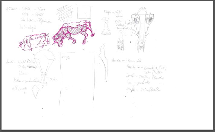
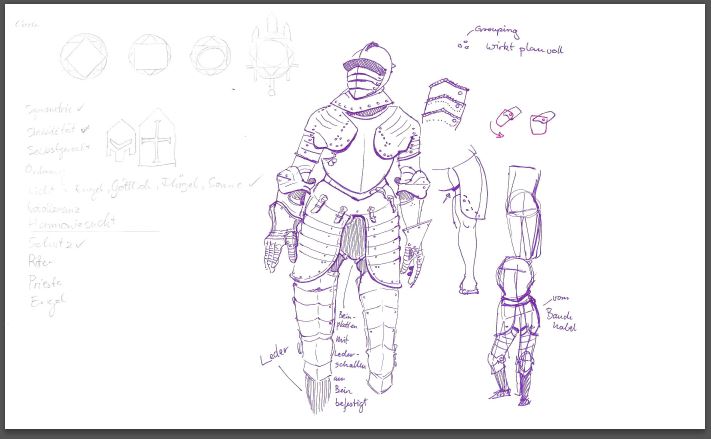
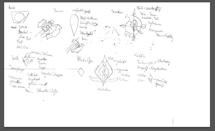
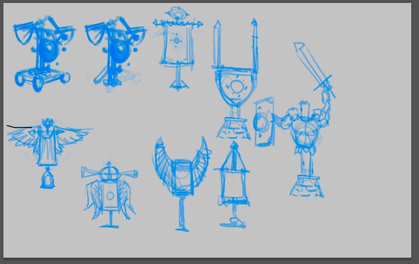
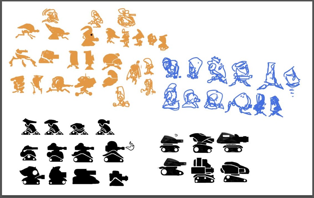
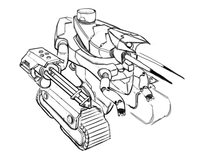
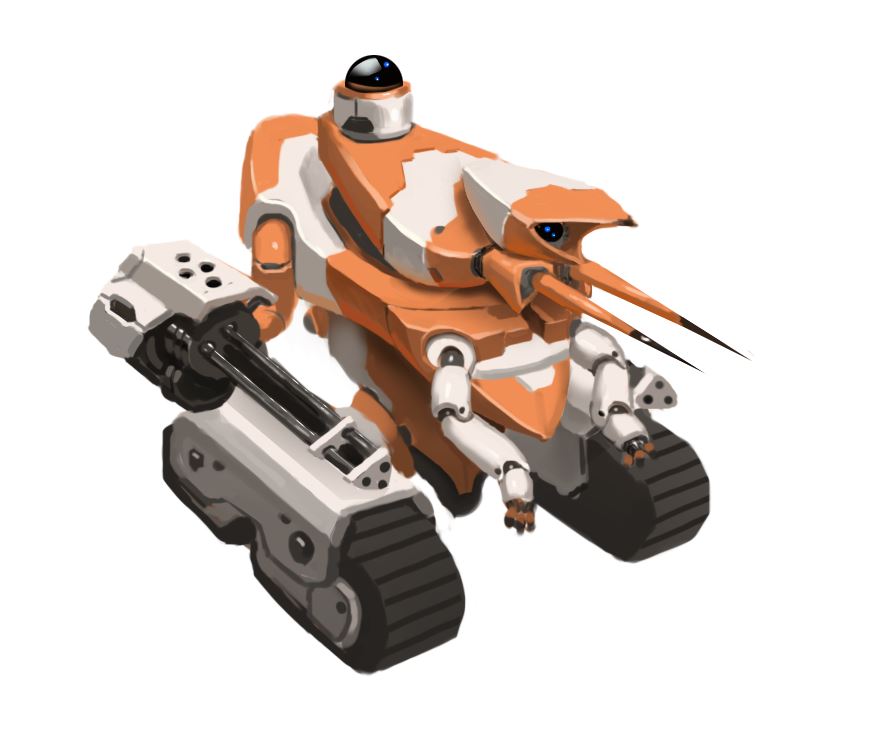
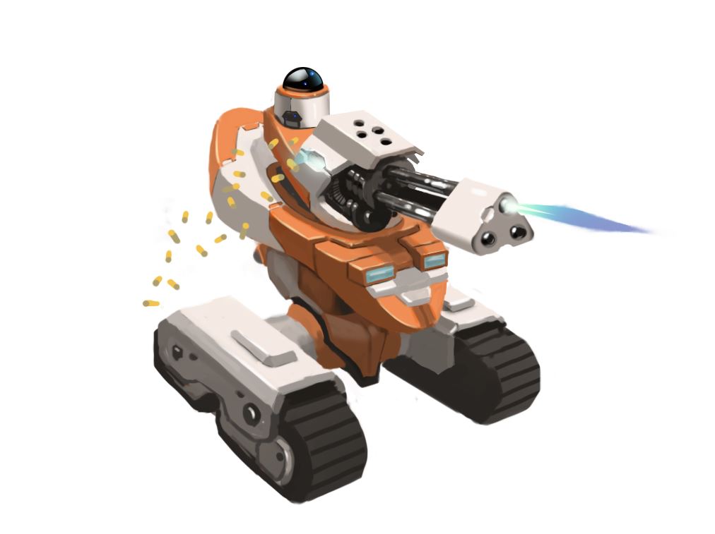
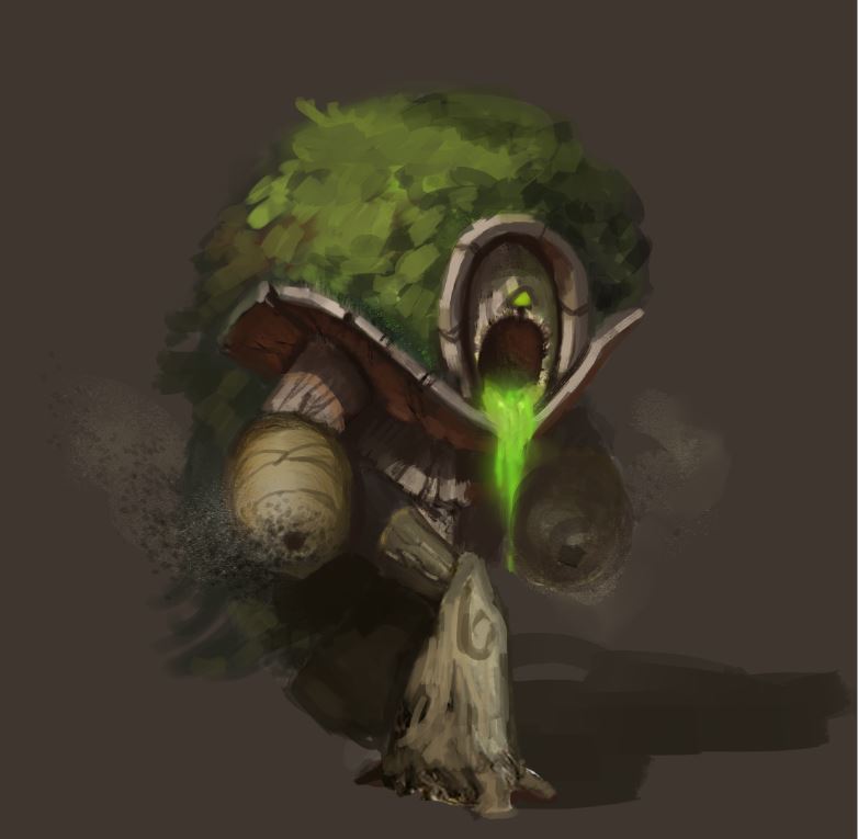
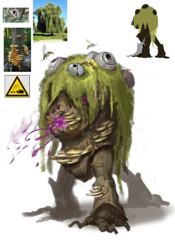
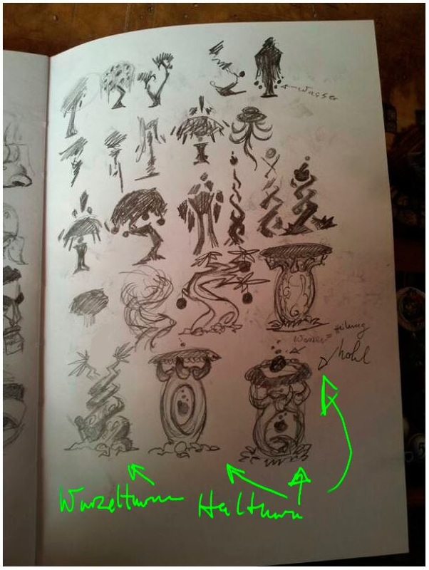
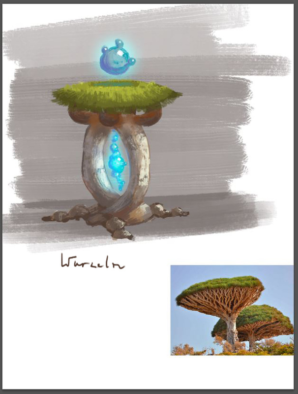
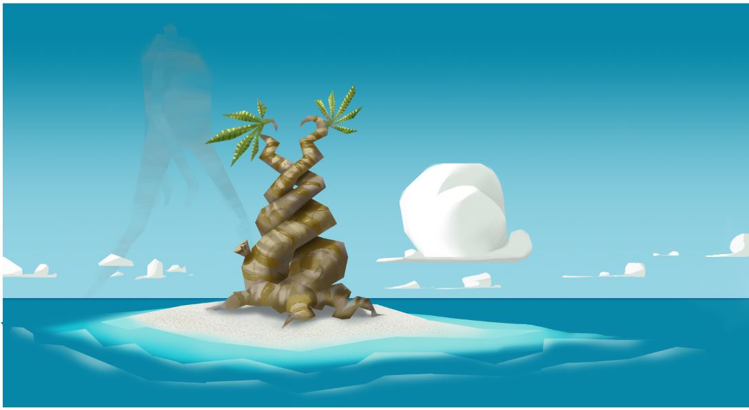
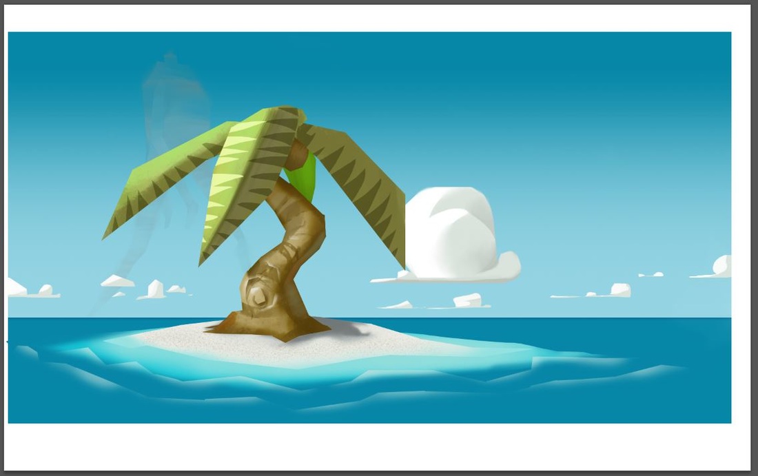
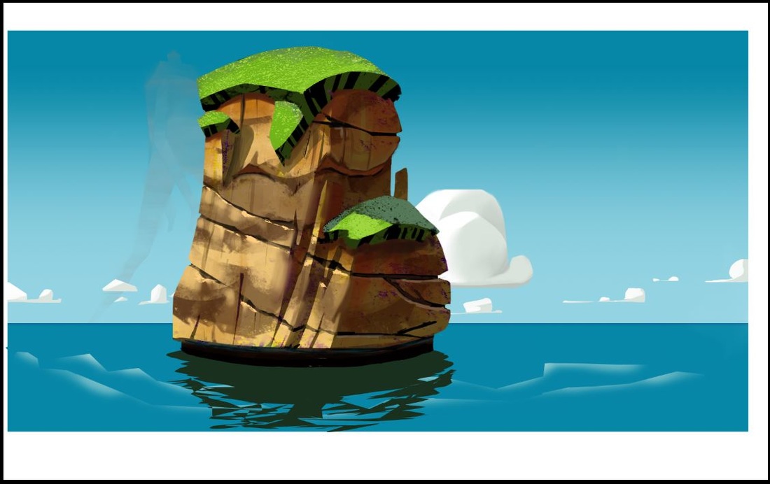
here are some new concepts for the game. The mushroom wasn't planned for the game, but I kinda like it too much to leave it unused. 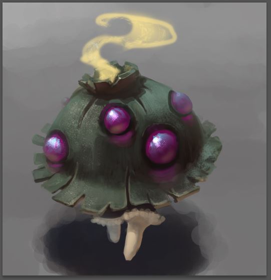   Hey guys, this is the newest concept art piece for Base Conflict. After some discussion we settled on putting a sci-fi race into the game so I get to design robots. This was kinda hard because usually I just like to look at them but haven't gotten around to design one myself. So in the beginning I did my thumbnails and settled on the veeery last one. Then I did a rough 3/4 sketch which I showed the guys and they liked it. I wasn't very happy so I did some more research and decided to go for a lobster - feel by borrowing shapes. I took they lineart as far as I wanted before starting to color it. For a perspective grid I used the programm "Carapace" which is a really easy way to place a grid in your painting. Get it here: http://epicgames.com/community/2012/11/free-art-tool-released-thanks-to-epic-friday/ After some discussion about questionable design decision (spikes, arms, head, gun to small) I did an overpaint, which got approved. I am quite happy with the result, being my very first mech-painting. (Btw I know that it is half - tank, so... yeah. still...) Hey guys, today I wanted to share one of the many processes there are for doing concept art. I didn't invent it, I picked it up during the last years teaching me this stuff. I like it, because it is really simple and cost efficient. To make this whole post a bit more relevant I use an example from today's work for Base Conflict, the game I am working on with 3 more guys. Currently I am concepting the green faction, which is a nature-race (meaning they are all some tree/plant-creatures). The briefing for the concept said: it is a tower, it has Armor/Damage-Aura, it throws rocks In my opinion the hardest part is that blank feeling inside your head, when you have to design something new. For me it helps to do thumbnails. What I mean are really small scribbles. It takes discipline to stay small, so I shoot for a size that is literally as big as my thumbnail. I do a lot of those and just let my mind and eye look for interesting shapes. In this case I did only a small amount, but I kinda liked what I had. This could look something like this: 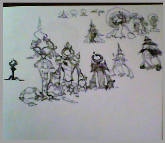 After that I pick two or three thumbnails and do silhouettes in photoshop. The main goal is to balance shapes and get some interesting rythms in the concept. Surface detail is of no interest, I try to repeat shapes to create unity and than introduce contrasting shapes to create interest. I like the 3rd one in the top row so I took it. It had some magic going on, which was shown by the floating orb, it could throw a stone with its grabby-hand and shoulder pads are always good to say "royal" "high rank" so I guess this helps with the "aura". 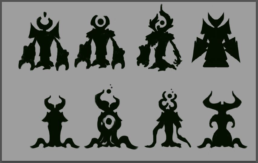 Now is where it gets personal. Personal as in, personal technique. Over the time every artist develops their own way of working I supposed. So my approach here way to encrease the size of the silhouette, add a gradient to it to get some light in there, define the simple shapes with a soft brush and then just sculpt the inner forms into the silhouette. As I said before this is simple, but it isn't easy. In a couple of years I will loke back an decide differently on the lighting choices I did today, but for now, this is what I came up with. After that I decided on a color sheme, added the colors with a multiplay layer, put a copy of the greyscale above the multiply layer and set it on overlay. I adjusted opacity until I felt it was a good start and then just painted. In the end I did another version where I used a photo-overlay on which I painted. I didn't change the silhoutte I established much during the whole process. So yeah, I hope this helps a bit, feel free to ask questions and see you soon. 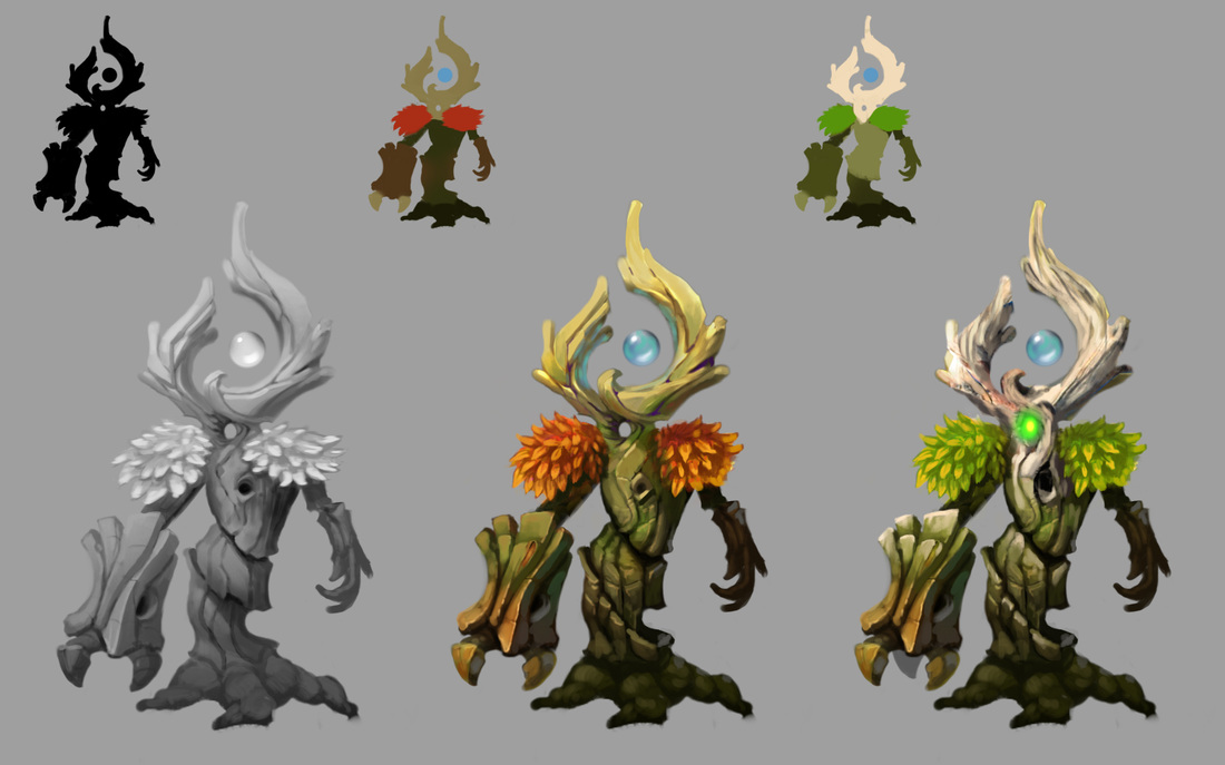 Siege unit of the green faction "Buildings" of the green faction Explorations for the map |
This is my blog. I will share information about workflow, my insights into image-making or just general thoughts and rants about being an artist. Archives
February 2024
Categories |


 RSS Feed
