|
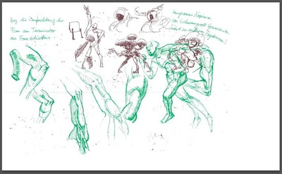
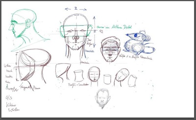
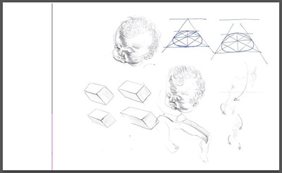
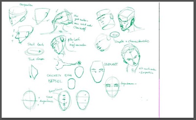
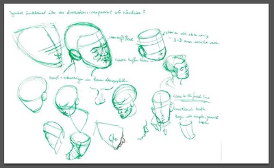
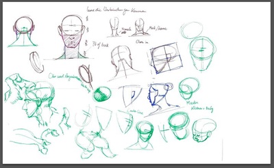
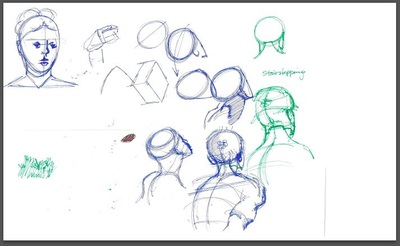
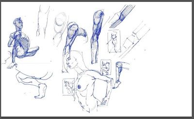
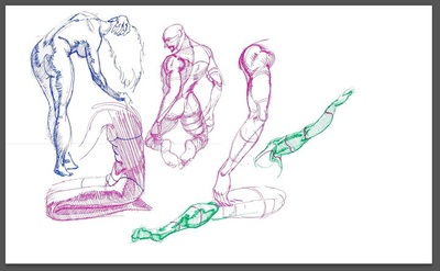
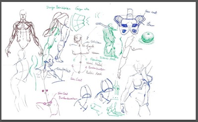
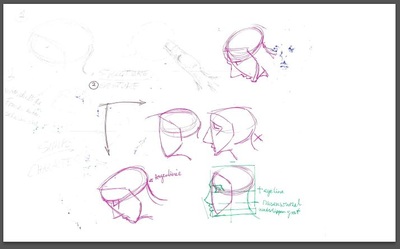
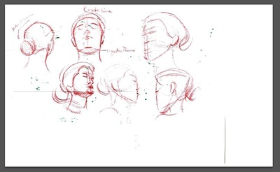
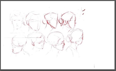
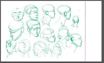
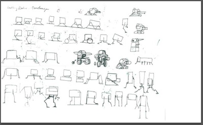
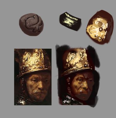
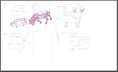
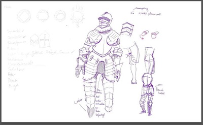
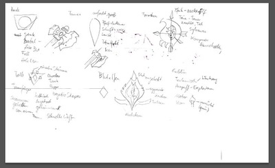
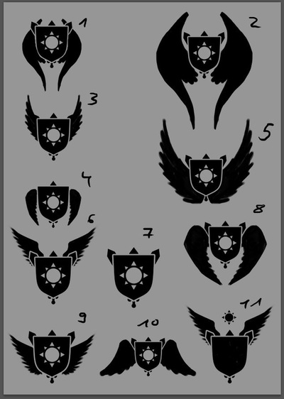
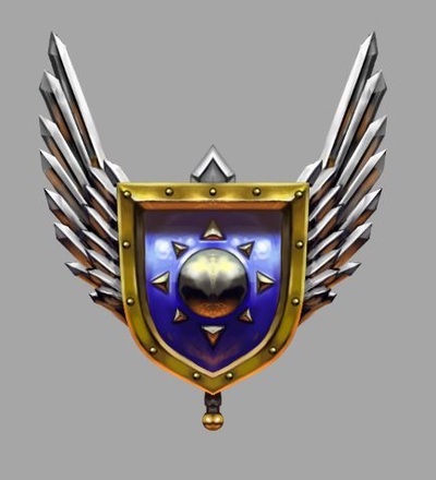
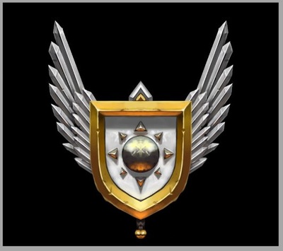
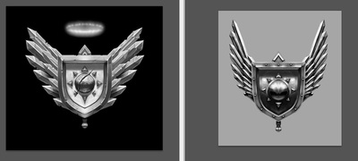
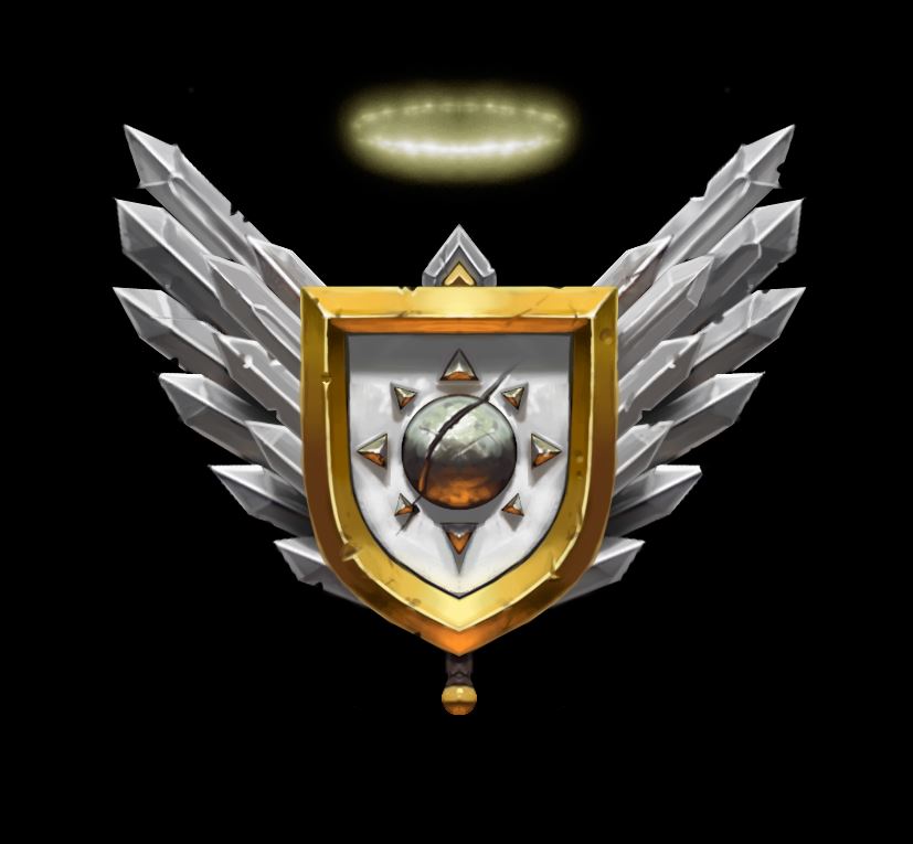
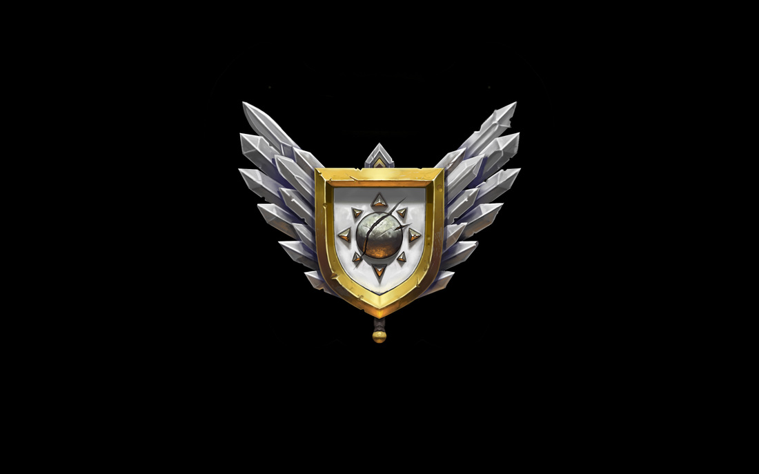
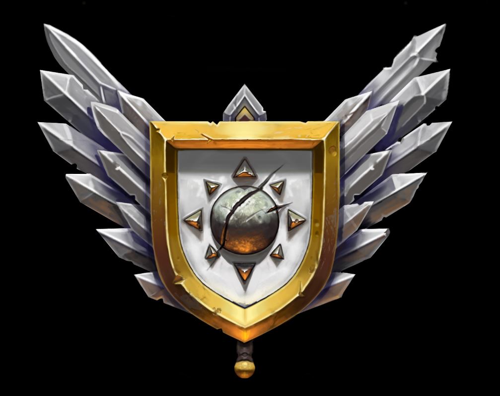
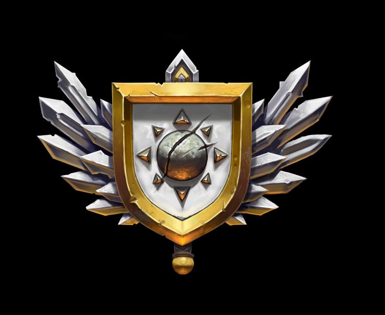
Hey guys, here some studies I did over the last couple of days. Mainly figure and head drawing since I struggle with that the most at the moment and I try to always work into those weaknesses. My buddy Milan also showed me an awesome youtube video by Steve Houston. Check it out if you don't already know it: https://youtu.be/2T7cDY7YDsg It takes a while to work through it but the information is really great, I can totally recommend doing it. This is the newest projekt for the game. We started to talk about the crests of the different factions. Much like these: http://wowwiki.wikia.com/wiki/Crests Those things are great, because I have to think about, what makes the faction stand out on a more abstract level. So first I had to make a list of words that describe the faction like "defensive, light, knights, self-righteous (to throw something negative in the mix), etc." Then I checked out the crests by the WoW factions and did some research there. Then I sketched my first ideas down. After that I went into PS and did silhouettes for the crest. After getting feedback I started painting, got feedback, painted some more, until everybody was happy with the result. What I learned: there is a truth about values, that I don't quite get yet. It's about the difference from the blue crest to the white. Like Tobi (one of the 4 guys working on the game) said, the blue one looks somehow dirty, muddy, dowdy... whatever. The white one has more mid-values and therefor it is possible to add more saturation, like in the shadow-side of the gold framing of the shield. Maybe it is because all the contrasts in the blue shield are very strong, whereas they aren't that strong in the white one. Except in the highlights and occlusion shadows. I recorded the whole process, so when Martin (another one of the 4 guys working on the game) cuts it, I can upload it here. The final piece isn't quite final, now that I see it. But it's good enough for now. Cheers, Flo edit: here is the final crest. I balanced some of the battlemarks with more battlemarks, so it didn't shift weight towards one side and I increased the resolution by a factor of 2. That meant going in and tightening up some edges, so maybe next time I start with a bigger resolution. Also I added some contrasts-points here and there, mainly in the swords and I broke up the symmetry some more. Hope you like it! The next one will be the crest for the green faction! Can't wait to start on it, this process is really fun! :) Cheers edit edit: after receiving some great feedback by our 3D guy, I changed some of the proportions and rearranged the swords. Also I encreased the filesize and added some more secondary lighting from below. 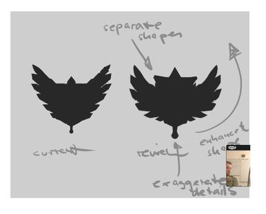 This is how great feedback looks like to me :)
0 Comments
Leave a Reply. |
This is my blog. I will share information about workflow, my insights into image-making or just general thoughts and rants about being an artist. Archives
February 2024
Categories |
 RSS Feed
