|
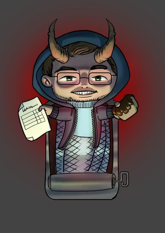
Hey guys, I did another card for "Dungeon League", this time it is "Uwe Seelig". He is extremely good in doing headers. As usual I got the lineart by Lena Kuschke via trello, which we use to manage the project and communicate. She sent me a reference picture for the colors, but the internet swallowed it and I can't find it anymore. Mainly it was that his shirt should be blue and he should be dark skinned. 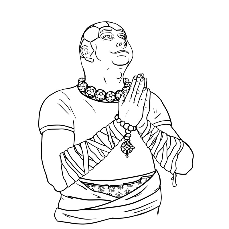 This was the color-comp I sent in for review. I got some feedback, mainly concerning his necklace and the football-pattern on his head. Right now it looks more carved in and less like a tatoo ... ouch. After sorting out the short-comings I did some studies. 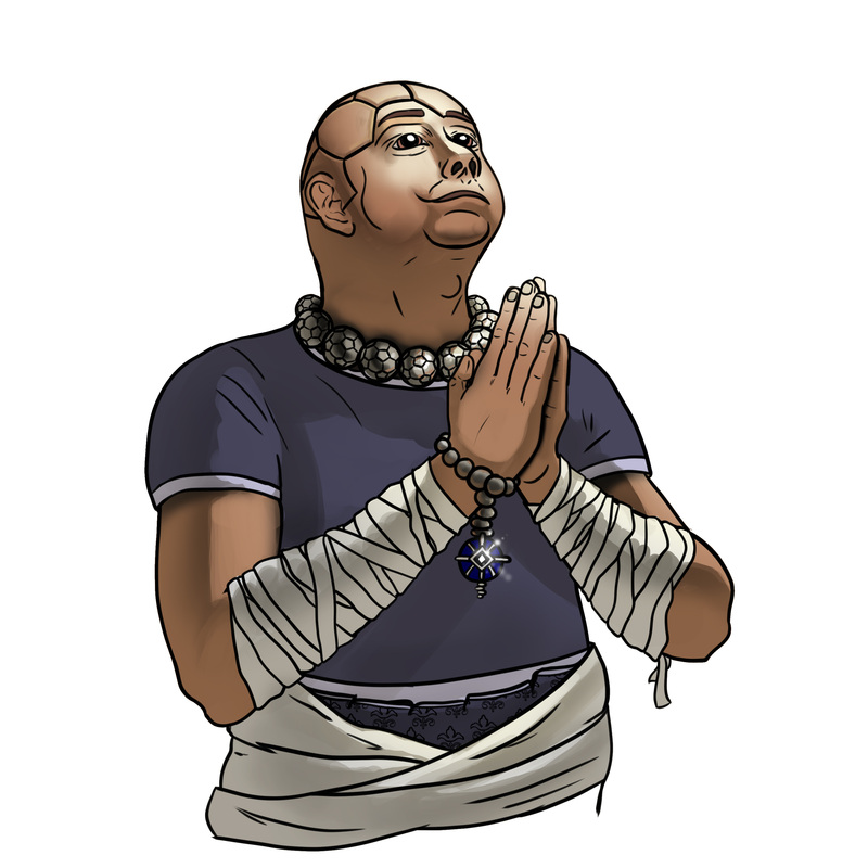   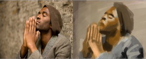 In the end I used a lot of the colors from the last study and the blue rimlight from the second study. And here is the final version. 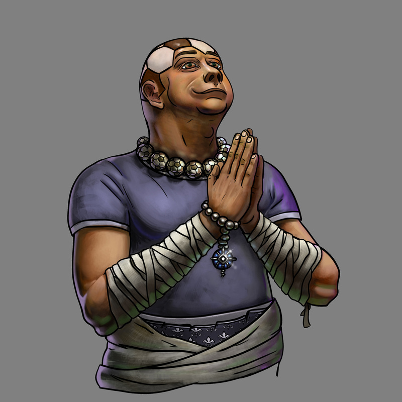
0 Comments
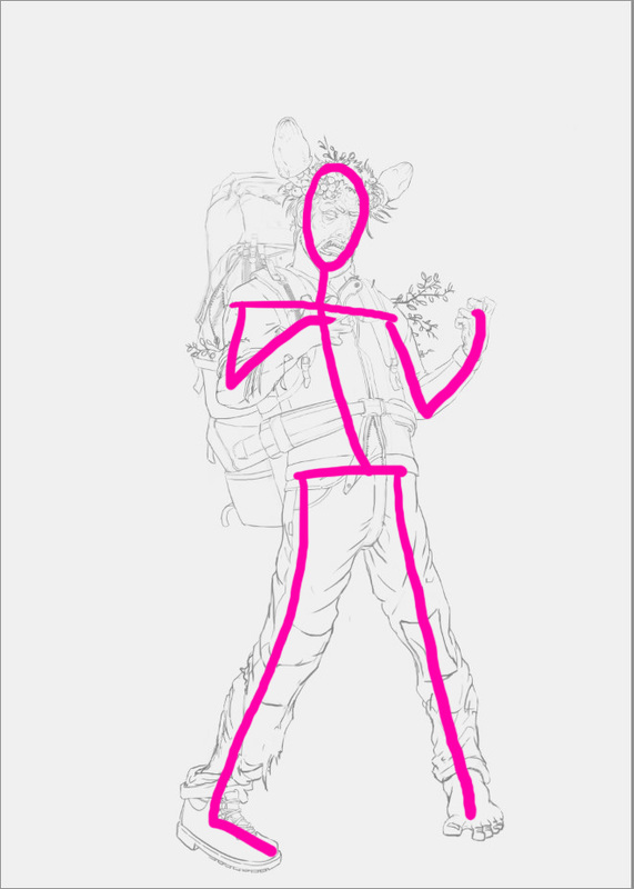
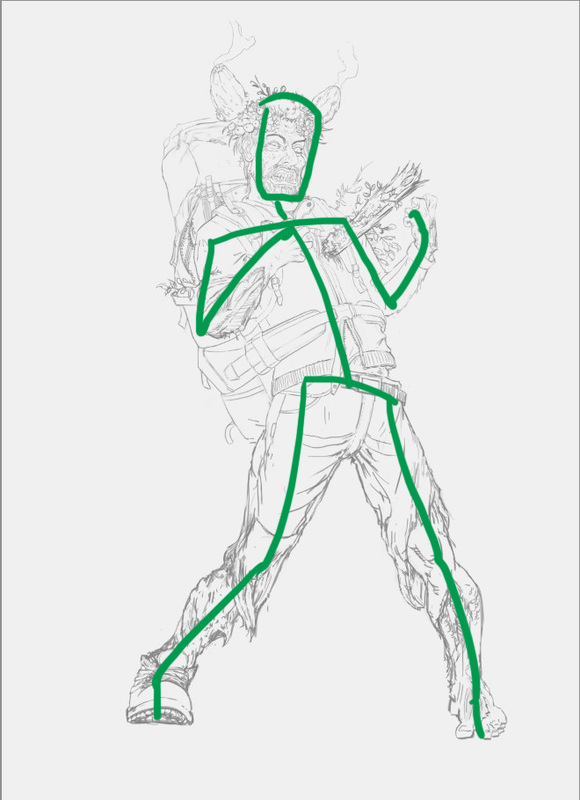
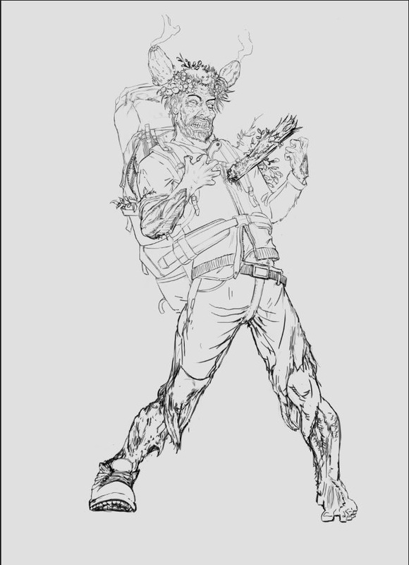
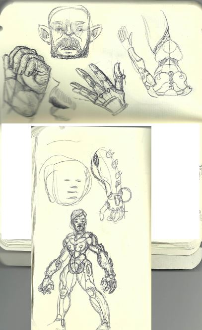
Heyho, I redrew one of my line-art pictures. In the first the pose is okay but a bit stiff, which is all the more visible when you draw a simple stick-figure over your art. Smart people would do that step in the beginning stages of their painting, but hey... sometimes I get carried away and I need to make adjustments in the later stages of an image. I put more emphasis on having a contra-pose, which means that the shoulder-line dips in another direction, than the hip-line. Also his stance is broader and his face is way more active. Looking at reference and acting the pose out helped me here a lot. So try it out and see if it helps you. Cheers, Flo This started as an anatomy study, the 2 additional arms where added from memory. I used 2 new brushes which worked out great. one left a lot of subtle texture while sculpting in light and shadow and the other was good for an additional texture pass, after having worked in the biggest volumes. they are pretty basic too, I can tell you more about them if you want. :) the picture was taken from here: http://figuresfordrawing.tumblr.com/post/37342781457 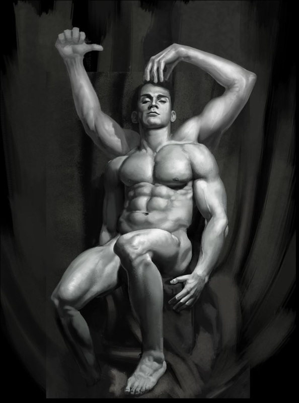
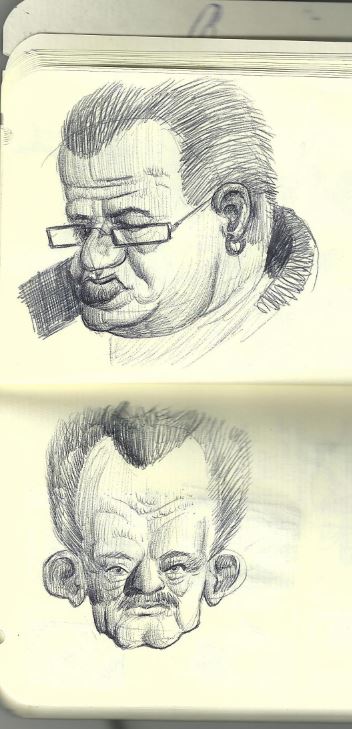
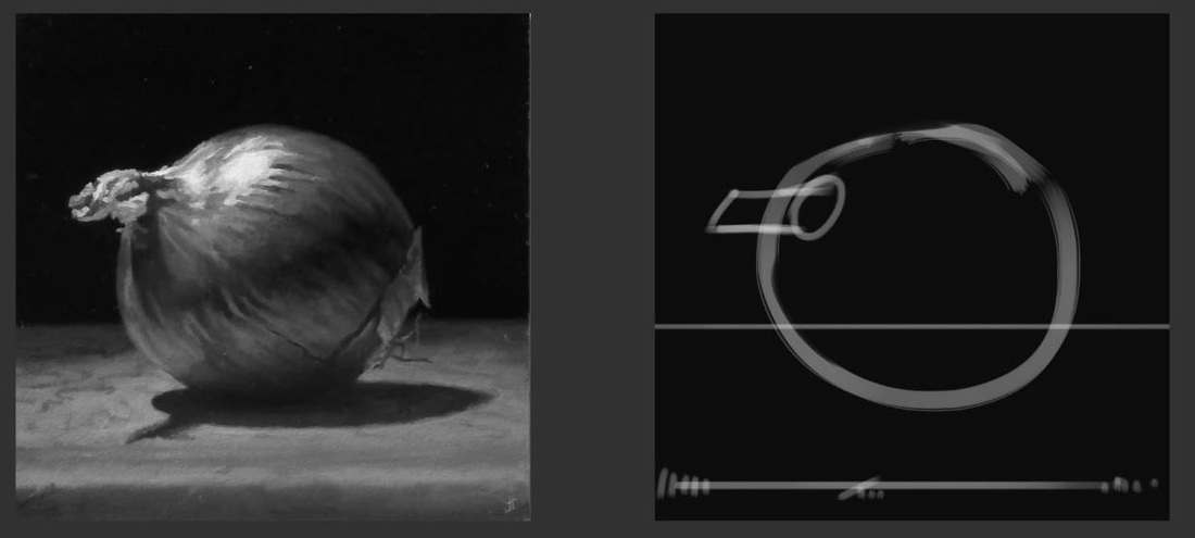
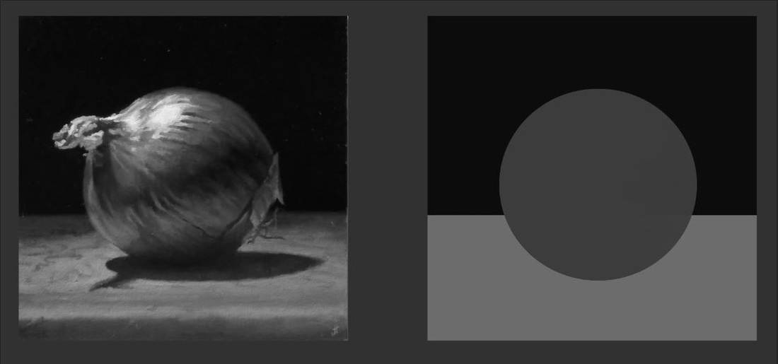
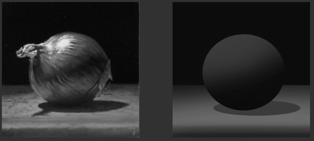
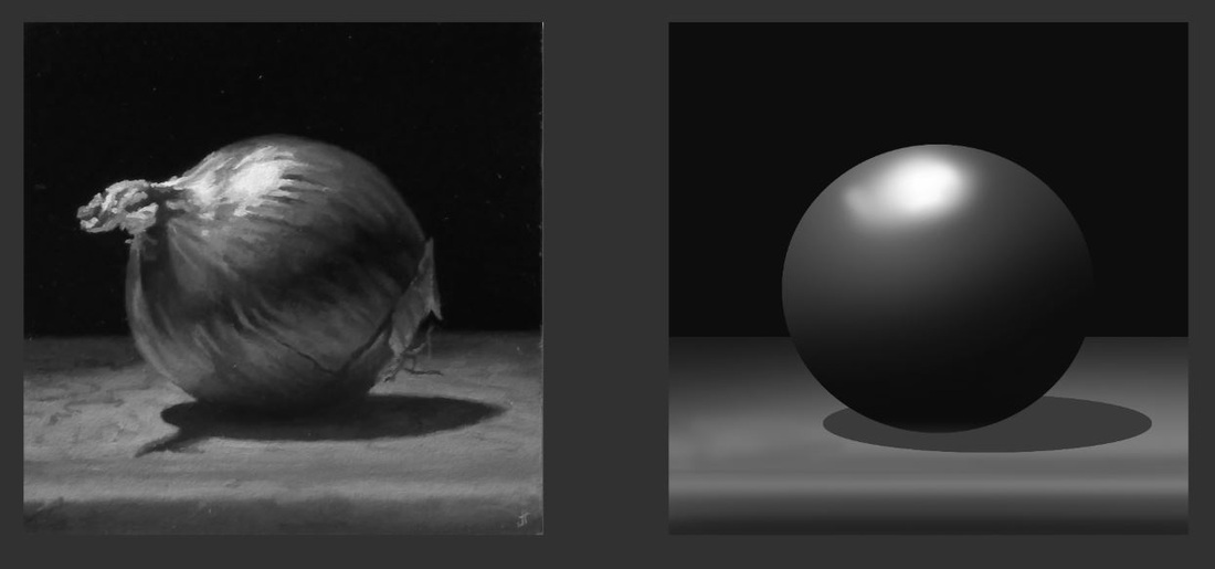
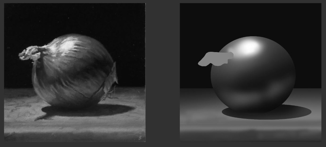
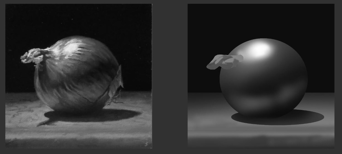
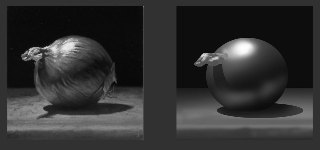
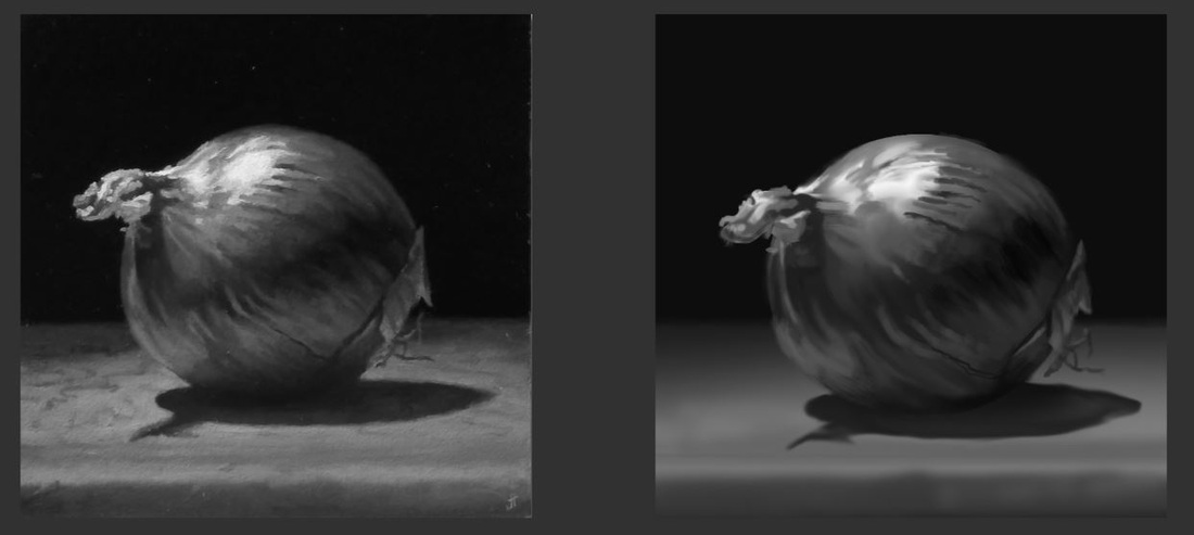
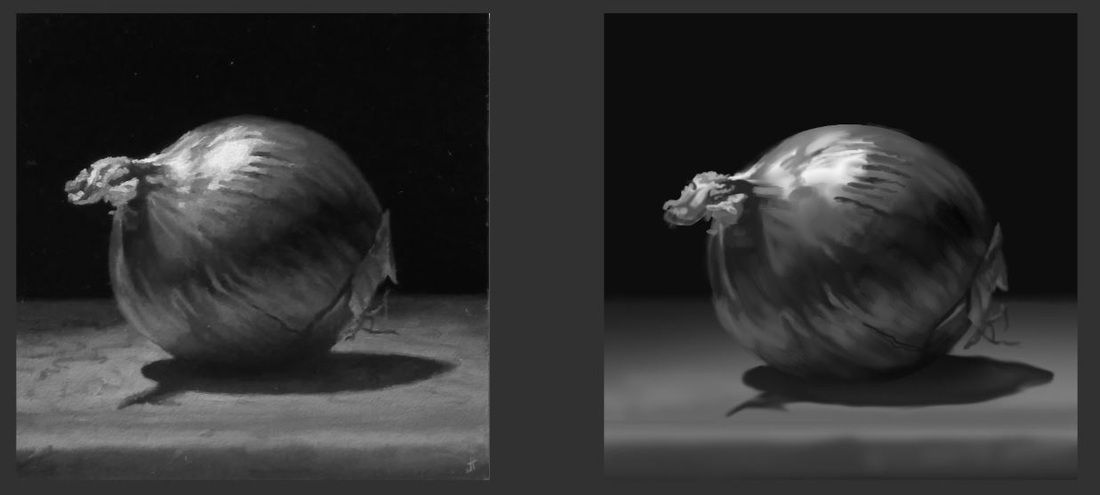
hey guys, I wanted to share another "Dungeon League" - process with you. Here is what I do: 1. I get the lineart by Lena Kuschke 2. I block in colors and shadows and send it for a review 3. I paint the materials and details after getting feedback by Lena and Julius The whole process is done in roughly 4 hours for every card. 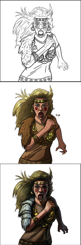 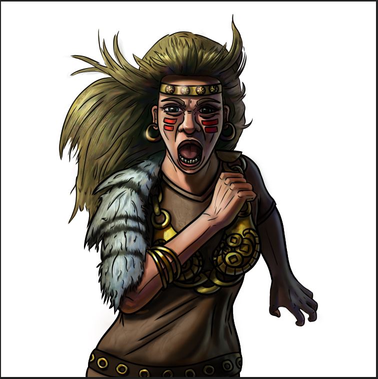 heyho, here two portrait studies. The first one was line-was with cross-hatching and later a tone-layer washed over it. I shouldn't have done the tone layer, it didn't work out the way I thought it would. The second one was flat-color based. Both could have needed more attention, but I wanted to keep it loose this time. ;) 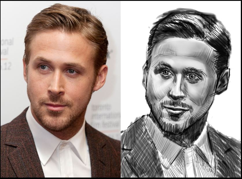 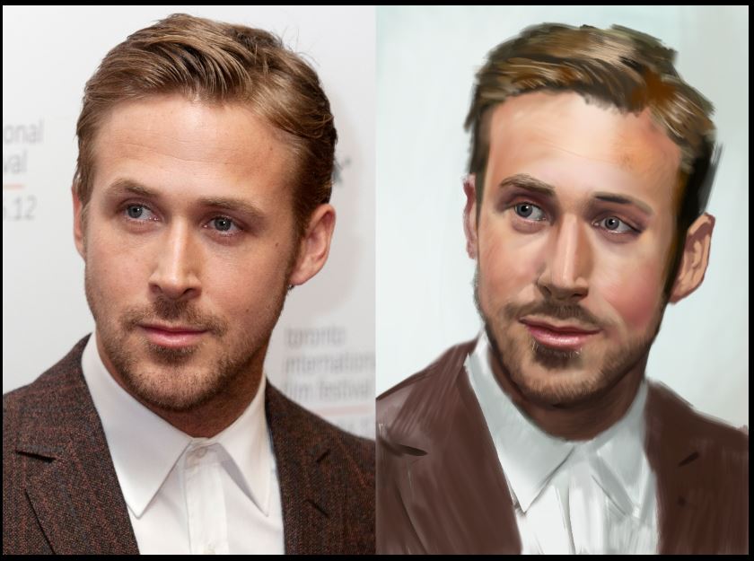 Hey guys, here is another workflow-post. 1. reduce the object to its simplest shape 2. fill it with the midtone 3. brush in the shadow. I use a soft round brush for this. 4. paint in the light 5. paint in the reflected light (it is always darker than the direct light, ecxept when there is a really reflective material reflecting it like chrome for example) 6. use the smudge tool on a seperate layer with "sample all layers" turned on and get a first pass of structure in. The good thing about the smudge tool is, that it keeps the light-to-dark pattern. I just took a soft round brush, set opacity on pen pressure and switched on scatter on both axes 7. take whatever brush you like and paint in details on another layer 8. blur the outer edge a little bit everywhere, except in the focal area Have fun :) 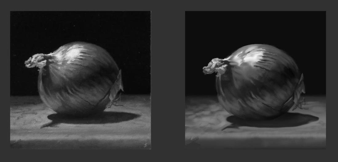 Heyho, I started learning about caricature and I find it really enjoyable. I think it is a great way to learn facial anatomy and design (to some degree) since you really have to pay attention to what to exaggerate and how to balance your shapes. It is just a sketch and may or may not resemble my brother :D edit: the picture is pretty big, but I am to lazy to change that :D so now you can see all the pen-strokes seperately ;) 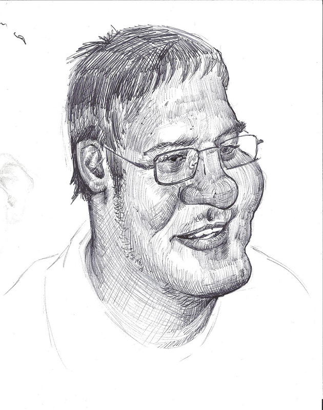 |
This is my blog. I will share information about workflow, my insights into image-making or just general thoughts and rants about being an artist. Archives
February 2024
Categories |


 RSS Feed
