|
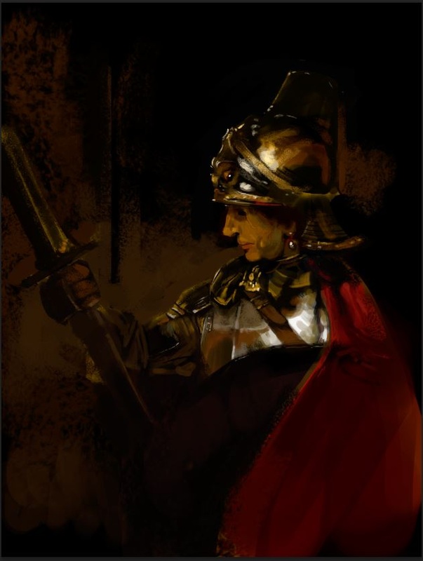
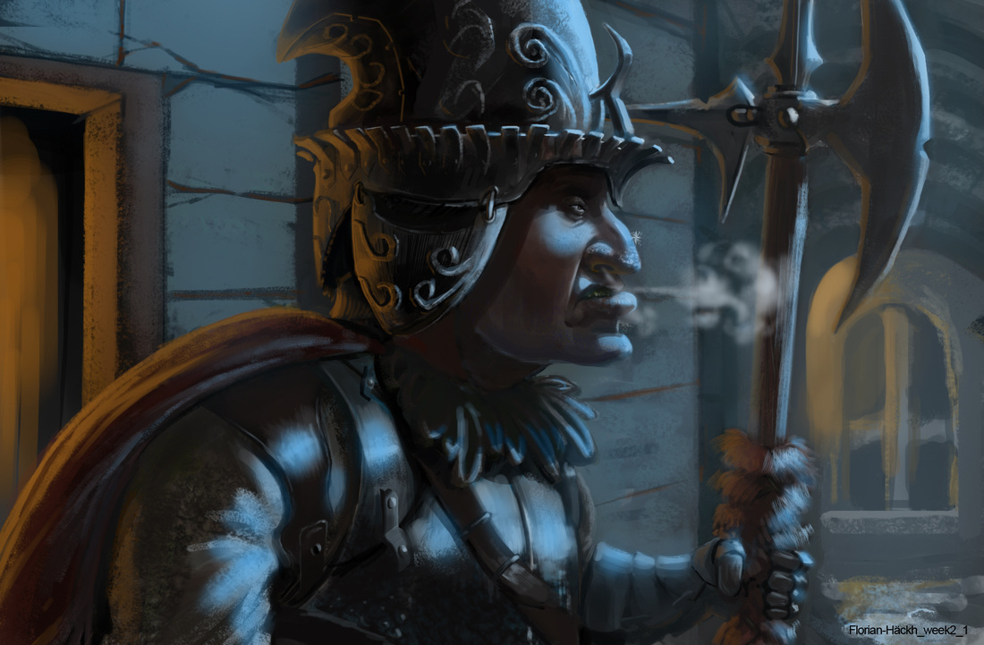
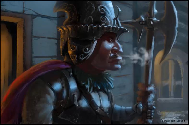
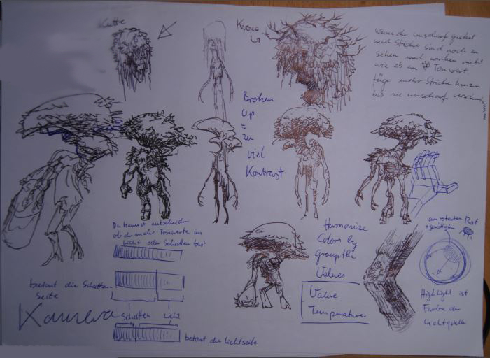
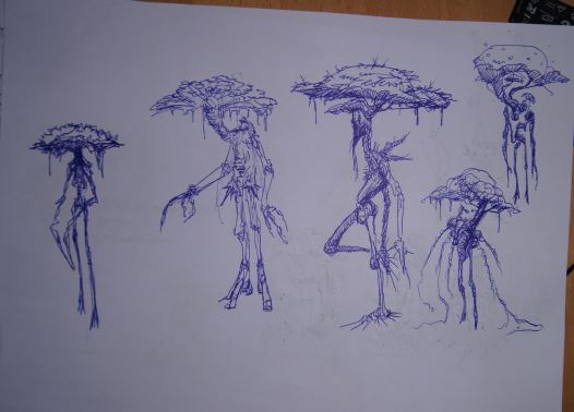
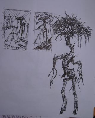
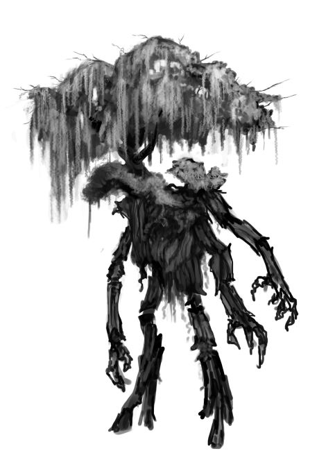
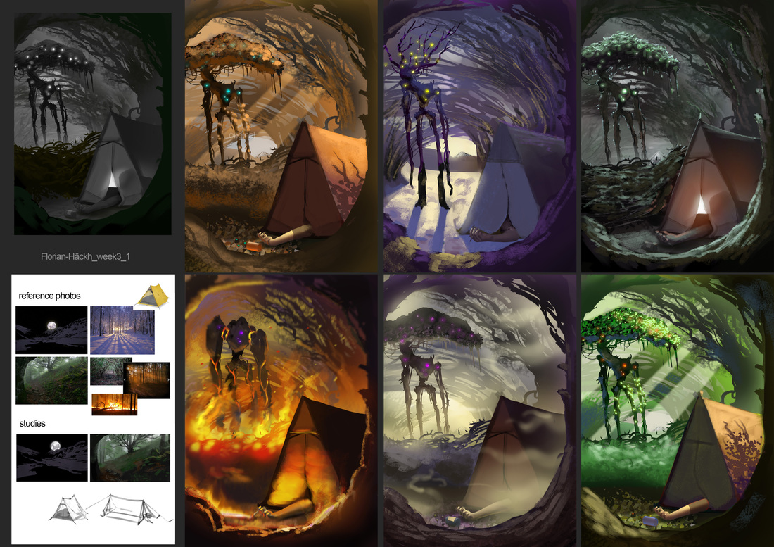
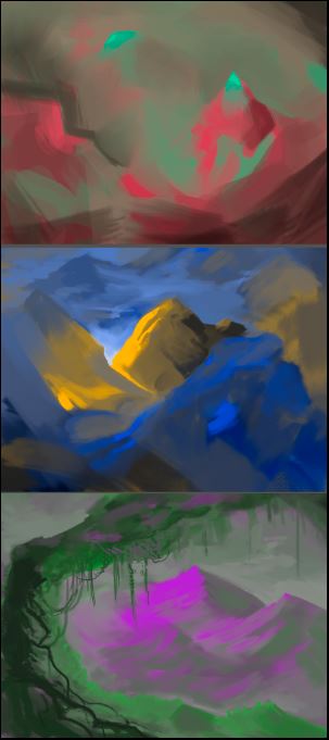
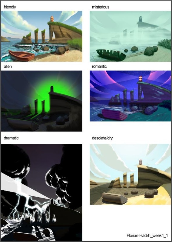
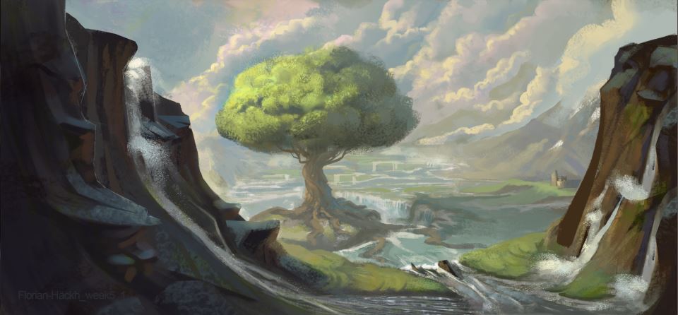
Hey guys, I am uploading a bunch of the assignments for the Schoolism class under Nathan Fowkes at once, so you get a good overview of what I was doing the last weeks. Week 2 We got a 3D render-image and we were supposed to add a cool and a warm light contrasting each other. I did a Rembrandt-study before starting out, to get an idea of some of the materials a soldier/knight would wear. So this was my final assignment: Mr Fowkes mentioned that I did render every material the same way, as you can see on the cloth of the arm and for instance the leather and the metal. They all have the same value range, so they don't look different enough to really read as different materials. Also my local colors are all quite greyish and desaturated and they don't react correctly to the color of light. Another problem was, that I didn't show enough of subsurface scattering in the skin to really make it look like being alive. So here is the overpaint by Mr Fowkes. Week 3 This week we were supposed to create a scene with a warm/cool color contrast and paint it 5 times at least with different warm/cool contrasts. After doing 4 or 5, I watched the critique-sessions of other students and I realized that I only shifted the hues and not the values, saturation and so on. Hue is only one aspect of color, so I did 5 more. Before starting out I designed a forest creature that I put in the scene later. These are the final 6 versions (+1 value version and a ref / study-sheet) of my scene. The main critique-point was that I didn't use local colors enough. In every image the local color (the color of the object in neutral light) is more or less grey. So actually a bit like in the assignment of week 2, so for the next time I really didn't want to make the same mistake again. Week 4 This time the goal was to create a scene and change the colors to get different emotional reactions from the image. To get a bit into the mood I did some small color roughs. The idea is to take 2 complementary colors and make an image only with those 2 colors. The main trick is to mix the 2 colors in most of the places because complementary colors desaturate one another so you can leave only a few saturated areas in your image. That way the image doesn't look garish. Since Ida was born during this weeks assignment, I tried to keep it simple and get back to my family fast. This was this week's assignment: This time Mr Fowkes said, that he missed contrasts of cool and warm at some places. He also did a quick demo of choosing appropriate colors for clouds since in my "friendly" picture, the clouds only go from white to blue. So I missed the opportunity to add a nice warm / cool contrast. So next time I wanted to focus more on those. Week 5 This is the latest piece, I only uploaded it yesterday and I didn't get a feedback on it yet. I had some really great critiques allready by some of my friends, so I am looking forward very to hear what Mr Fowkes has to say about it.
0 Comments
Leave a Reply. |
This is my blog. I will share information about workflow, my insights into image-making or just general thoughts and rants about being an artist. Archives
February 2024
Categories |
 RSS Feed
