|
Hey guys,
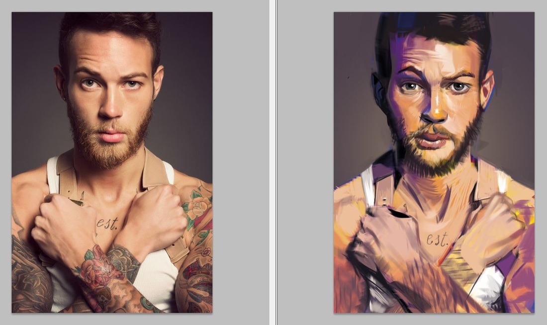
I tried something new with this painting. I recently learned a cool watercoloring-technique where you map certain colors to certain values. Yellow is light gray, red is medium grey, blue is dark grey. Then I started painting using those colors in the beginning and translating the values I saw in the source into the colors mapped for that value. Of course I had to simplify the values I saw first. After a while I realized that using blue wouldn't cut it for the darkest darks and yellow wouldn't suffice to be the lightest lights. At least not for what I intended, which was a full range of values. So I used black and white too. Also with this I used a custom made brush especially for cross-hatching. And I worked loosely and fast, overpainting all the time. Now that I look at it, I see a lot of "mistakes", but it was fun and I like the vibrancy of the colors. If you are interested in the water-coloring-technique, check out this guy's channel: https://www.youtube.com/watch?v=ueAOPEUk8mw Cheers and have a great week :) Edit: I should mention that this was done in CMYK - mode because I was annoyed by a lot of colors, looking like they where glowing from the inside. Sometimes, this may be desired, but I find that more often than not it makes paintings like a bit fake. Try it if you haven't, do a painting in CMYK and tell me how you like it. In Photoshop go to: Image > Mode > CMYK Color, to change the setting. Have fun!
0 Comments
Leave a Reply. |
This is my blog. I will share information about workflow, my insights into image-making or just general thoughts and rants about being an artist. Archives
February 2024
Categories |

 RSS Feed
