|
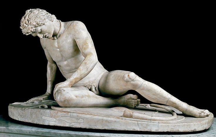
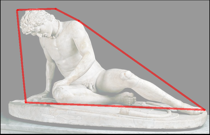
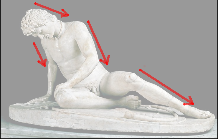
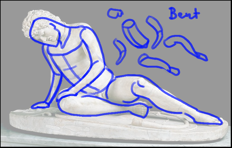
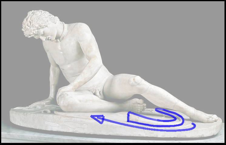
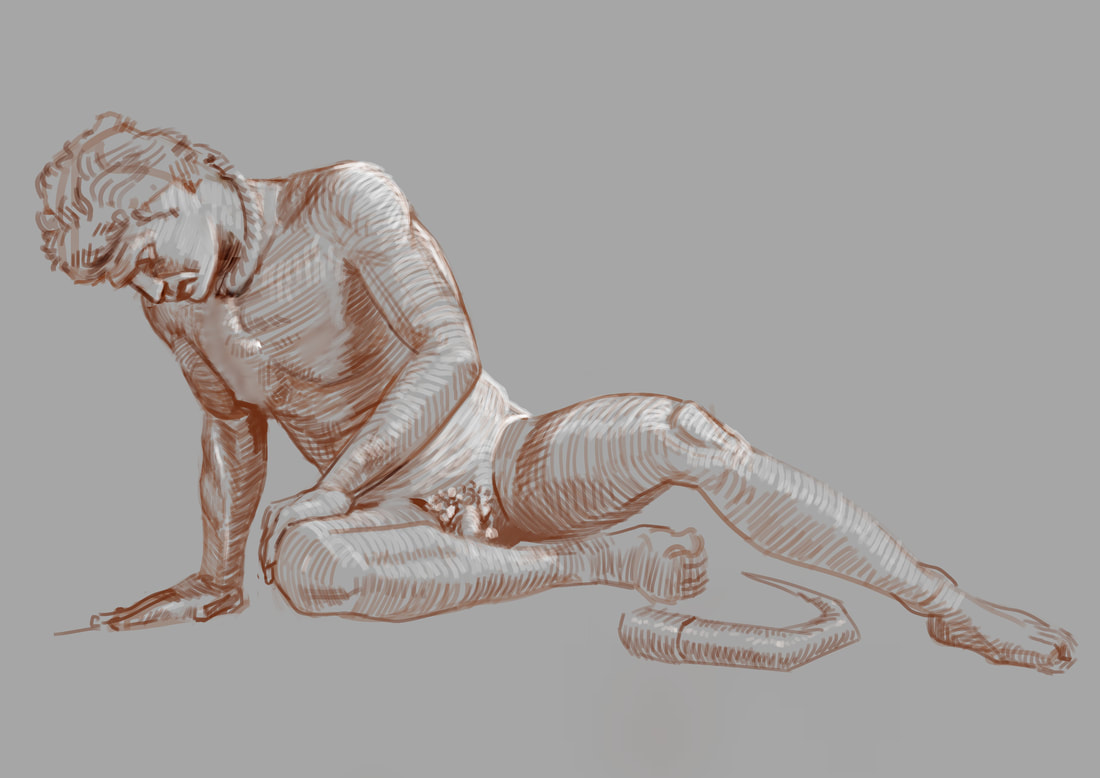
I am starting to get a feeling, that there is something out there in the world of image-making, that has slipped my attention for a long time. It is the concept of "visual communication". Up until now, I wasn't to aware of it. I was using photos as reference for my artworks and if for instance a pose was working for what I had in mind, I stole it. But after learning more from great master's artworks, I realized that there is more. They used every shape, maybe even every brushstroke or piece of marble, to communicate an idea. They weren't just randomly making scribbles and marks until something popped out. A great example is the statue of the "Dying Gaul". "commissioned some time between 230 and 220 BC by Attalus I of Pergamon to celebrate his victory over the Galatians, the Celtic or Gaulish people of parts of Anatolia" So what is so special about it? What I find so interesting about it, is the fact how perfectly it portraits the down-fall of the gauls. And it does that by communicating it visually, using shapes and forms. Here is a break-down of what I am seeing: The general movement of the statue is "from the upper left to the lower right". Every limb is pointing down in some way. Every limb is bent, there are no straights. The broken horn or bow on the bottom takes us back to the hands and face.
So every shape and form helps communicate the concept of "feeling down", "going down", "downfall", etc... So next time you start an illustration, maybe start by clearing up, what the idea of the illustration is and make every shape and form communicate that idea. I hope it helps. Flo
0 Comments
Leave a Reply. |
This is my blog. I will share information about workflow, my insights into image-making or just general thoughts and rants about being an artist. Archives
February 2024
Categories |
 RSS Feed
