|
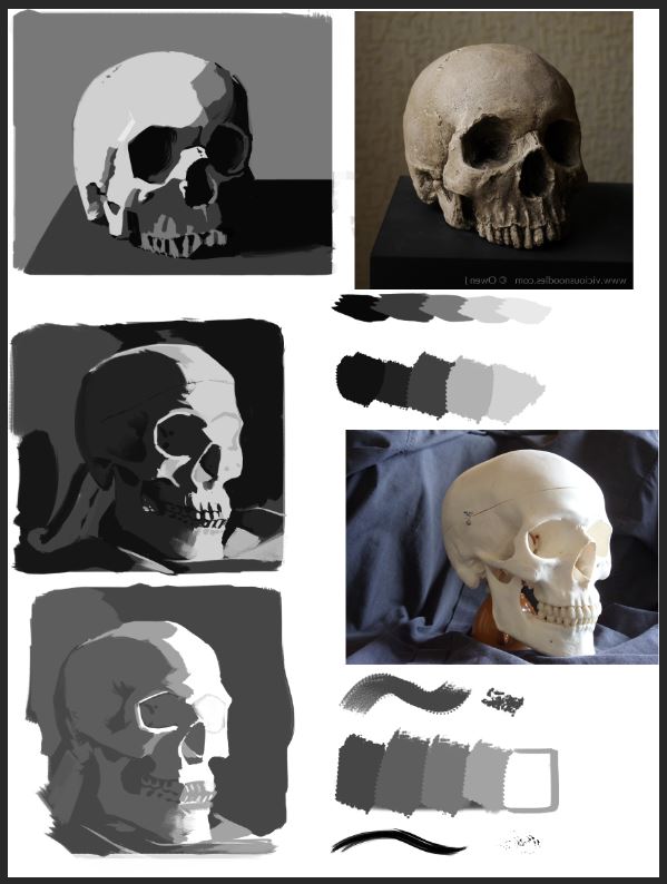
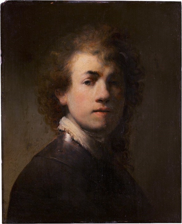
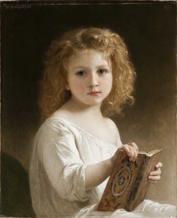
Hey guys, I wanted to share a thing I learned about values. I posted before about values and how it helps the readability of the form to keep the light and shadow values seperated. You can read up on that here. After you understand that, it frees you up to manipulate values to make the fit your needs more. Let's say in one image you want a more dramatic feel, so you want to have more contrast and deeper darks. Or on the other hand you want a more lofty feel to your image, you want less contrast and lighter values. If your reference doesnt give you that you have to manipulate the values to come to that result. The main thing is to remember to keep the value groups (light and shadow) seperated. In the image below I did 2 studies of the same photo. One where left out a good portion of the light values and one where I left out a lot of dark values. The atelier painters call that "Value Compression". That means I left a certain value range out of the picture (pun intended) in order to achieve a different effect. What makes both images work on their own is the fact that I kept the values seperated (light and shadow). I know I am getting redundant here, but really it is important to me to stress it. Keep them seperated to help your form read. Also with the studies, I tried to put the values in a similar relation one to another as they were in the photo. For instance I kept the darkest darks in the places where light has a hard time travelling. Behind the eye socket, between the jar - bones and between the teeth. My lightest lights are where the light hits so on the far side of the skull, but also on the left ridge of the nose-hole (I don't know the right English word for it, sue me). In my studies, those two values (lightest light, darkest dark) help me put the others where they belong in the mix. It is always a "comparing act" with values, since except the extrem values, every one can be lighter or darker than the value that sits next to it. I hope this was easy to understand and I hope it frees you up too. You don't have to be exact all the time, as long as you keep the relationships correct and it fits your need, you can manipulate values. Here are some examples of artist who also compress values, to achieve a certain effect. Rembrandt compressed the values in the shadow side. Why? To make the image more dramatic AND (and that is really the beauty of it) to have more values to work in the light side. This might get a bit confusing but I try to keep it simple. If you only use say a value 0 (black) and value 1 (dark grey) for painting your shadows, you have all the values from 2 (slightly lighter dark grey) up to 10 (white) for your light side. One of my all time heroes Dave Rapoza does this too in a lot of his pieces. This works in both directions, but I usually see more people tending towards compressing the darks. I don't know why that is. A famous example of somebody who lightend his darks quite a bit, to get a softer, friendlier feel in his pictures was A. W. Bouguereau. Also one of my favorites in terms of technique. I wasn't there of course, when he painted this, but the shadow on her face is so close in value to light side, that I really believe he manipulated the values to be lighter in the shadows. Or he lit her from both sides. Either way he wanted to make her look angelic, innocent and not dramatic, so he used light values.
That is it for now. If you have any questions, please send me a message or write in the comments. Cheers, Flo
0 Comments
Leave a Reply. |
This is my blog. I will share information about workflow, my insights into image-making or just general thoughts and rants about being an artist. Archives
February 2024
Categories |


 RSS Feed
