|
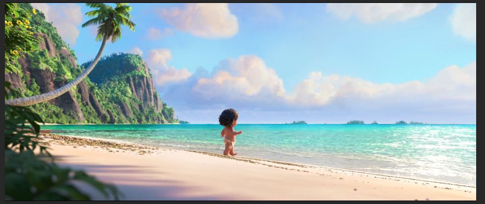
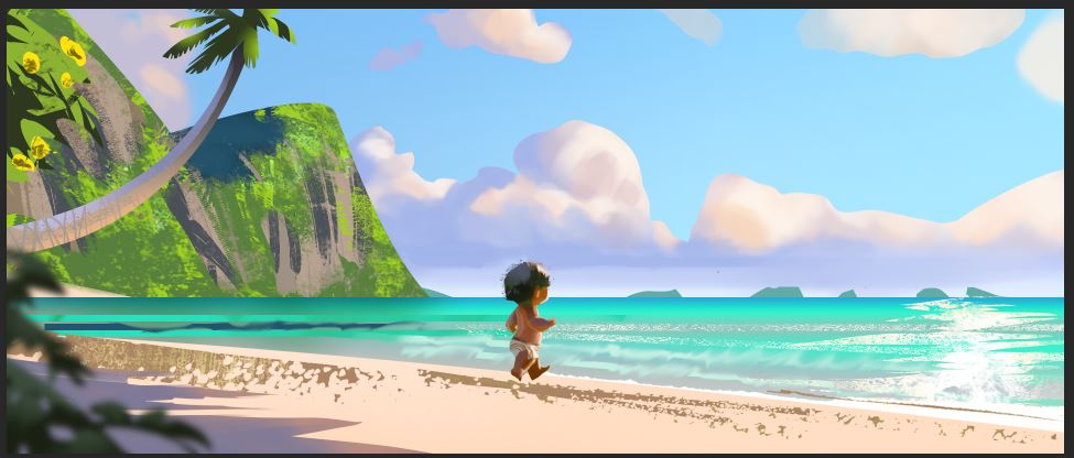
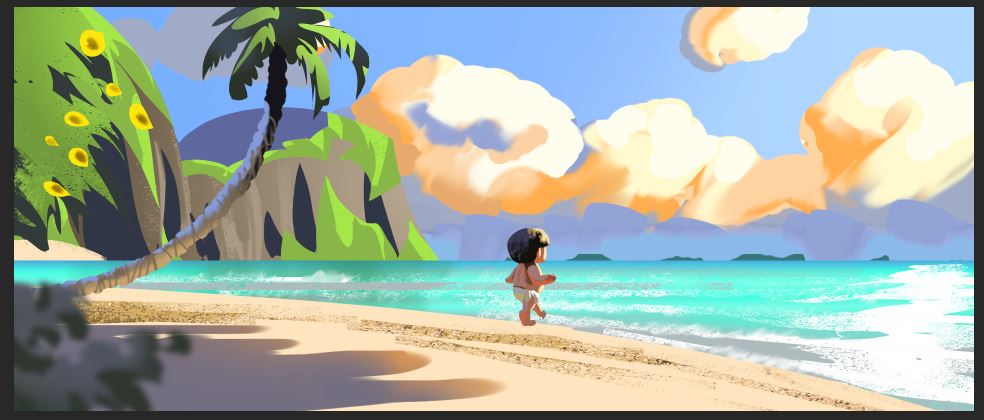
I am learning more about color, for my personal project. Since the keyframe, that I will illustrate is set in a similar scenario, I picked a screenshot of Disney's "Moana" from here: https://disneyscreencaps.com/moana-2016/3 I then did a color study, not worrying too much about proportion and shape-language (although a bit), but more on color and value. This is the part I skip the most, since it is the hardest and the least satisfying haha. I try to do it again from memory, bringing to focus what I learned and what I forgot. As usual, my colors and values get to extreme, to contrasty. Therefore my composition is way more uneasy to look at. Especially the clouds take a lot of attention. Since the most contrast is still on the character, it works, but it isn't as pleasing and subtle as in the ref. Here is what I learned:
- in this lighting scenario (early evening?) the shadows are blue-ish or grey-ish, except on skin. - top planes receive skylight and get colder, planes that face down receive warm bounce light from the ground. The closer to the light-source, the stronger the effect. - brown rock also has desaturated blue shadows - sandy beach can be brighter that the sky or the clouds - gaussian blur filter is a quick easy way to get the foreground out of focus - there is a gradient in the sky from green-blue to a darker blue. The green-blue is closer to the sun - the shadow on the beach is violet-grey but has a saturated edge - it helps to think of everything in terms of 3D geometry and not in terms of thinking of the object itself (i.e. arm, leg, tree-trunk). Easier said than done, though. Hope it helps. :)
0 Comments
Leave a Reply. |
This is my blog. I will share information about workflow, my insights into image-making or just general thoughts and rants about being an artist. Archives
February 2024
Categories |


 RSS Feed
