|
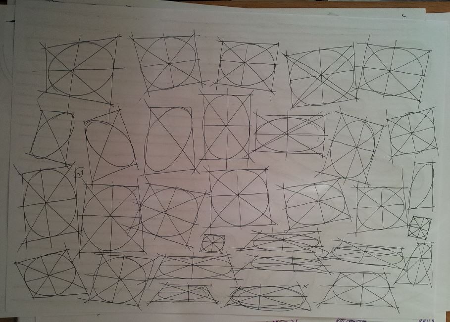
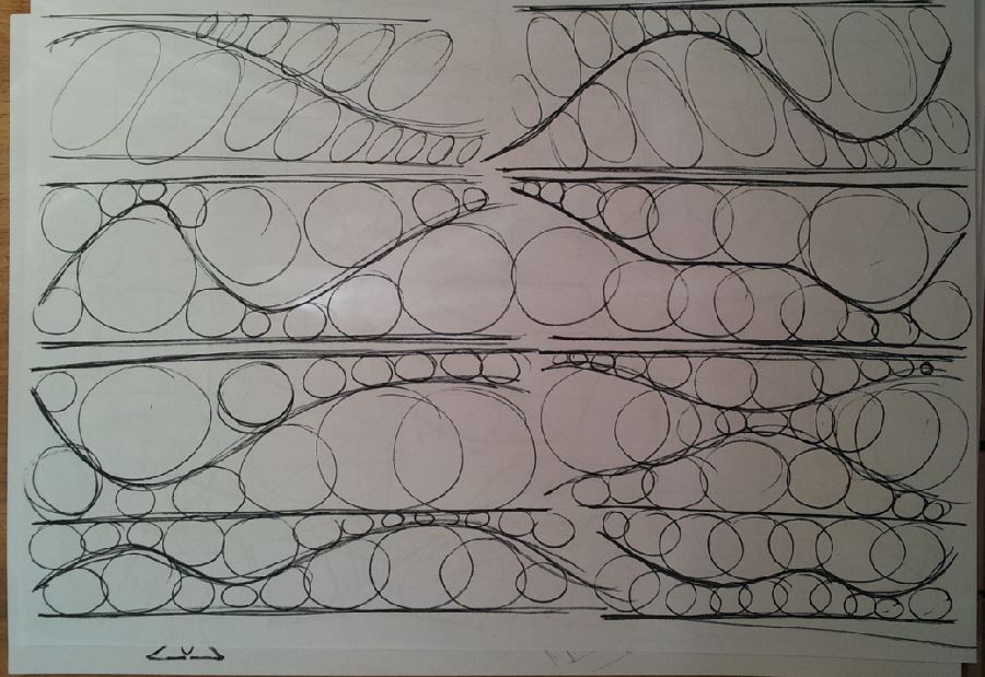
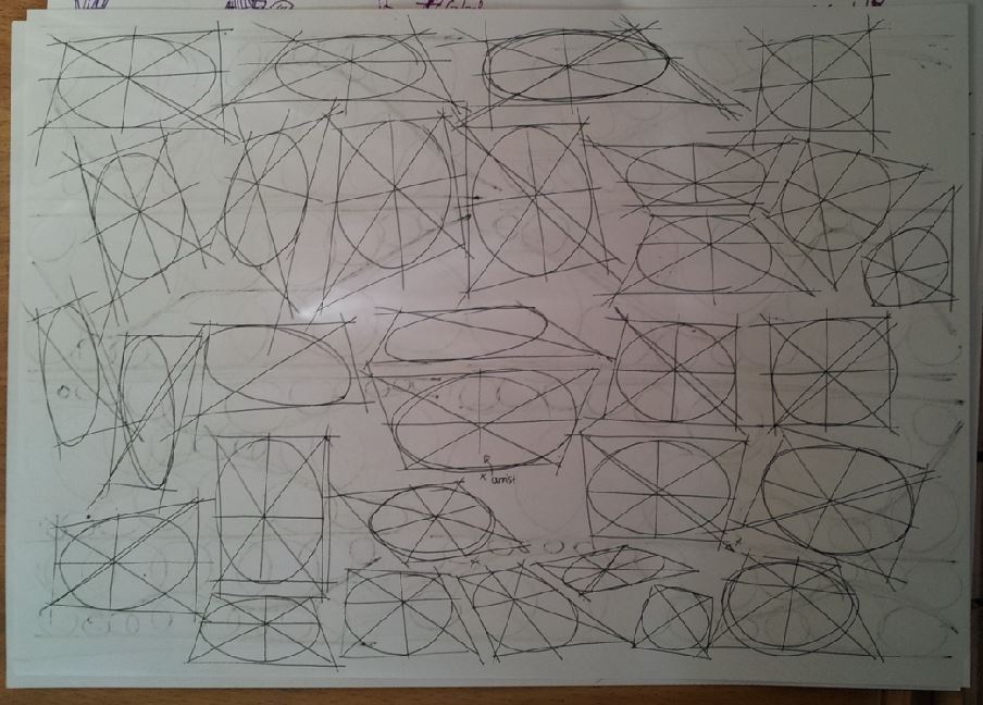
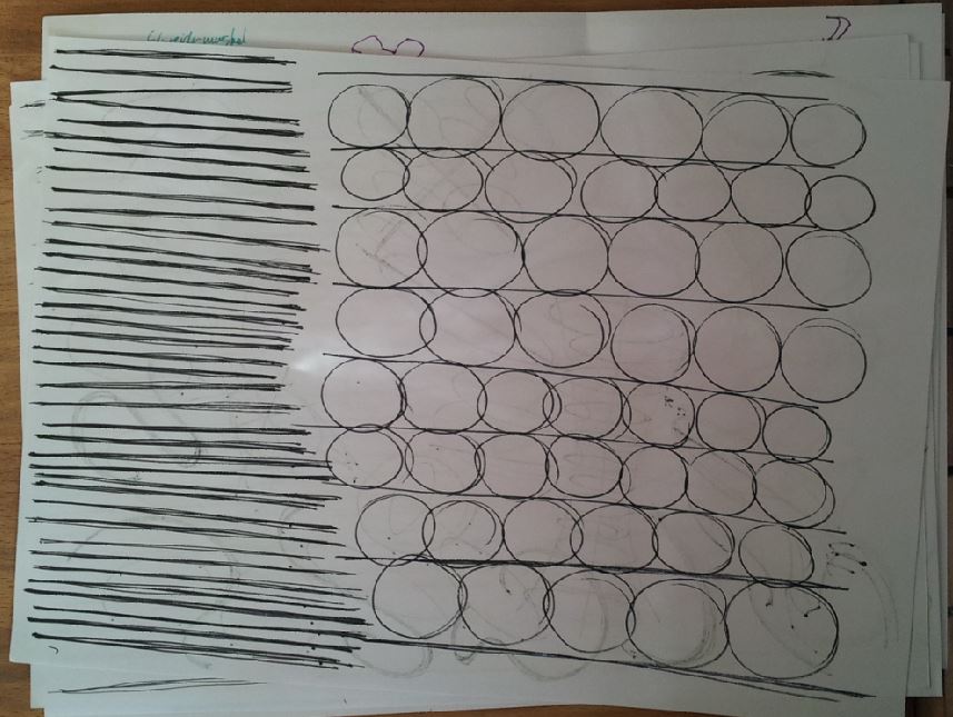
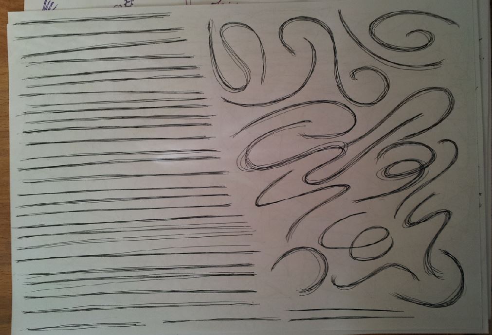
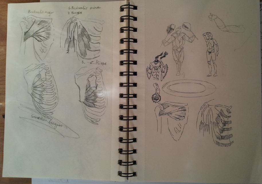
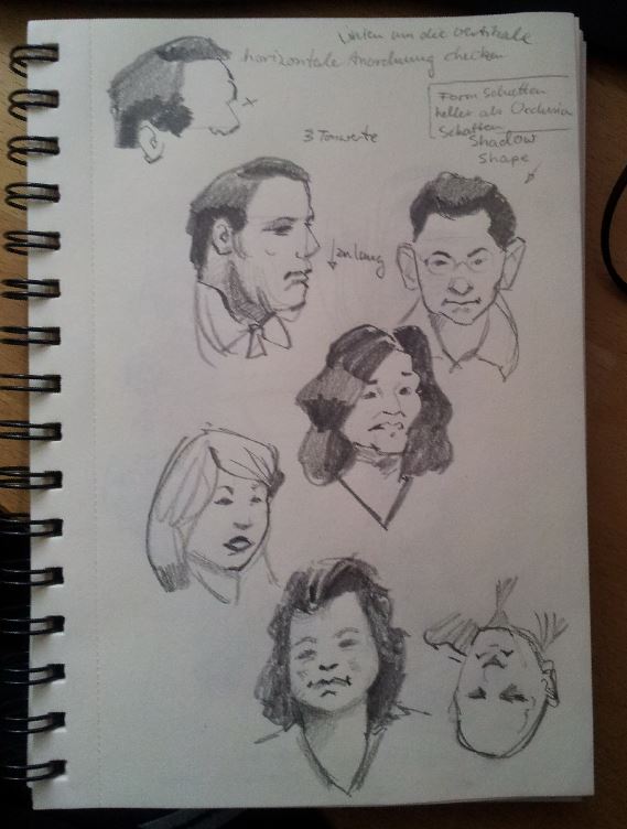
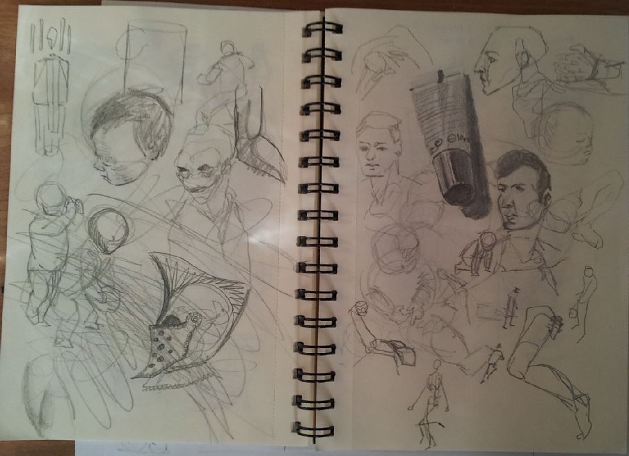
Hey guys, after quite some time, I wanted to do a longer blog post again and maybe share a thing or two that I have learned. So here is the second assignment for the mentorship I am currently doing. It is with Mike "Daarken" Lim and I am excited to have taken the step to get some 1st hand tutoring from an industry pro like him. 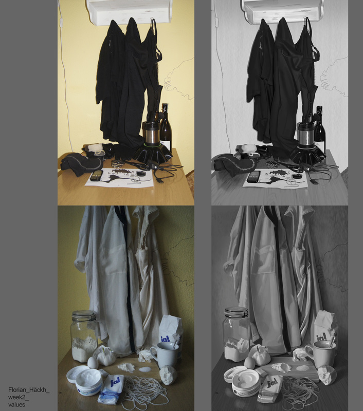 What I learned doing this: In light values: nothing except highlights are really white. It is enough to have light grays for the light side and a dark grays for the dark side. That way I have more room to go dark in the occlusions (where 2 forms get so close, that no light can go in between and really light in the lit areas/speculars. Make sure to check out James Gurney's blogpost about it. He also has a white-value-"object" to show, that white doesn't have to mean "pure white": http://gurneyjourney.blogspot.de/2007/12/albino-frogs-occlusion-shadows.html To me that was a big revelation. :) In dark values: modelling form in dark values is way harder, than in light values. It seems too logical to be surprising but I never thought about it. Also it is important to keep the darkest dark (black in my case) for the occlusions. Going too light in the lit areas, tends to make stuff look "shiny", like the inside of the cocktail dress (in the back, hanging from the cubboard in the middle) The next 2 still-lifes where done after doing the studies. The light came from behind the flowers and passed through the petals. This always makes for very saturated colors. Of course James Gurney has a post about that too! http://gurneyjourney.blogspot.de/2007/10/transmitted-light.html This effect can be partly seen in the skin of the apple in the second still-life. Also I don't take more than 1 to 2 hours for these, usually just to warm up, or get my mind going about certain aspects of light and color. 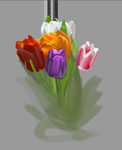 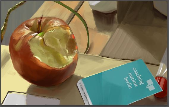 These are some more fundamental pages from the drawabox.com - drills. Putting those ellipses in the squares is actually fun, which probably either means a) I am doing it wrong or b) I should do something harder, less fun haha Some sketchbook pages. Some Loomis in there and also some Gurney. http://www.alexhays.com/loomis/ http://gurneyjourney.blogspot.de/2016/01/quick-tip-for-faraway-faces.html Recently I stumbled upon Claire Hummel's blogpost about fashion. Since I am not so much into costume-design (yet) I checked out her DA page for other stuff and I found those really gorgeous landscape paintings of islandic scenery. http://shoomlah.deviantart.com/art/Iceland-2014-Svartifoss-551519291 Go check out the other ones too. Since I have travelled Iceland myself in 2014, I know some of the places. It was cool to see her doing her own versions of them. Her brushwork is just so beautiful. So I did a study of a section of it, trying to get behind her working method. What I mainly took away was another value-learning: she has a really good seperation of planes. The planes that show down are the darkest and thus easy to seperate from the ones showing towards us. The sky is bright, but the brightest spot is the top of the waterfall, which is almost pure white. Other learnings where: - do more hue shifts, meaning changes in color whitout changing the value (changing saturation is ok though) - hard edges for hard objects, soft edges for soft objects (like the bottom of the water fall) - she uses textures on top of the rocks, that is tilted along the direction of the surface - good brushwork is hard to copy - don't repeat 2 shapes 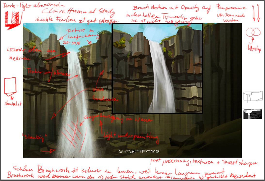 Here is a Leyendecker study, I did to learn more about brushwork. He was a real master of this. As usual in such a master's work, there is far more to learn than I set out to learn. Which is btw in my opinion why it pays to single out the things you want to learn and learn them apart from each other. I made a brush for this, so I could get a bit of the texture like him. Download it from below, if you like
Learnings were: - warm underpainting in the color of the lightest shadow-color. In this case a light brown - do mory hue-shifts - don't repeat 2 shapes (I am starting to see a pattern :) - use white only for the lightest areas in the light shape (like on the fore-head and on the check where there is specularity) - brush-strokes go along the form, seldom across - the colors in the light side are way less saturated, than in the shadow side. - there is a dark line, seperating the light and dark side (terminator) 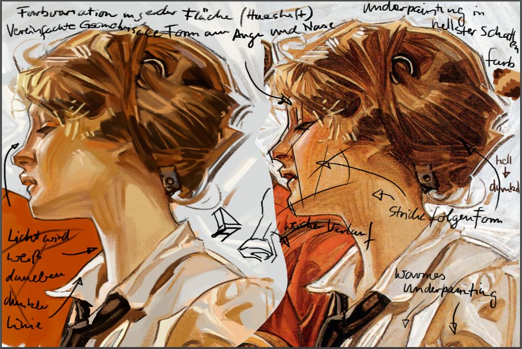 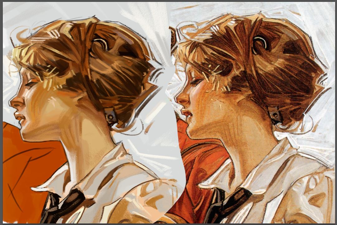 Lastly some Vance Covacs studies. He has some really cool black and white drawings on his website. The site for itself seems broken to me, since it navigates really weird. But once you get past this, you can marvel at his awesome drawings. http://www.vancekovacs.com/ Or you just go to his artstation: https://www.artstation.com/artwork/4aGvn These were also done to get more fluid and simply better brushwork.   That's it for now. But I will post more work soon.
Cheers, Flo
0 Comments
Leave a Reply. |
This is my blog. I will share information about workflow, my insights into image-making or just general thoughts and rants about being an artist. Archives
February 2024
Categories |
||||
 RSS Feed
