|
Doing some color studies again and trying to put it straight into practice by doodling a character. The pose is pretty stiff and there is no narrative going on, but this was about light and color. I added the purple light with a color dodge layer and painted into it then. What I learned was that in the study, the most saturated part is around the terminus, while the light part gets really desaturated as well as the bounced light. Judging from the light in his eye there is a white light from above and a cool, blue bounce light. I guess this is to get to a "light-of-day" scenario, with the sun spending white light and the blue sky-dome blueish light. The occlusion - shadows were most saturated. I kinda overdid it when adding saturated bounced-lights in my doodle so in the end I toned down the saturation. I am fairly happy with the outcome, considering the time spend. But to push it to a portfolio finish, I can't get over the fact, that it is a pretty generic concept to start with. Nevertheless it was fun to do while listening to this: https://www.youtube.com/watch?v=64af_LsfHx8  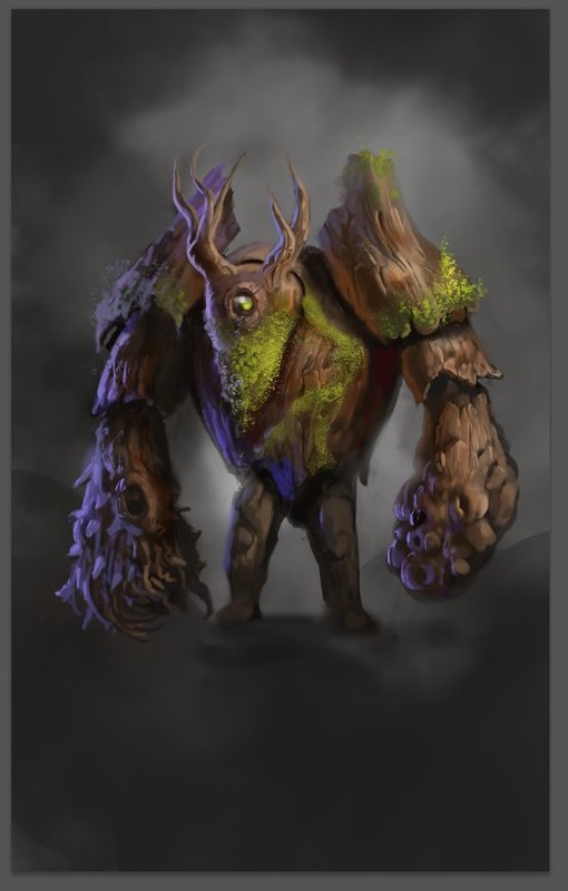
0 Comments
Leave a Reply. |
This is my blog. I will share information about workflow, my insights into image-making or just general thoughts and rants about being an artist. Archives
February 2024
Categories |
 RSS Feed
