|
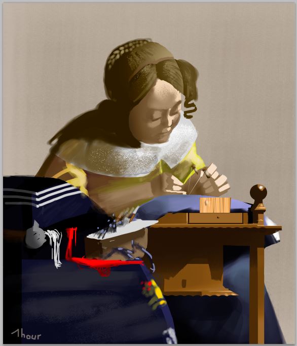
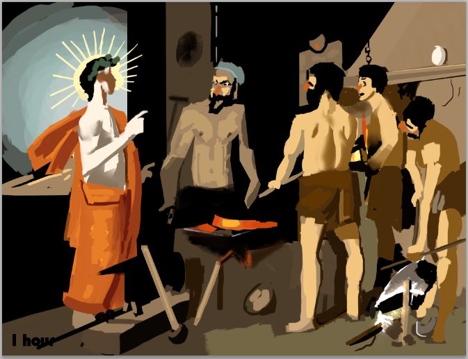
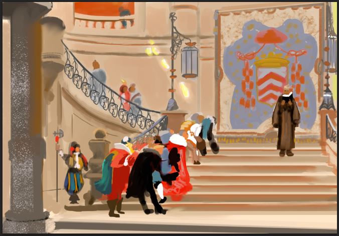
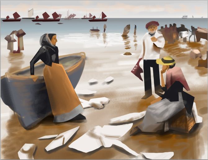
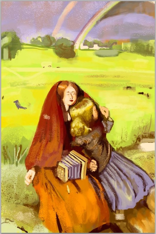
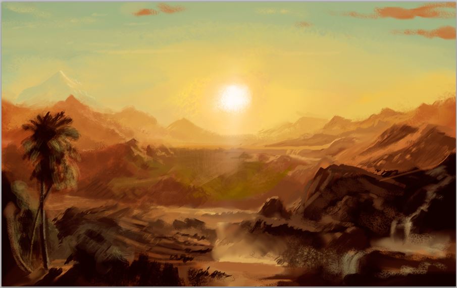
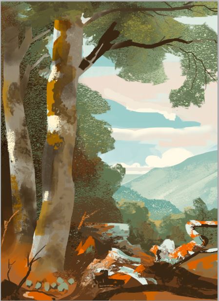
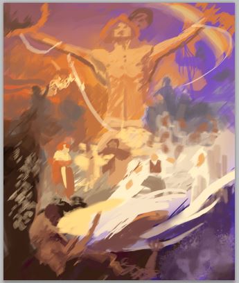
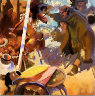
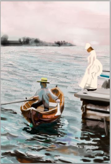
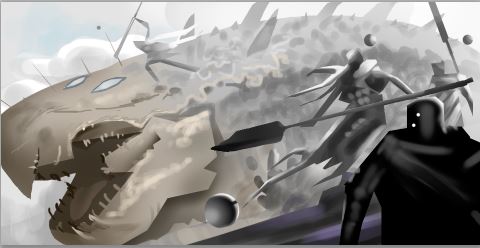
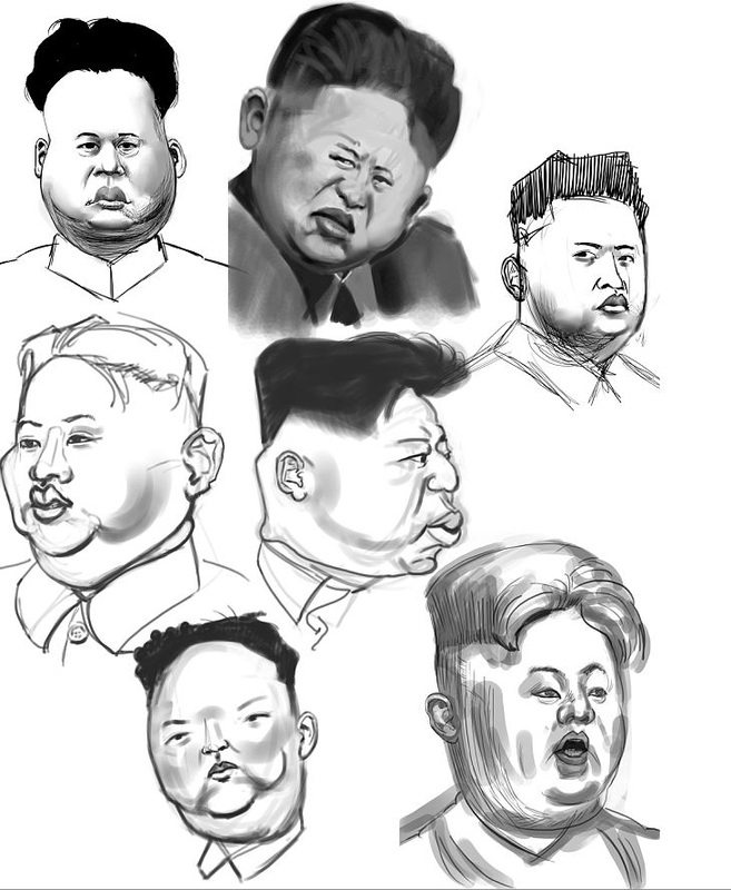
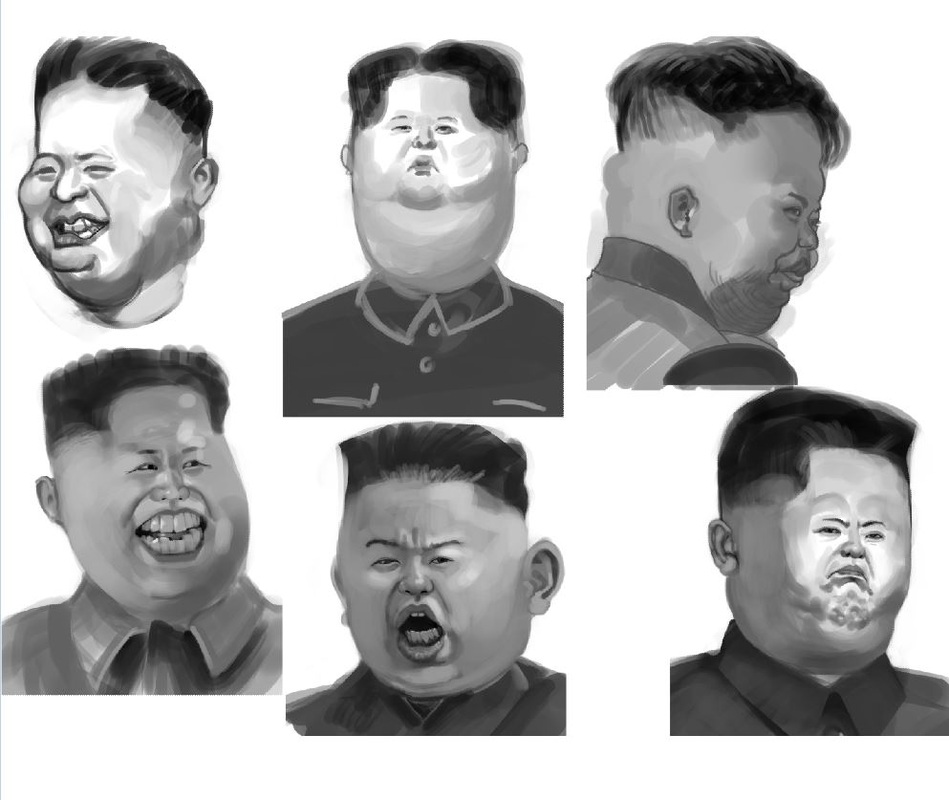
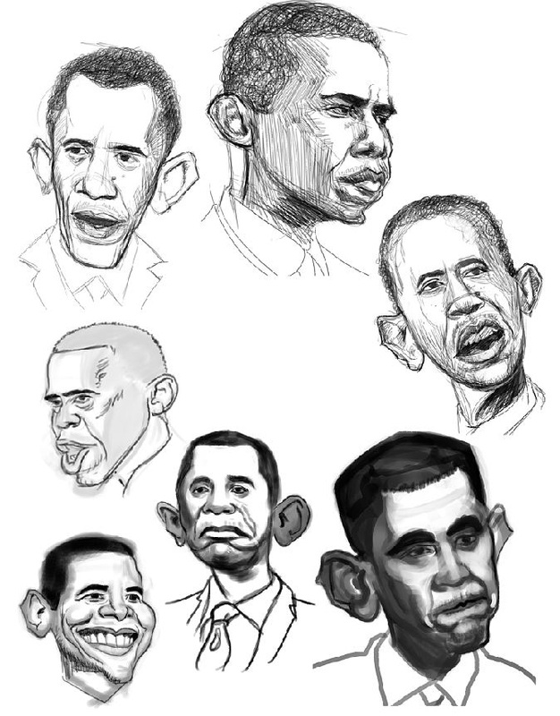
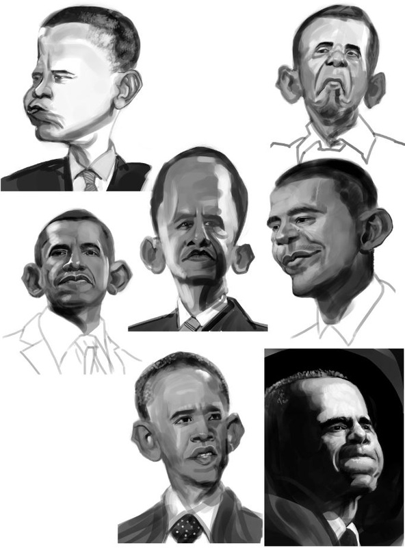
Hey guys, I hope you have been good, the last week. I didn't post in a while, because I was really busy AND I started to play Dark Souls 2. I really enjoy the game and it took up one evening or the other. ;) But apart from that I also decided to post less frequent, but with more information in the single post. It feels like I sometimes had the urge to post something in order to stay in the "buzz" and have the feeling to be relevant to the art-community. You hear a lot of the "getting your art in front of people"-argument, that I can develop quite a strong power. There were occasions were I lost interest in a study and just wanted to finish it, because I wanted to show it to someone, without actually having gotten any information from it. So from now on, I will post my studies at the end of the week, with the things I learned and personal thoughts. That way I can work, learn and study without interruptions and hopefully have something worth reading and looking at by the end of the week. I can't promise it, but I think with getting my priorities more on art-making and less on PR I can accumulate more interesting stuff over the week. So this is my first attempt at doing exactly this. First thing: my 2 Schoolism courses kept me busy this week, here are compiled all of the copies I did for Nathan Fowkesthe and the caricature-sketches I did for Jason Seiler . I kept the copies under 60 min and tried to keep them simple. I already got video feedback by Nathan. In short, I have an issue keeping the contrast close to the original. What that means is that in my copies, the viewer's eye is lead to other spots than in the original. By extension it means that I didn't fully understand, what the creator of the original intended to say and do with her color joices. By using to much contrast, the groups (light, midvalue, darks) are getting broken up too much. This results in confusing and unrelated splotches of color in the painting instead of harmonious gradients and transitions. All except the last 2 of the studies (one is from Anders Zorn, the other one by Kekai Kotaki) were taken out of James Gurney's book called "Color and light", so if you want to see the originals, you have to look there. I tried scanning them in, but it washes out a lot of the values, so the copies seemed even more off-contrast than they already are. If you do art, I recommend the book anyway. It is really great and has a ton of important information in it. For the caricatures I didn't get any feedback yet, but I am sure it will come next week.The topic will be an illustration about Kim Jing Un and Barack Obama. We have to do sketches of both, then decide on a composition and do sketches of it and lastly paint it. This will happen over the next 3 weeks. While doing them I stumbled upon this video on Ctrl+Paint which helped me a lot in doing faster sketches that I like to look at way more than before. The big improvement for me was using big brushes in the beginning stages and getting progressively smaller and smaller for the later stages. It was something I heard a lot of times but only really started doing now and I love it. It makes for cleaner, more tydied-up sketches, which I like doing more than having a lot of stray lines, that distract and confuse. So after doing 50% of the studies, I did the rest with the new technique. I think the difference is pretty obvious in the pictures below. Here are some studies I did for pictures for Hanman Media Production*. It is really pleasant to work with Hannes who is the CEO of Hanman Media Productions. I hope I can deliver the pictures before my daughter is born, they are the last big thing, I want to get done before the February 1st, which is the calculated day she will be born. I try to keep up the at-least-1-study-per-day-habit, so this one is from today. After doing it I tried to paint a sketch with the things I learned from the study. Looking at it now, I see that the study works better because one of the lights is more important than the other. In the study the cool light dominates aroung 50% of the picture, while black color is in around 40% and the warm light gets the last 10%. In my sketch both lights get roughly the same importance, so in the result it isn't clear what the mood-statement is. Also a thing I learned is that there is a local color, which is independent of the dominant light-sources. I guess that it is colored in the color of the object and the sorrounding objects? But I am not sure there, I will have to do more studies concerning this. This is a study of a painting by Manfred Schatz. What I really love about it, is that way he managed edges to show movement, the big brush-strokes in the areas that are of no big interest like the corners of the image and how the brushmarks get smaller towards the face and lastly the color-variation in the shadow-areas. He also paints details mostly in the light-side of the lynx, so you always get drawn to it. Another thing is the cool, desaturated colors everywhere, except the animal, which makes for a nice color contrast. 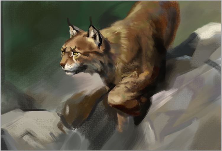 This study is from James Gurney's Color and Light, which I mentioned above. It is from the first chapter, which is called "Direct sunlight". He writes that it is important to always subordinate the secondary and tertiary light-sources to the primary. In this picture the primary light-source is the sun, the secondary is the cool-blue sky-light and the tertiary is the bounced light. You can see the blue light in the planes that face toward us, because they don't get a lot of the tertiary warm bounced light. Because it is the light from the sky-dome, the colors tend to get cooler. The tertiary light can be seen on the downward facing planes, which get a lot of bounced light, coming up from the wall and the ground. 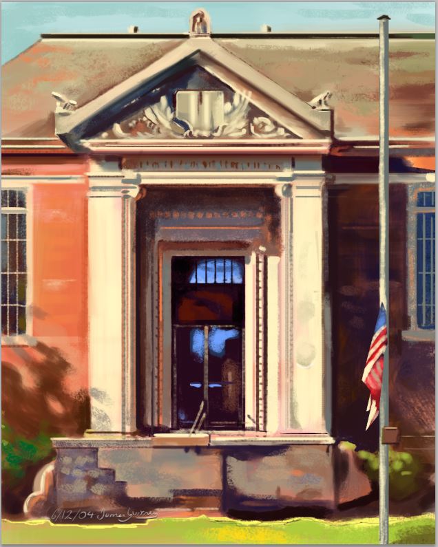 Lastly I want to say, that I don't try to sound super-smart or anything when I post all those findings. Mainly I try to understand the paint-techniques better by vocalizing and writing down what jumps out at me. It helps me to not only do the studies, but then make notes and write it here so I can jump back to re-read what I found out. If it helps you, I am glad. If you read this, I am thankful anyway.
Cheers, Flo
0 Comments
Leave a Reply. |
This is my blog. I will share information about workflow, my insights into image-making or just general thoughts and rants about being an artist. Archives
February 2024
Categories |


 RSS Feed
