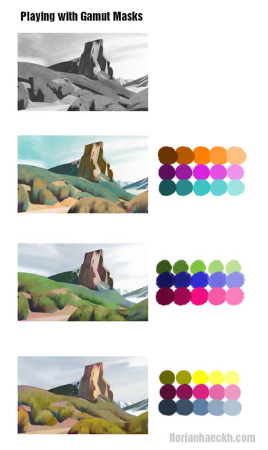
 Are you struggling with finding harmonious colors for a illustration or simply tired of only using photo-ref for colors? Maybe using a gamut-mask is for you! I am guilty of using all the colors in one painting and wondering why it looks so "all-over-the-place". So lately I am more and more interested in limited palette for illustration or concept art. To show how it would work, I made a little sketch, from this photograph. I tried to keep it simple by using only 4 values in the beginning, like Loomis wrote in "Creative illustration". White, light grey, dark grey and black. I also simplified a lot of the shapes into their essence. Then I used the gamut-mask. It is easy to use. You simply choose the shape of the mask and take the colors that are inside the shape. I took a triangular shape, creating a triad-harmony. After picking the 3 colors from the cornes, I created 2 shades (dark version of a color) and 2 tints (light version of a color) by using the "Color and Saturation" adjustment in Photoshop. I then painted the pre-made sketch, using clipping masks in Photoshop. That way I don't have to worry about painting outside the shapes, I designed during the sketch-phase. I tried to stay true to the warm / cool play of the colors, having my warmest colors in the foreground, using cooler colors for the background. I did this 3 times. Everytime I chose 3 different colors. The final color-sketches all look different, having their own mood. But all are harmonious. So next time you are having trouble, deciding on the colors for your illustration, give the gamut-mask a try. I hope it helps :) Flo
0 Comments
Leave a Reply. |
This is my blog. I will share information about workflow, my insights into image-making or just general thoughts and rants about being an artist. Archives
February 2024
Categories |

 RSS Feed
