|
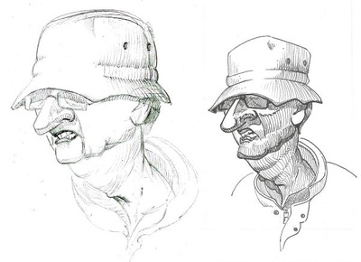
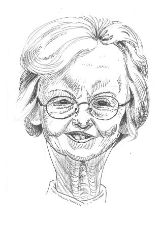
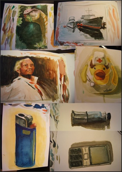
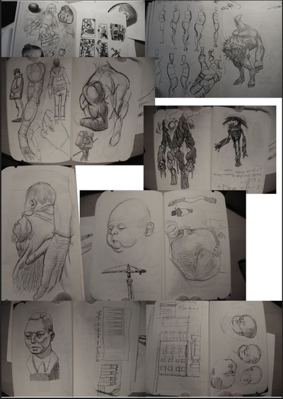
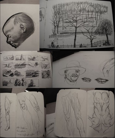
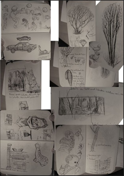
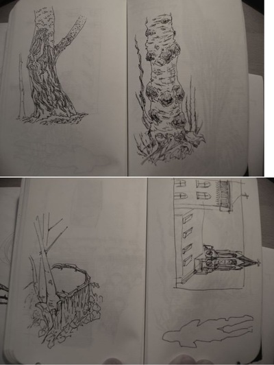
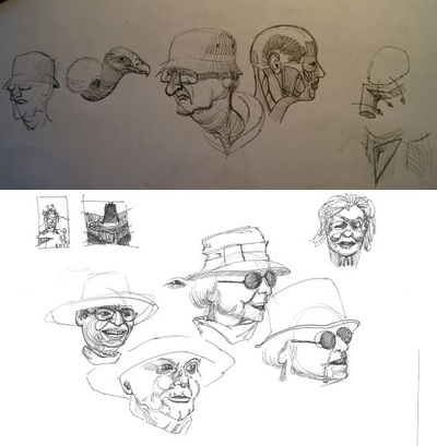
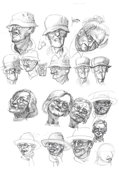
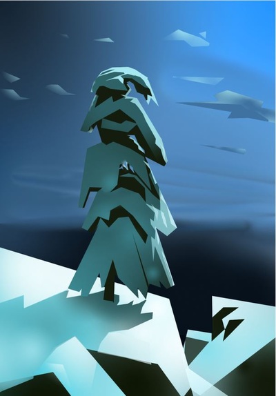
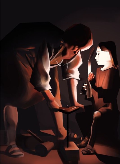
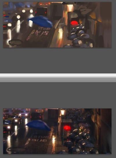
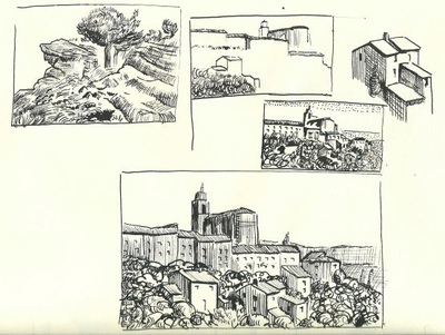
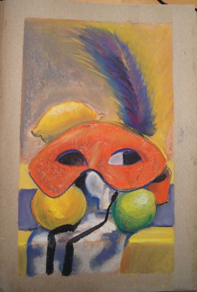
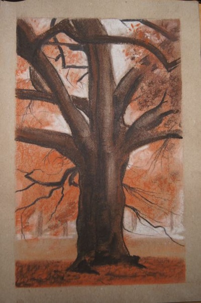
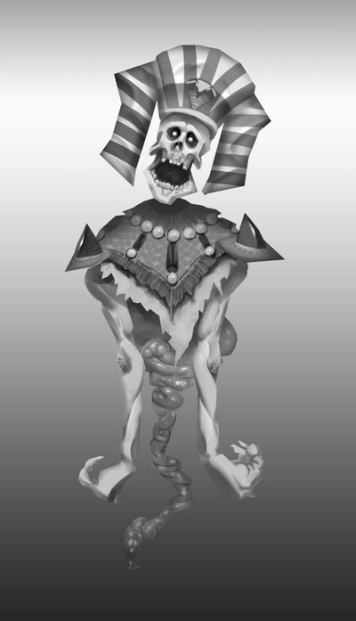
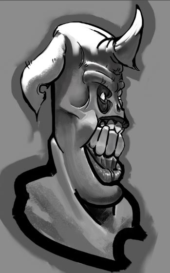
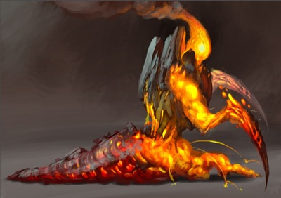
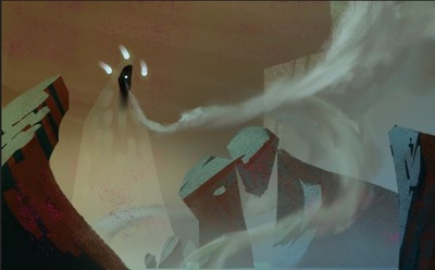
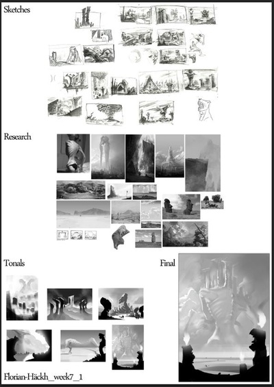
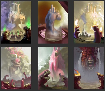
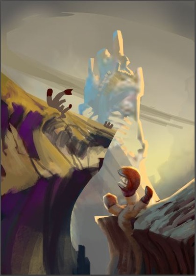
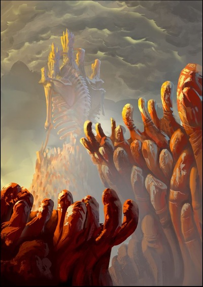
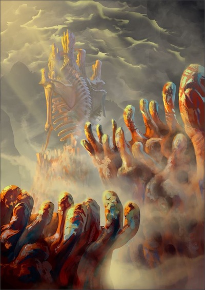
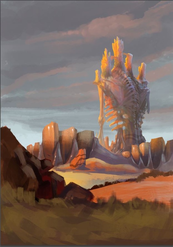
Hey guys, I finished two caricatures I did for my girlfriend's grandparents, so I took the opportunity to scan and photograph a lot of other sketches I did in the last days and weeks too. Hope you like it, I usually don't post EVERYTHING, I am just too lazy for that. To be honest I never considered photographing, only scanning which takes ages and produces crappy images. So maybe in the future I will share more of this. Maybe. The watercolors were done mostly at night after I changed the Ida's diaper and while Sarah was nursing her. It was always very peaceful and I loved those moments. But I did them on the changing-table and had to be slumped over a bit, which killed my back after some time. The sketches are from walks through the park with the baby, or just from imagination. I feel like I am learning to draw with a fineliner right now, my friend Milan gave me a great one for birthday and I am using it since then. some screengrab studies, most of them around 1h These are the last images from the course I took in January. I learned that I like using other media than Photoshop. I recently got nominated for a challange over at Facebook. I had to post everyday 1 picture and nominate a new person for the challange. It was a lot of fun, because I didn't want to spend ages on a painting but didn't want to post crap. So I had to find a good balance. I was kinda happy with the lava-creature until my girlfriend dissed it lol she meant it didn't have any details. Well, if you like it let me know, took around 1h to make This is the final assignment for Nathan Fowkes Color and light course. We had to make tonal roughs, color roughs and then finish it. I wrote about it before but here is the whole thing on one glance. I was kinda proud on the final, showed it to Nathan Fowkes (still proud), heard his critique ("well, it looks like roadkill" lol) and got my ego crushed! But he was right, it was way too crowded and weird. The scale was not really reading, everything competed. So I made an overpaint. I got other critiques over at facebook and after working them in, I kinda feel like this is more what I wanted from the beginning.
Also I only recently understood something about using light-against-dark-against-light. James Gurney writes about it and calls it "windmill principle" http://gurneyjourney.blogspot.de/2008/04/windmill-principle.html. I looked for it in the old master's work and the use it left and right. Check out for instance Thomas Moran for it. I did a study on a painting to show the principle but I seem to have lost it. As soon as I find it, I will post about it. I feel like it is something more people should know about, it is so simple yet effective. There are even paintings crafted around one cool-looking light to dark contrast like this one. Of course I don't want to downtalk the painting, it is gorgeous, only maybe I now start to understand WHY he painted it this way. So from now on there is not only thinking about atmospheric perspective to know what values to use but also how to arrange things pleasingly. It is probably a basic thing, but for me, this is huge. Stay tuned for more, it really feels like I only got started.
0 Comments
Leave a Reply. |
This is my blog. I will share information about workflow, my insights into image-making or just general thoughts and rants about being an artist. Archives
February 2024
Categories |

 RSS Feed
