|
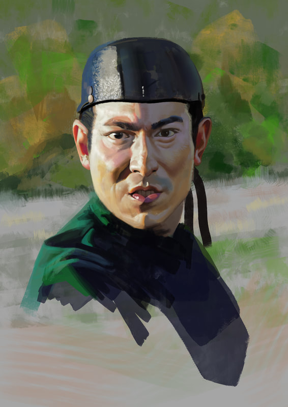
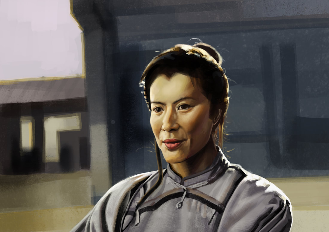
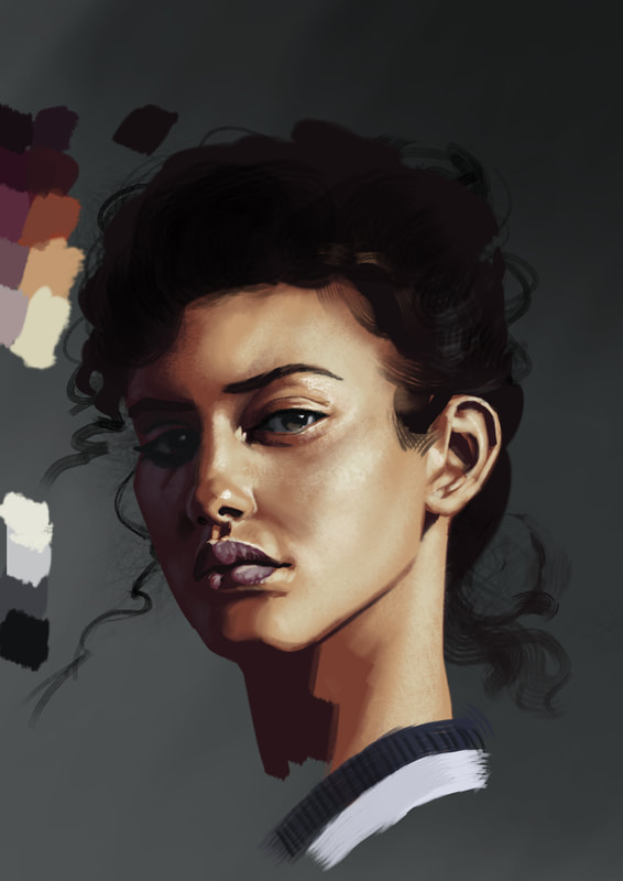
So since I am working on a character-illustration, I realized my portrait-skills are lacking in certain areas. So it is back to studying: After doing the first 2, I decided to change my approach. So instead of copying as close as possible, what the photo has to offer, I settled on 5 colors first. 2 for the shadow-side, 3 for the light-side. Since I was asked, how I define the colors, here's a little explenation. The darkest color for the light-side is at the same time the most saturated (the midtone), it then gets lighter, more yellow and less saturation towards the highlights and redder/bluer and less saturated towards the darks. So the most saturation occurs in the area, where light and dark meet. This can go meta-physical here, but lets not ... :D I then mapped out the shapes as close as I could. Especially the shadow-shape is something, that can be treated with a lot of care here. Even done a lot of edge-refinement pays off later. After the initial lay-in, I continued with overpainting. In this phase I also add dark and light accents here and there. In the end I was surprised how straight-forward and easy this approach is and I am very happy with the result. I tested this approach on another portrait and recorded the steps (below). Since it produces the same satisfying result, I can safely say, that this process is solid. I love to work like that and for the first time in a long time, studying is fun again. Hope it helps you to crack colors and gives you some inspiration on how to approach your next project. Cheers, Flo Process GIF
0 Comments
Leave a Reply. |
This is my blog. I will share information about workflow, my insights into image-making or just general thoughts and rants about being an artist. Archives
February 2024
Categories |


 RSS Feed
