|
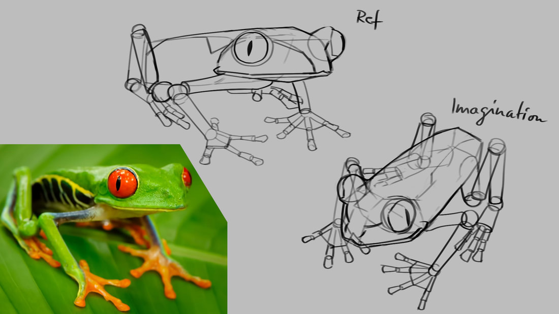
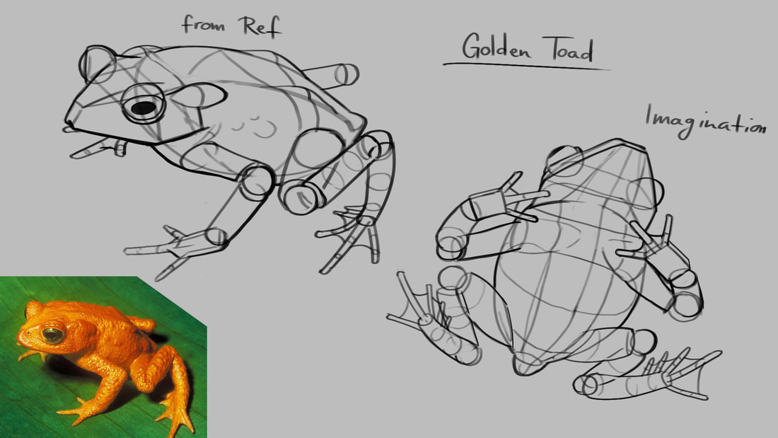
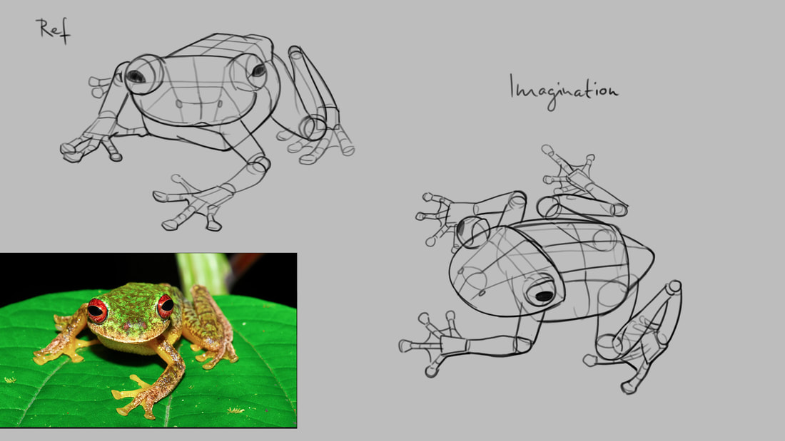
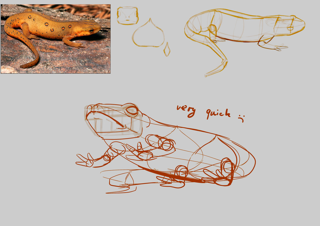
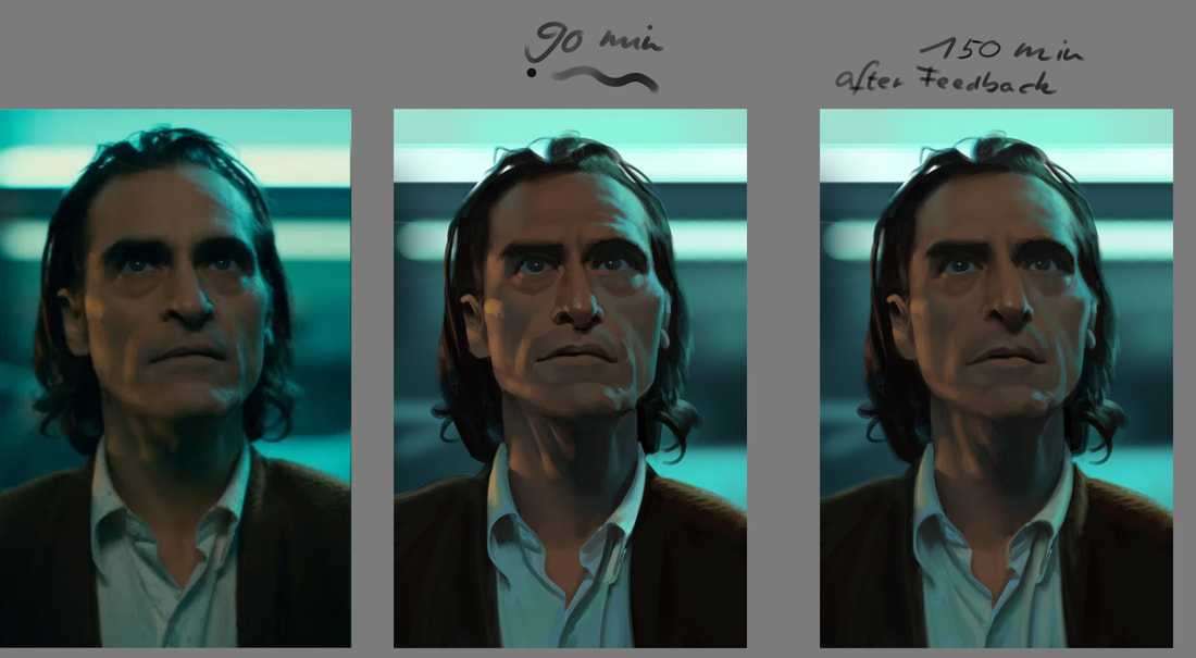
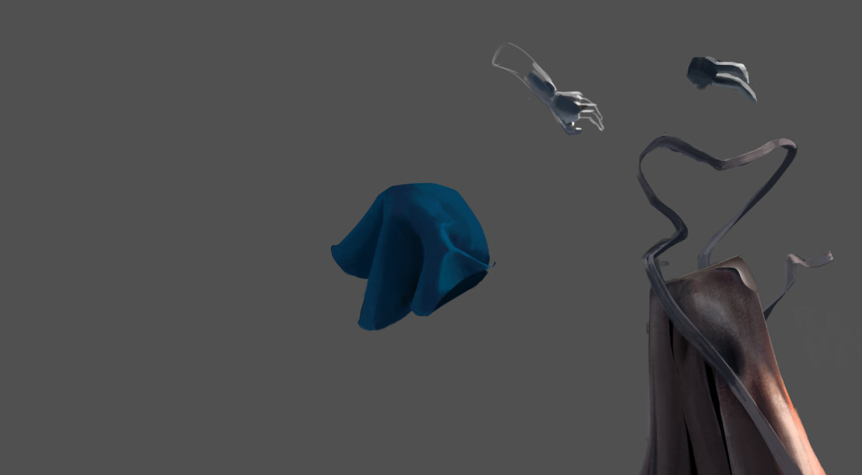
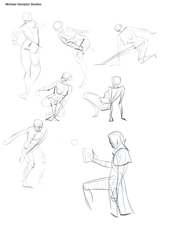
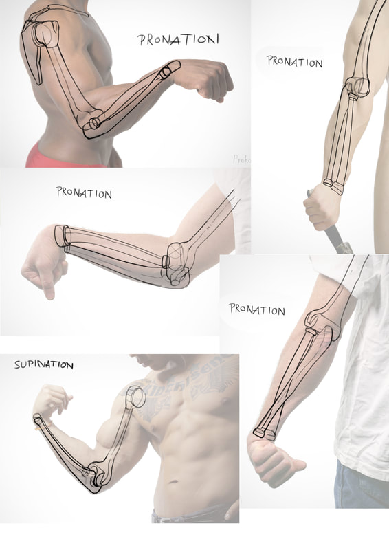
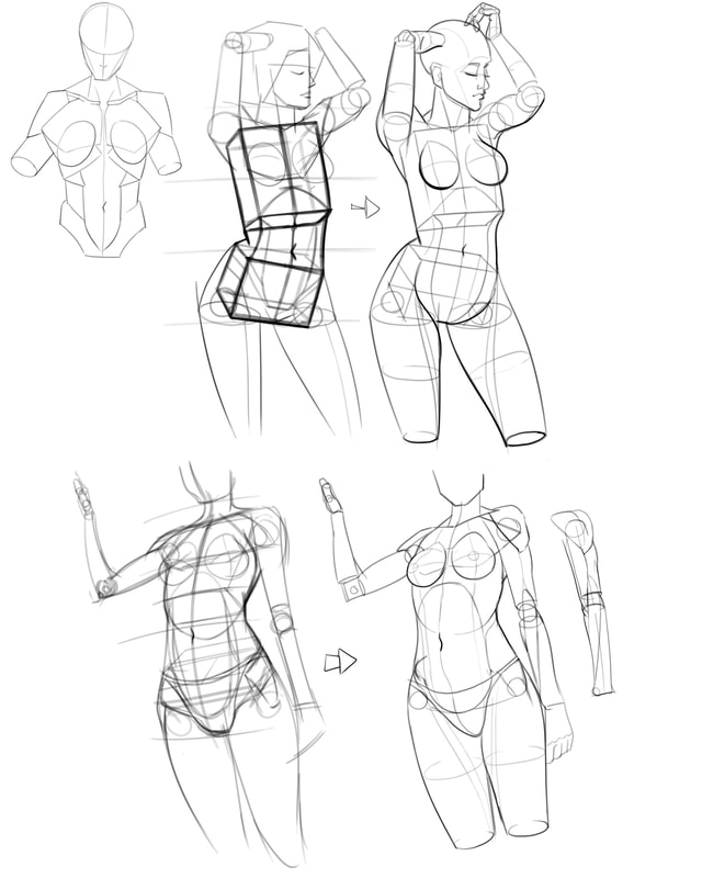
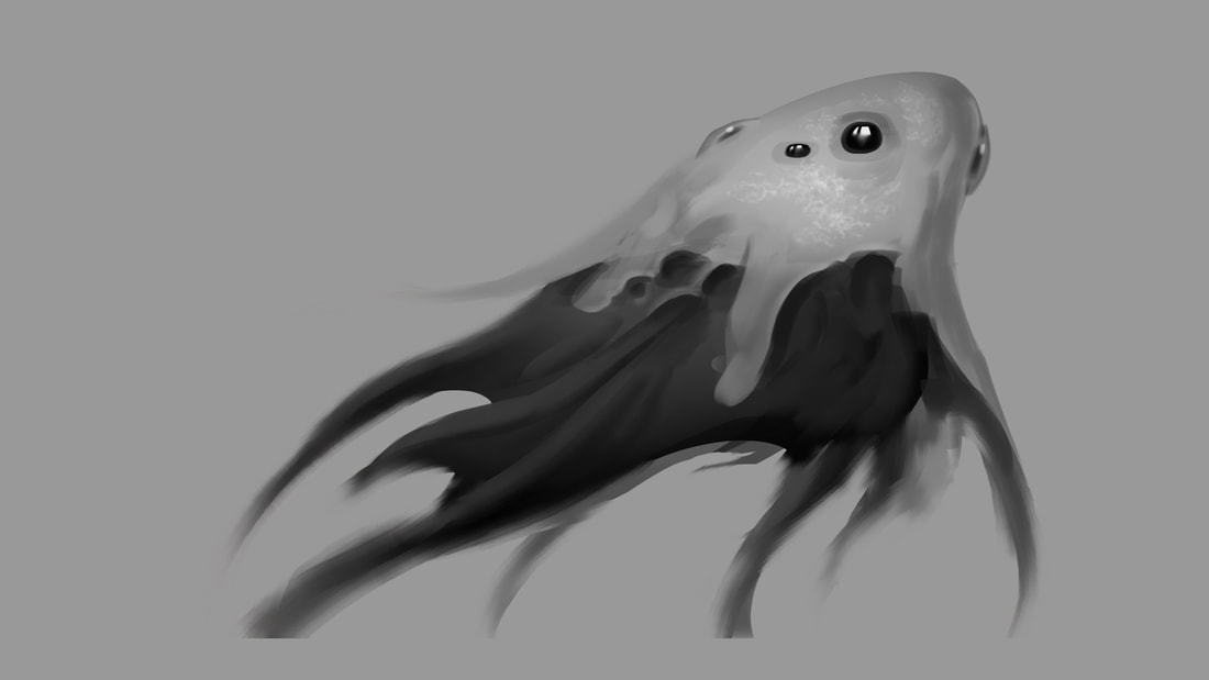
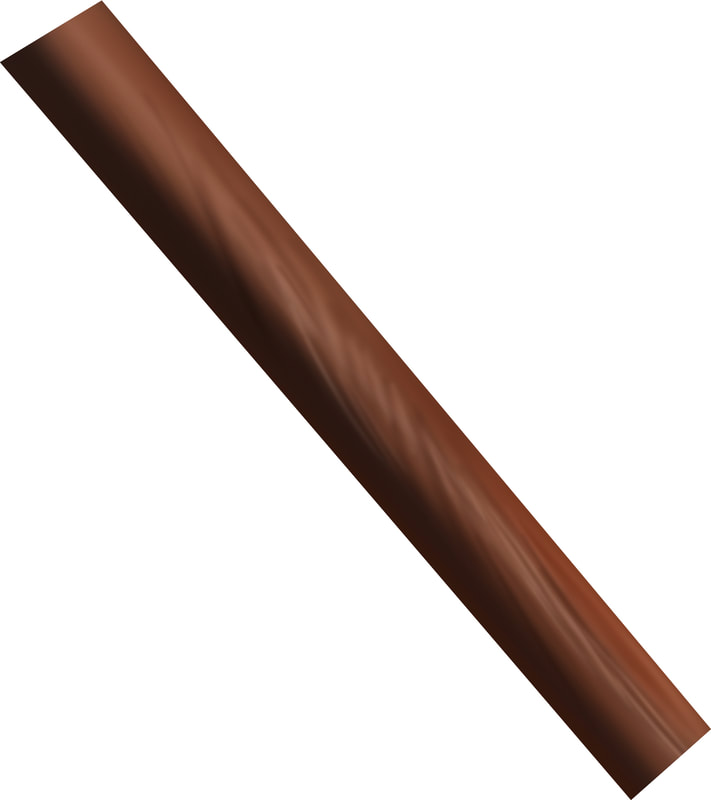
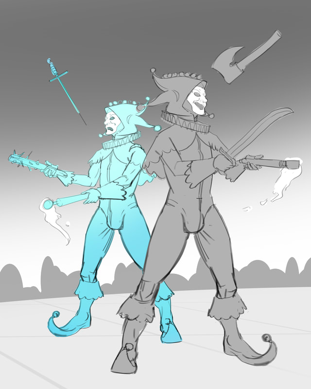
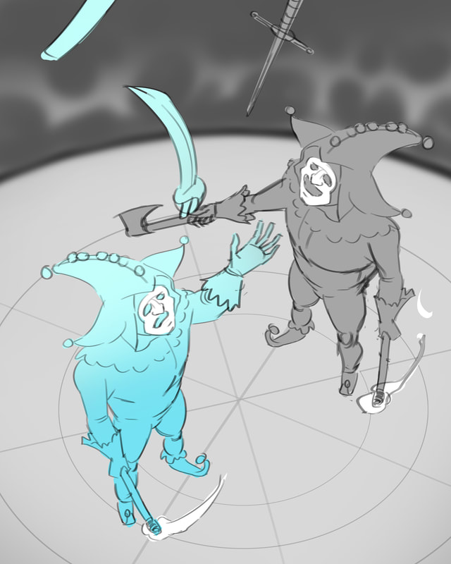
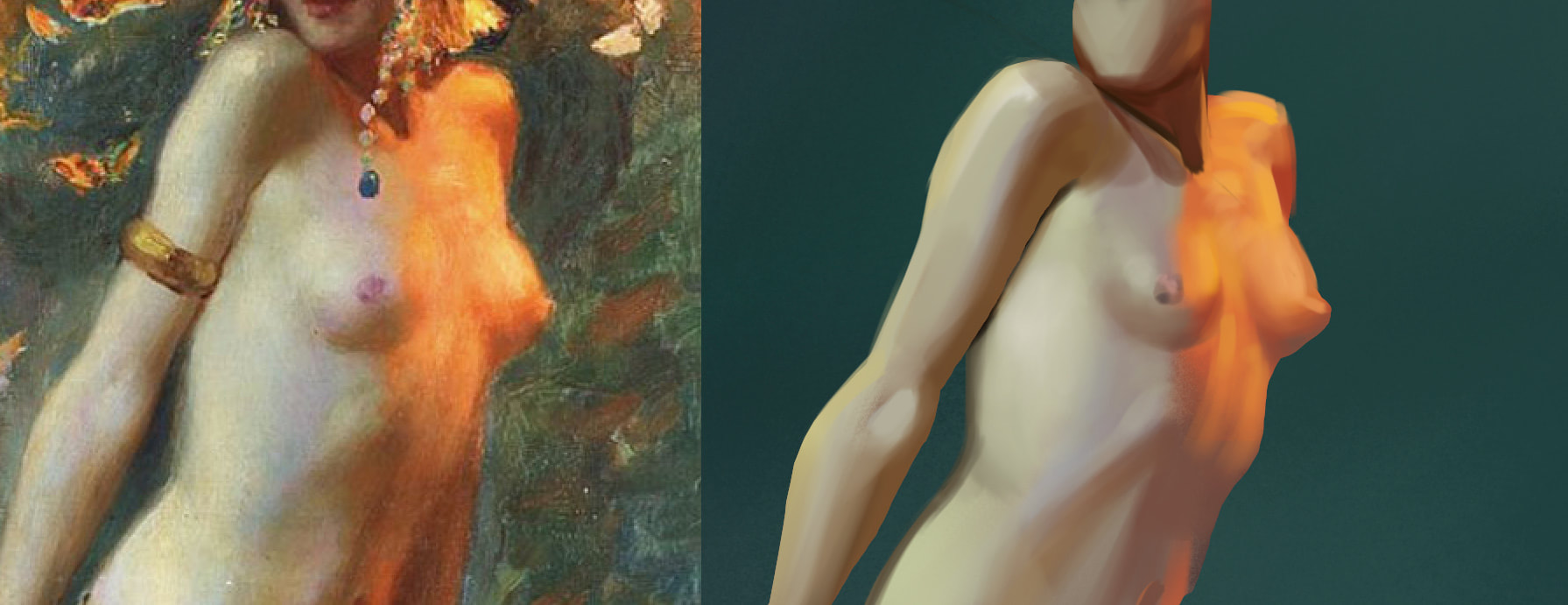
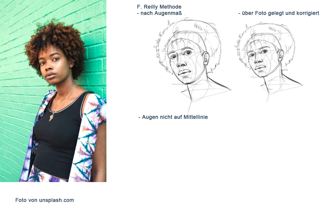
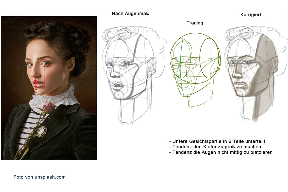
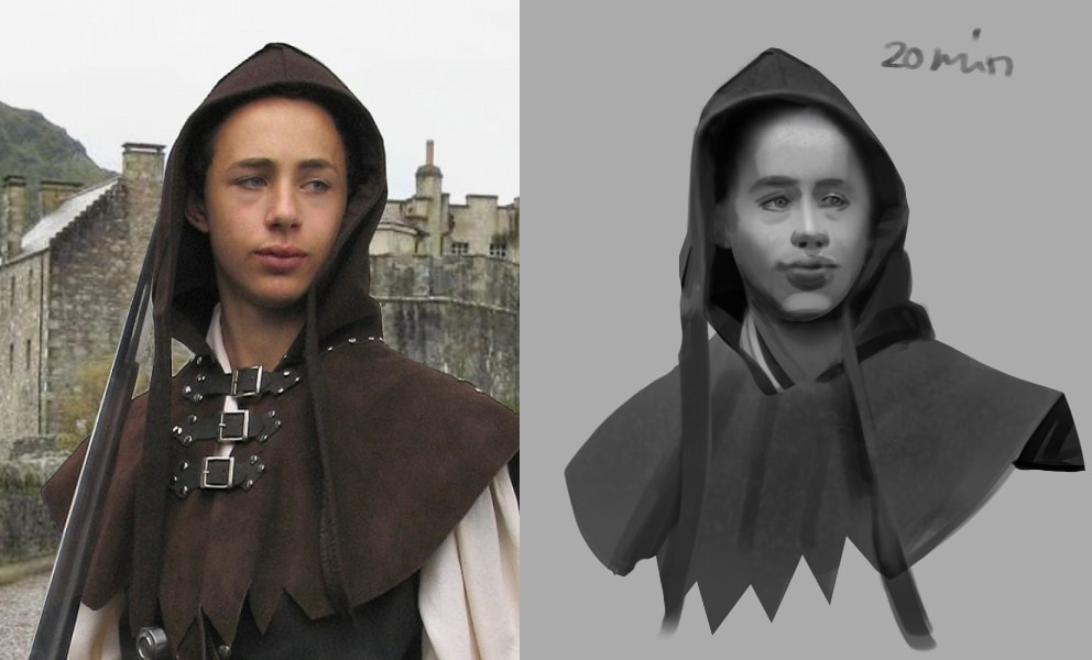
Started this study with hard brushes and only 2 colors for each element and built up from there. This way it was never overwhelming and I feel like I really learned something. 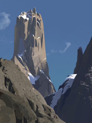 After watching a tutorial on drawing I gave this a shot. 1st step: simplify what you see in the reference into basic forms (cylinder, sphere, cube) 2nd step: draw it from another angle. Really hard, but gratifying and informative. Simplifying an image into few values helps to keep readability and clarity in the image. 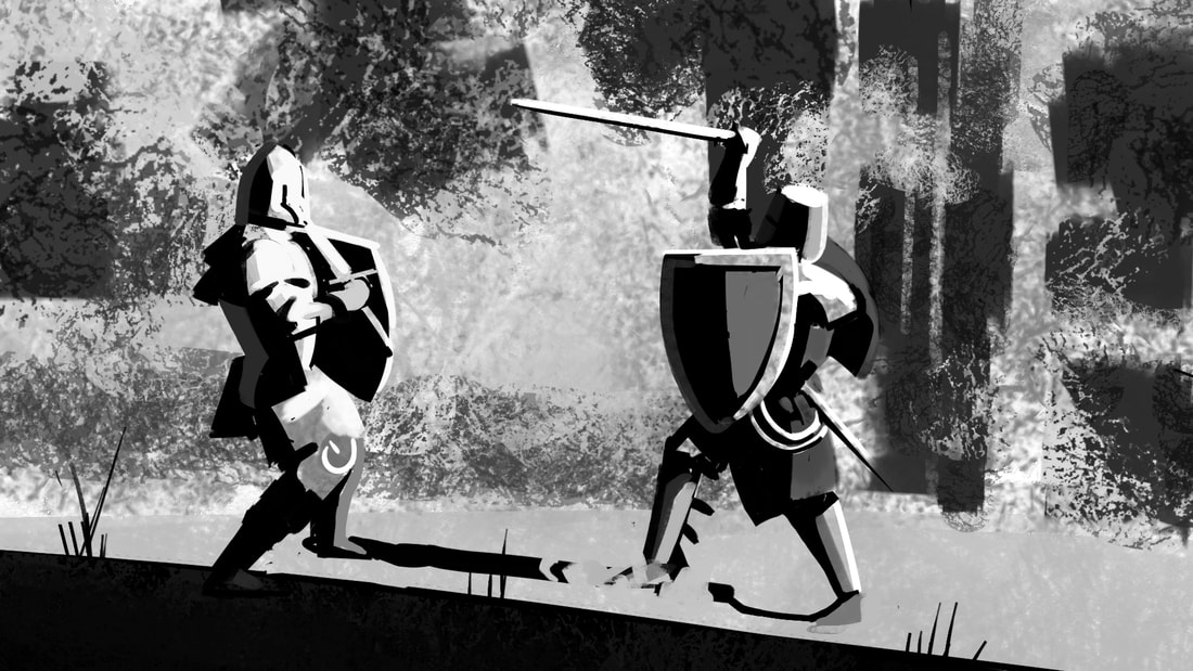 A rather quick painting of my body ... ehm my ecorché. 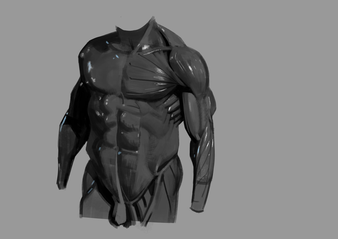 Just a quick sketch, playing with silhouettes. 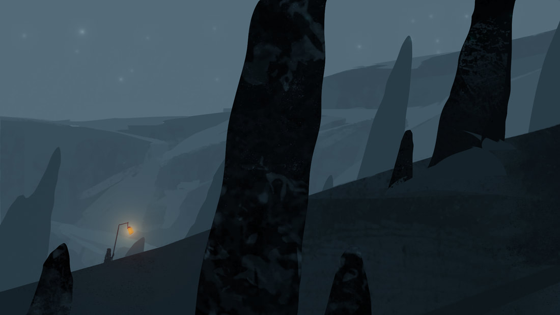
2 Comments
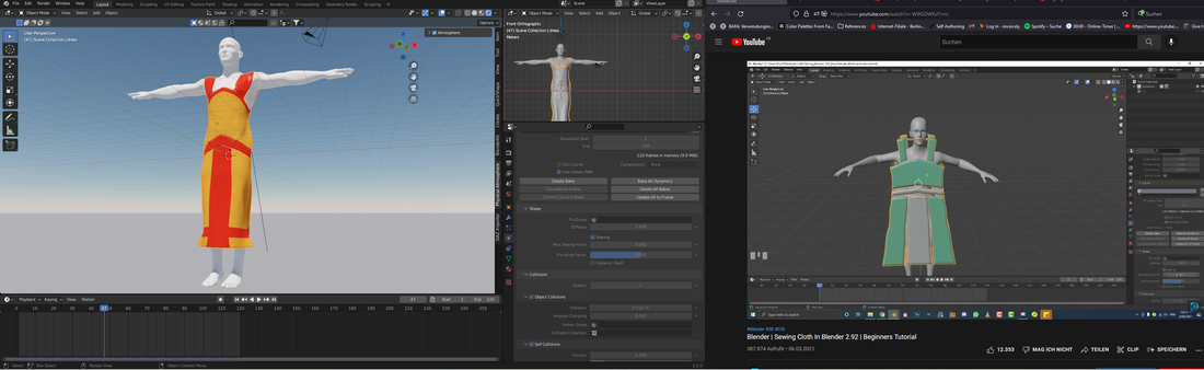
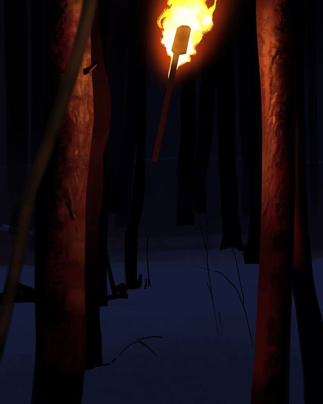
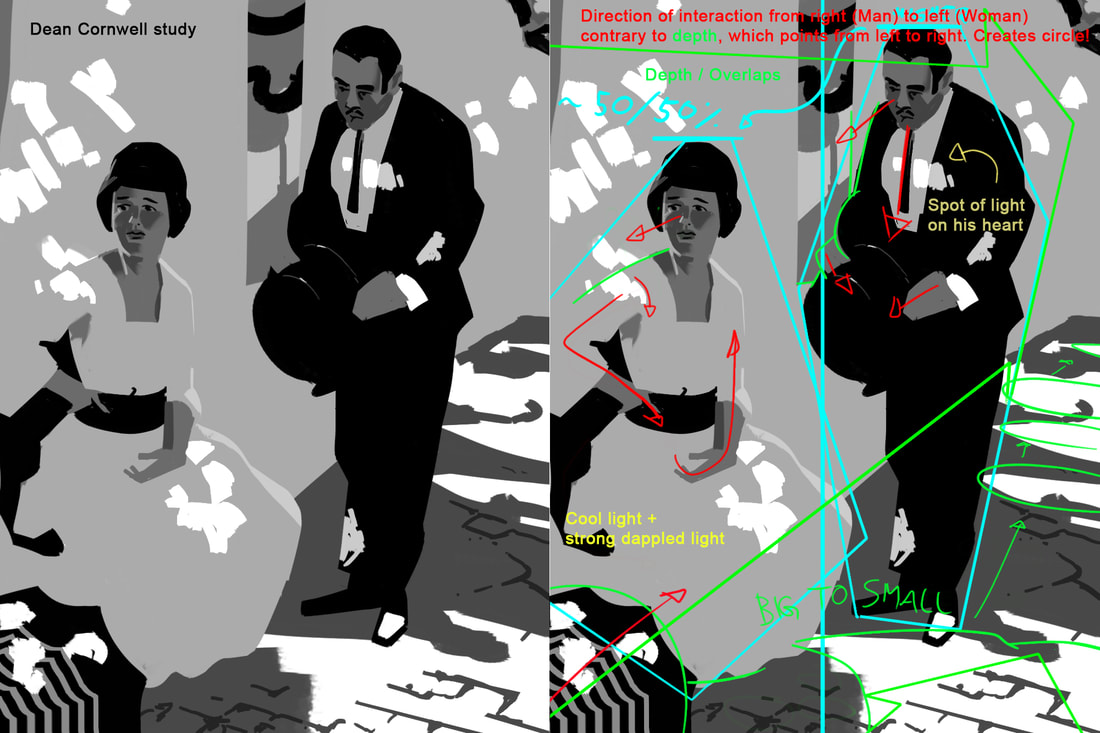
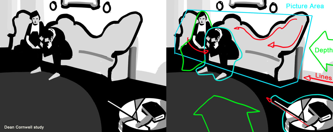
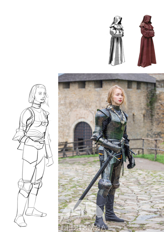
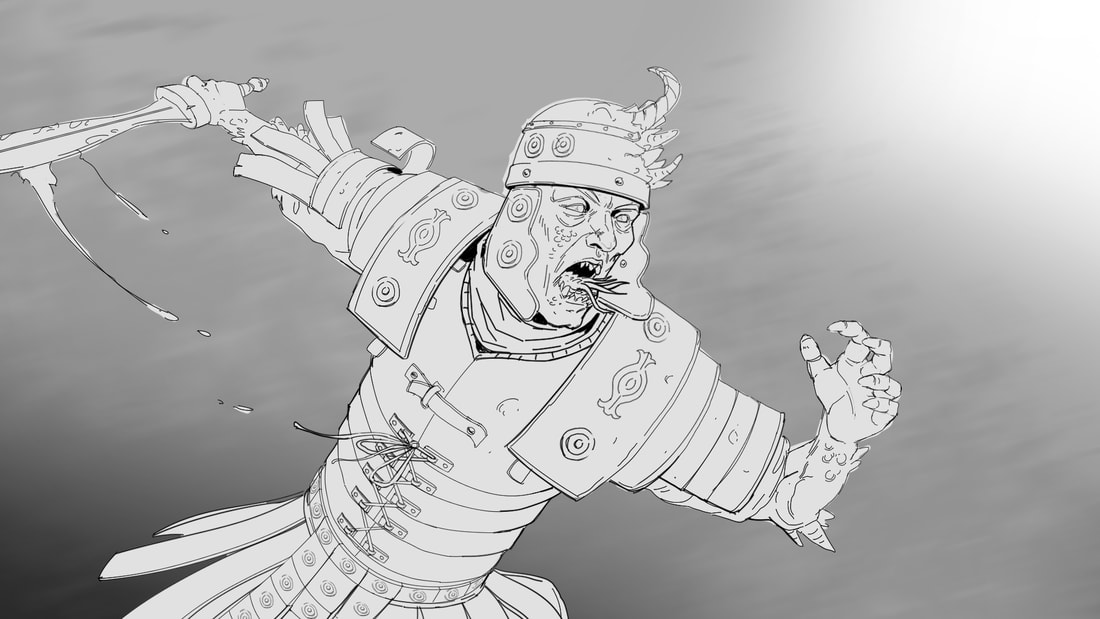
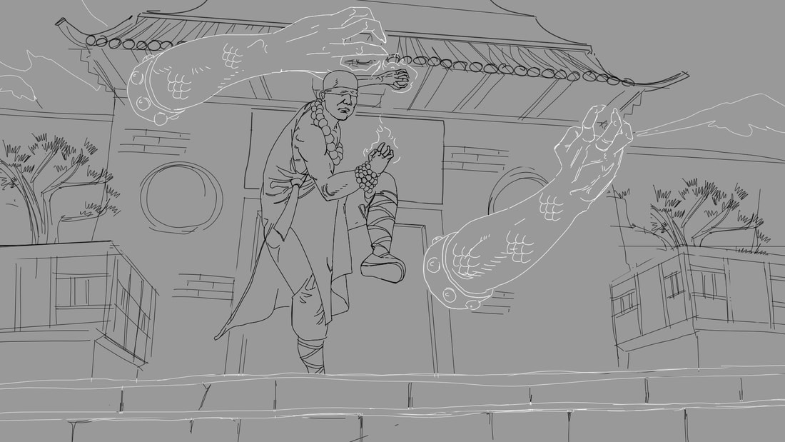
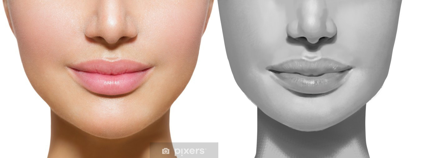
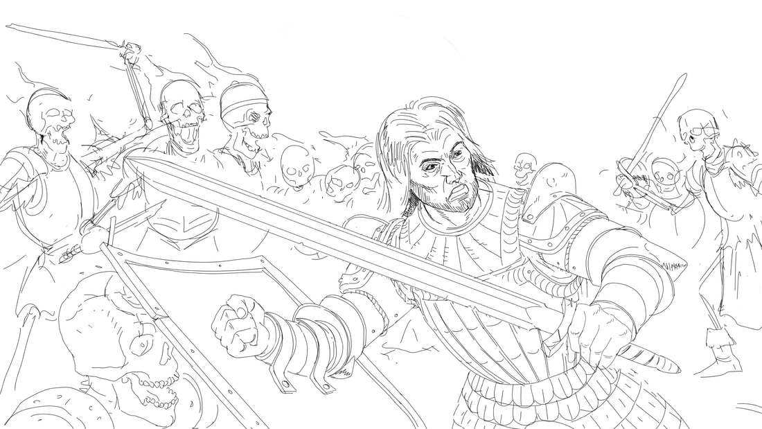
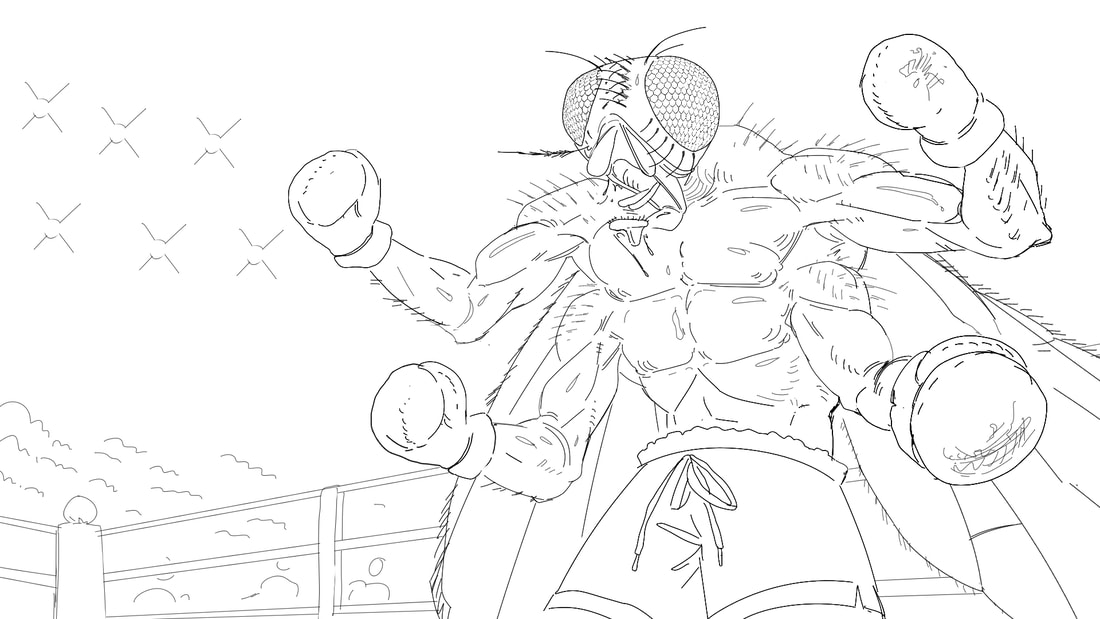
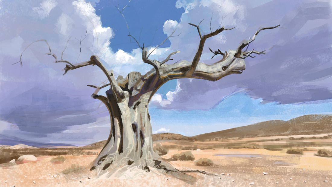
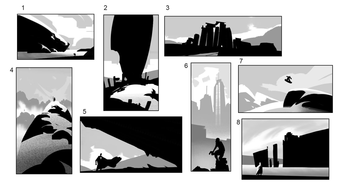
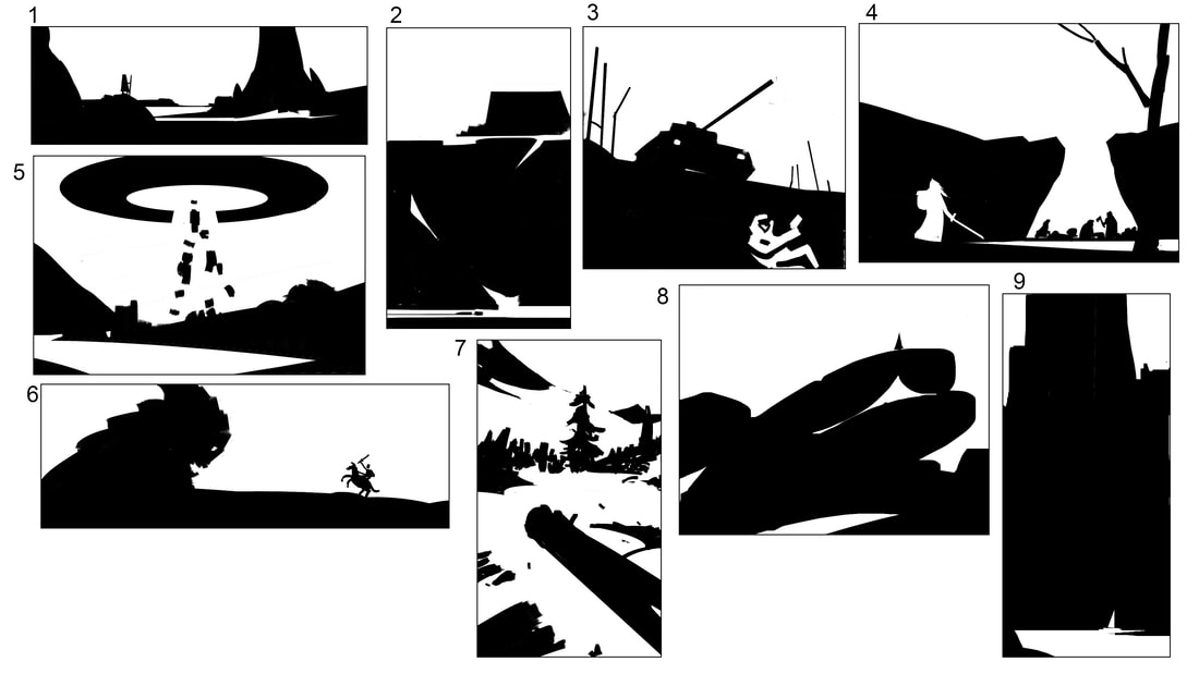
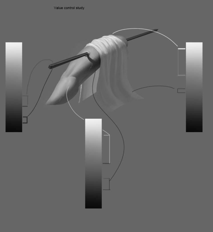
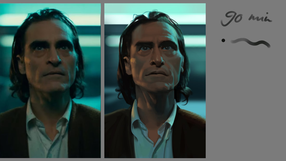
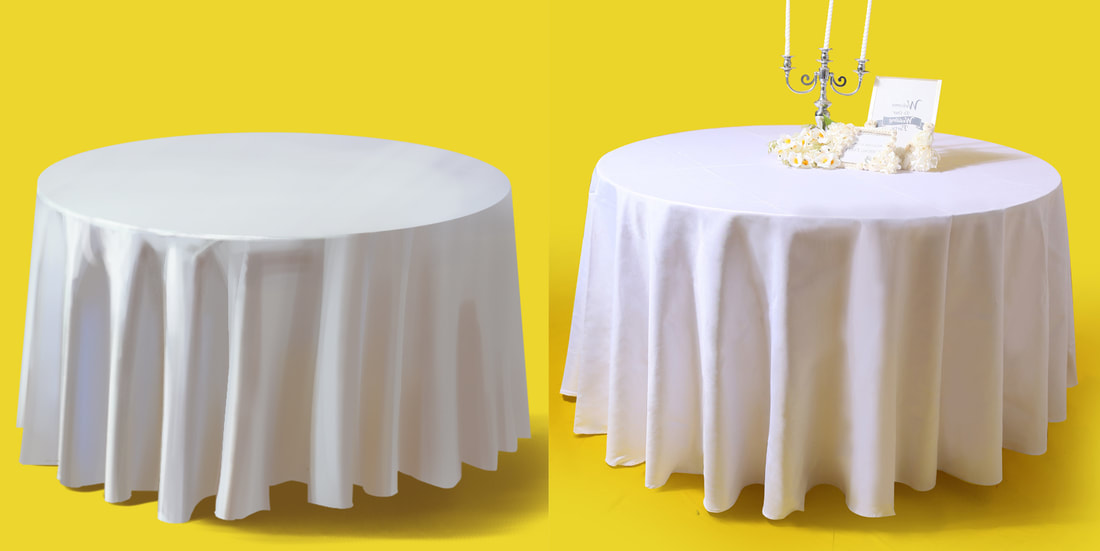
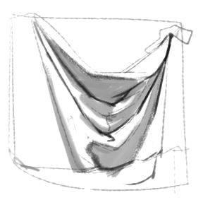
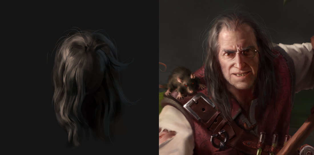
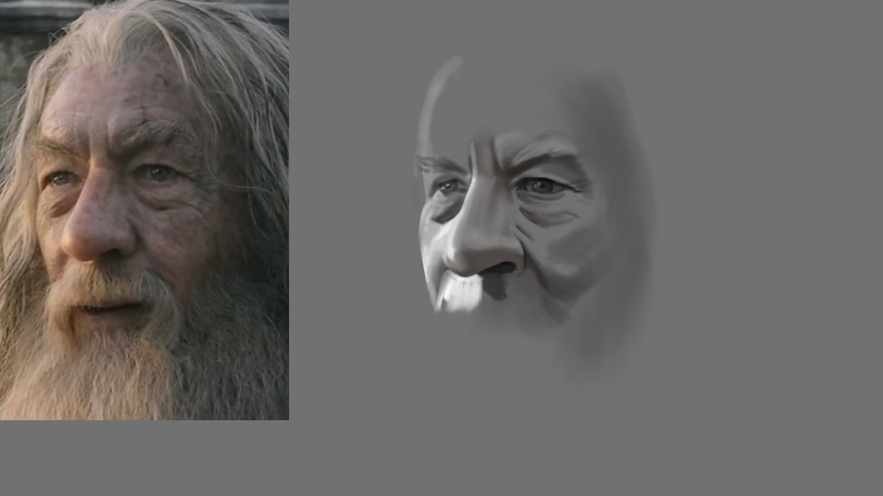
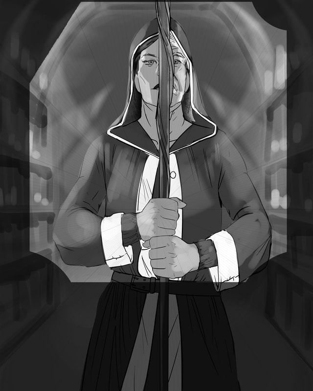
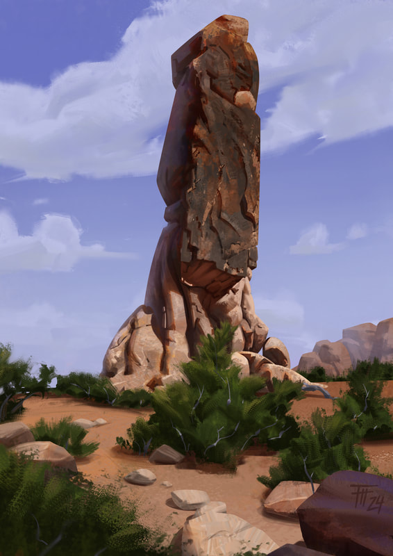
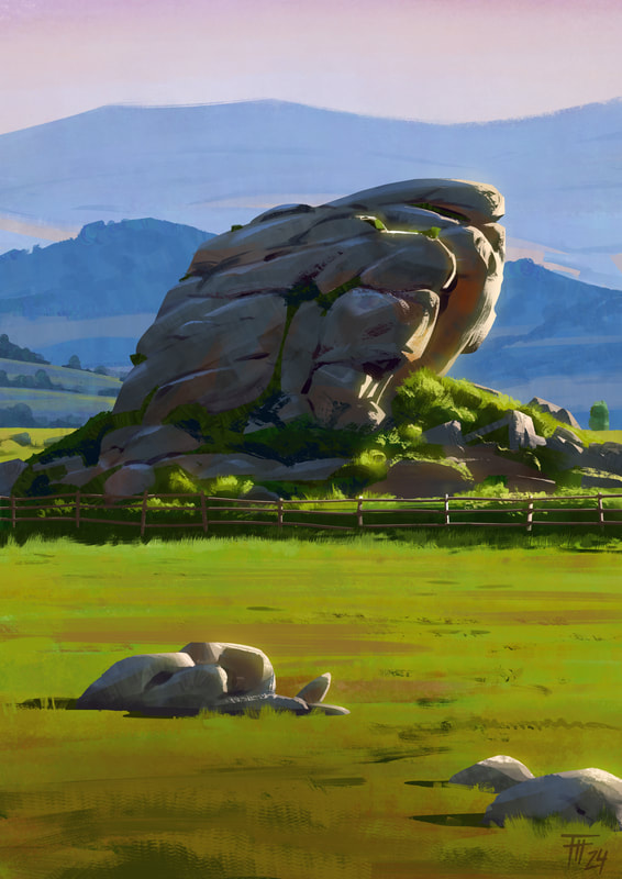
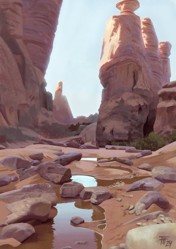
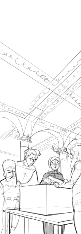
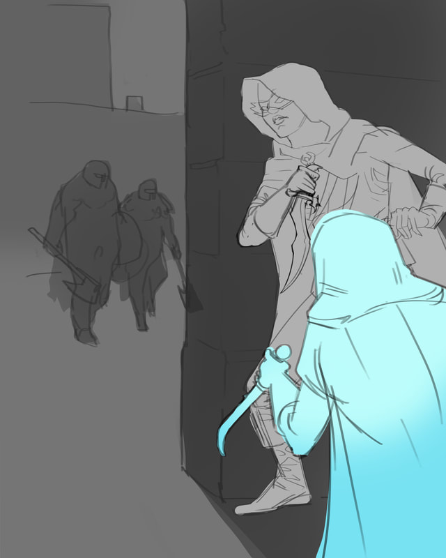
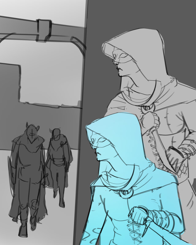
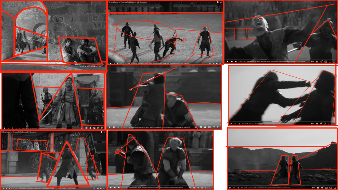
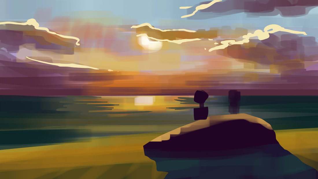
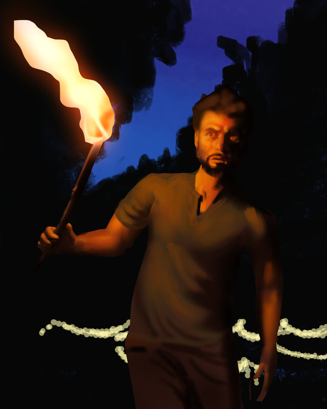
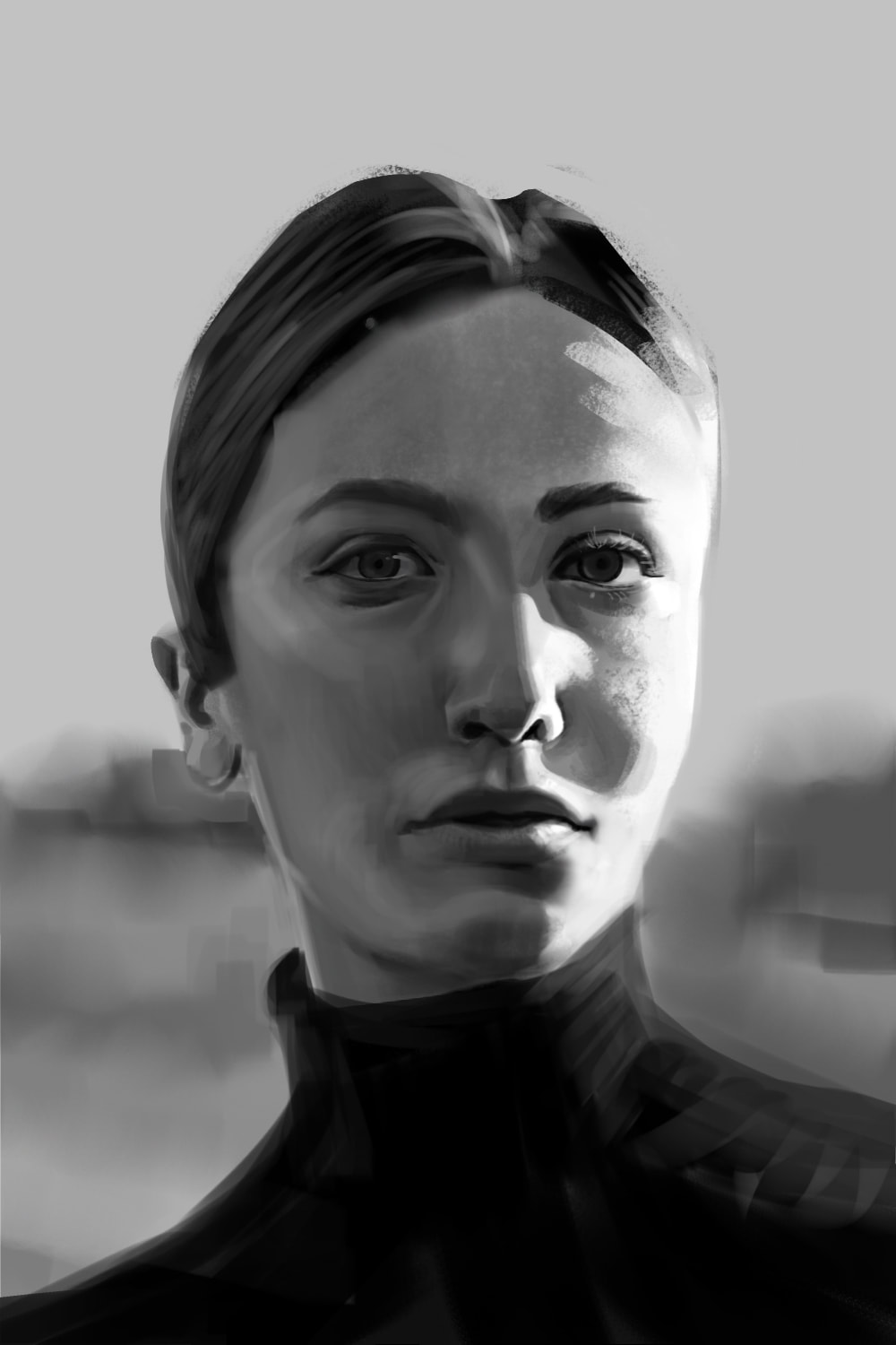
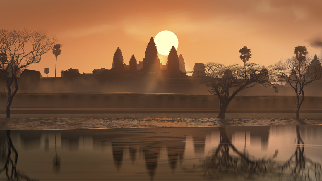
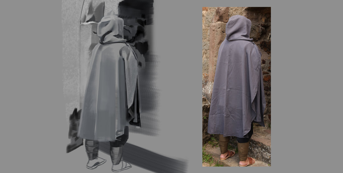
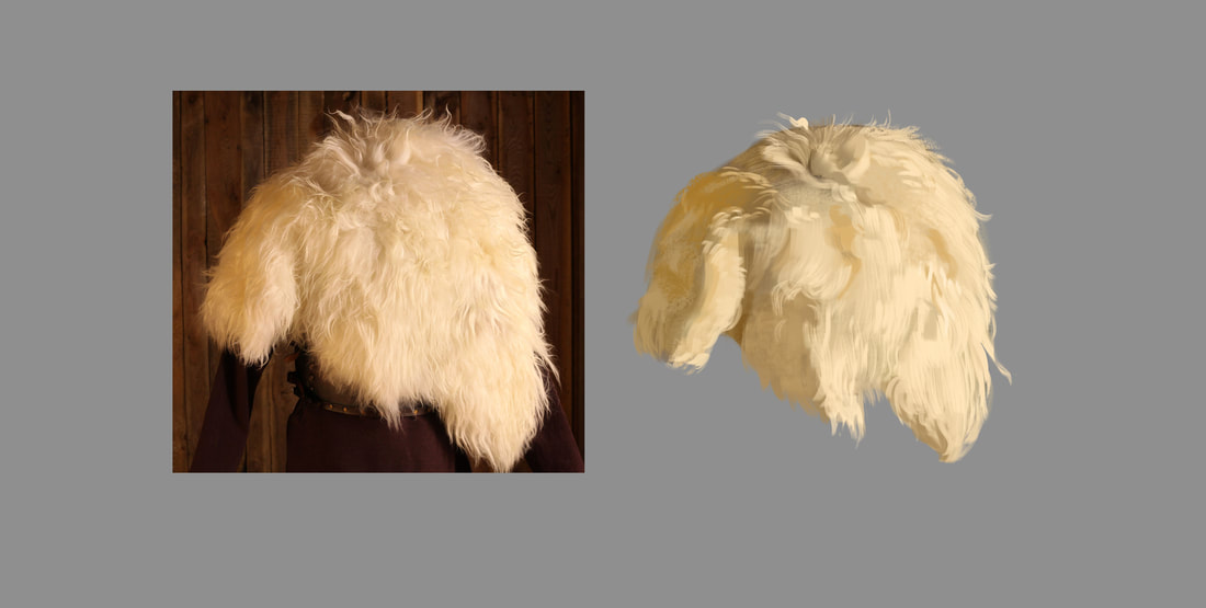
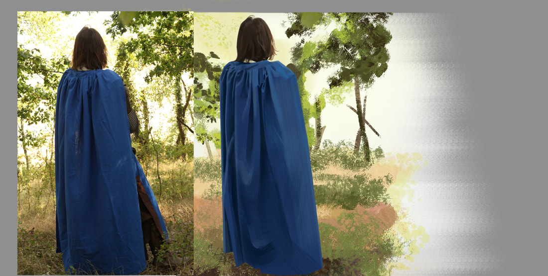
Sorry for not posting in such a long time. I have started a new project and things are running along very nicely. I am learning a ton on that new project, so I haven't felt like doing a ton of other studies. But still, there is some output and I wanted to share it. Pretty all over the place, but that is normal for me :D Have a nice day. Hi guys, I did a photostudy lately from a photo I took at the Botanical Garden in Berlin. After being done, I was quite proud of me. The result is below. I then asked some people for feedback and got a pretty short but insightful answer: "too much black and white. Look how this artist does it ..." At first as usual, I feel a bit stressed out by feedback like that. After so many paintings, how can it be, that I don't simply get praises? But after a while I relax and can work on it again. I then filled the whites with bright colors and the blacks ... I didn't do much to the blacks to be honest, but the result was a lot more pleasing to me. Scroll down to see it. Also I am not much of a dreamer, so I know that not many people are reading this (I see the metrics). But still, I am grateful for the ones that make it back from time to time. Thank you :* 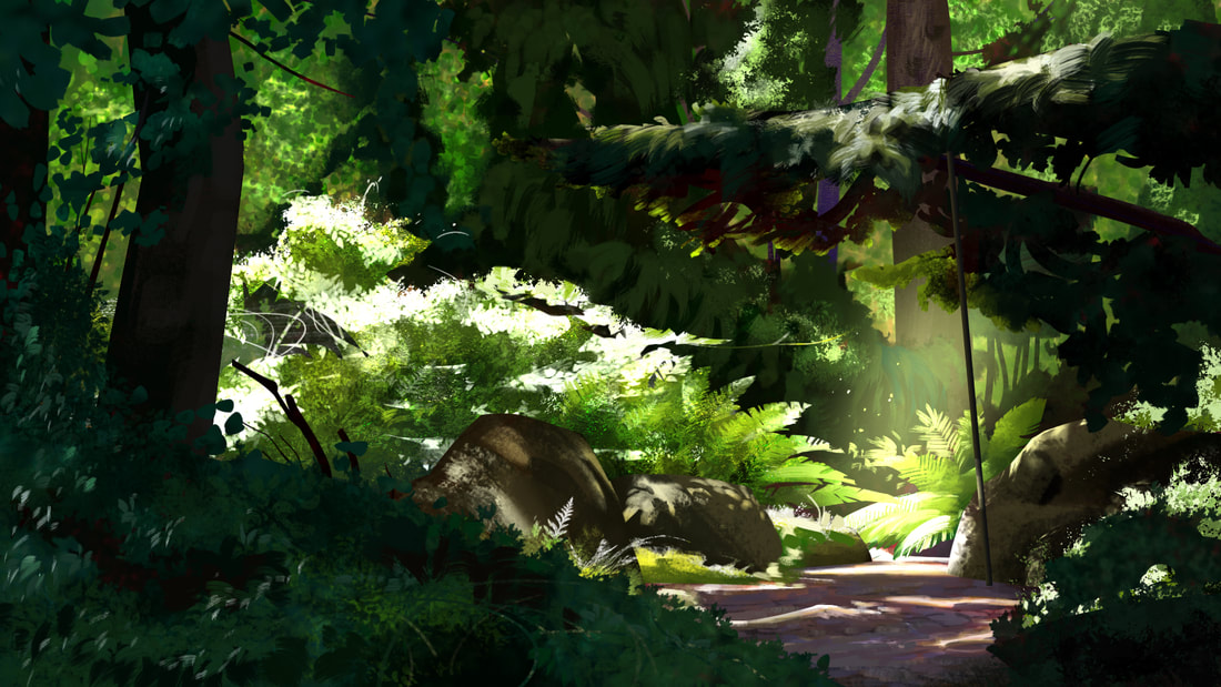 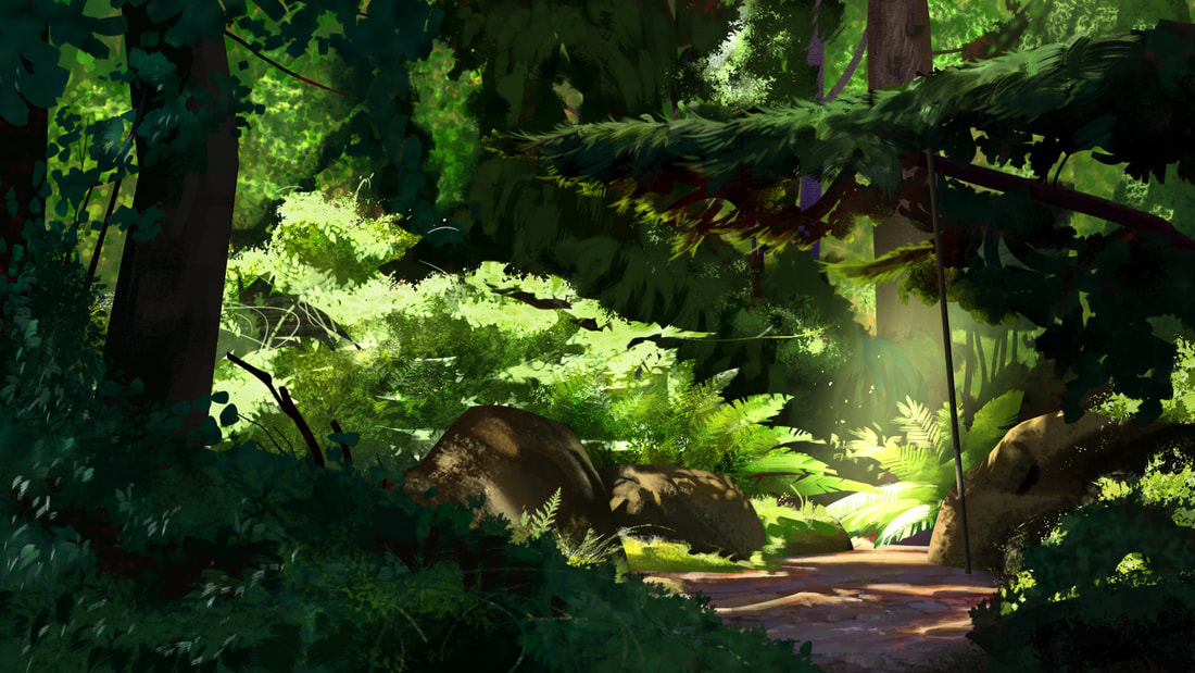 Below is the photo I based the study from. Looking at it now, I really overdid some of the darks. Even though the photo is a bit overexposed. 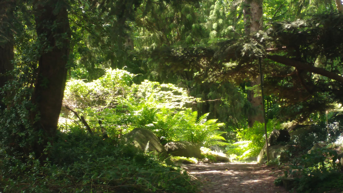 Studies of folds, hair and a nose I need for an illustration. Hope I can show some of the work I did over the last month soon. :) Unused sketches for illustrations Drawing folds is hard, but it gets easier over time. Also, today is my birthday and many people have send their good wishes and congratulations. Thanks everyone :*  Hey guys, I was watching a video by artist and teacher Dorian Iten, who is insanely good. It was about using a limited value-range when do a painting or a study. This is a great way to get out of the habit of trying to copy what the reference is presenting. I actually found this to be helpful a couple of posts back, where I painted portraits with 4 - 5 pre-chosen colors. But it is great to see it taught by someone like Dorian. What I found new and interesting about it, was the concept of using colors from the light-family, to describe shadows, that are lit by a lot of surrounding sources. He makes that very clear at 1:04:07 in the video. Just watch. To solidify the information I made a value study of a portrait. I tried to keep to my swatches for the value groups. Hope you like it :) 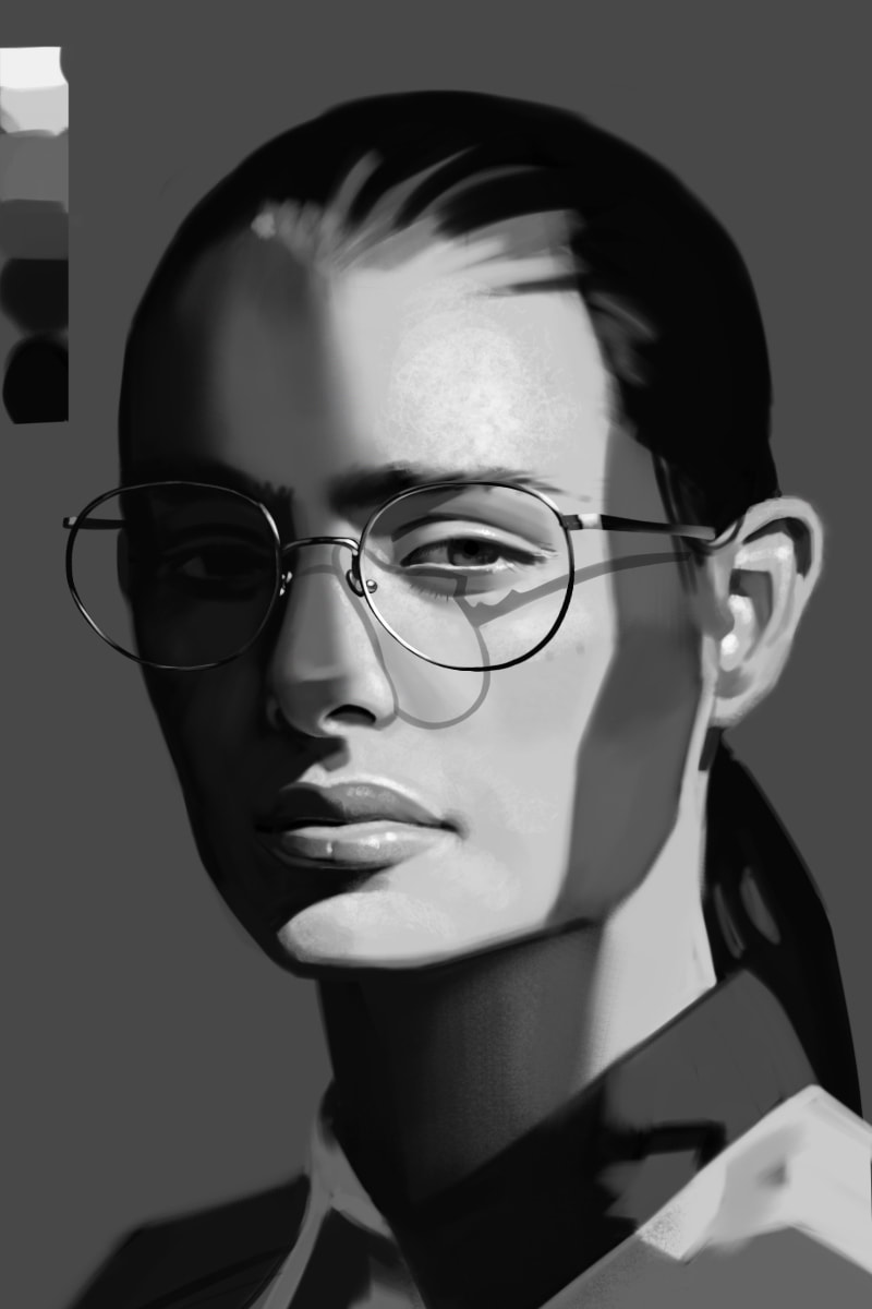 Some other studies I did :) The one about composition was very interesting, since I rarely think about the abstract shape of the things I put in my images and I should do it more. Some imaginary interior based on islamic architecture.  Dean Cornwell study. 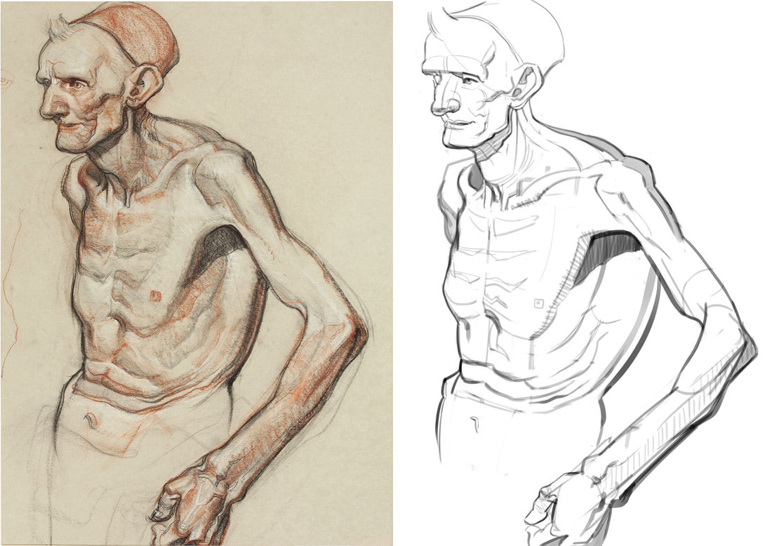 Applying what I have learned to a photo-study. 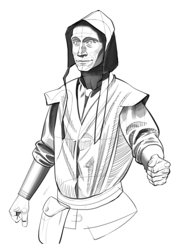 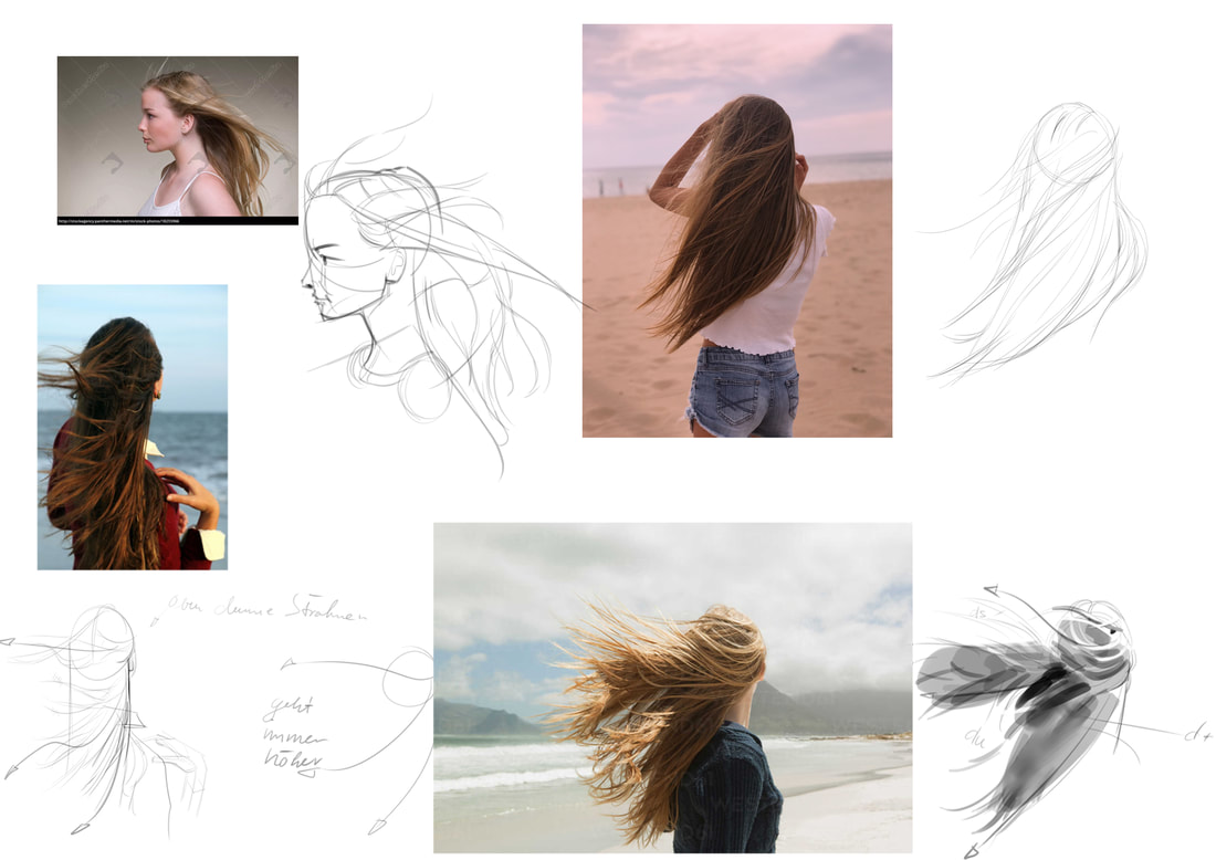 Silhouette study from another artwork I don't know the artist of. 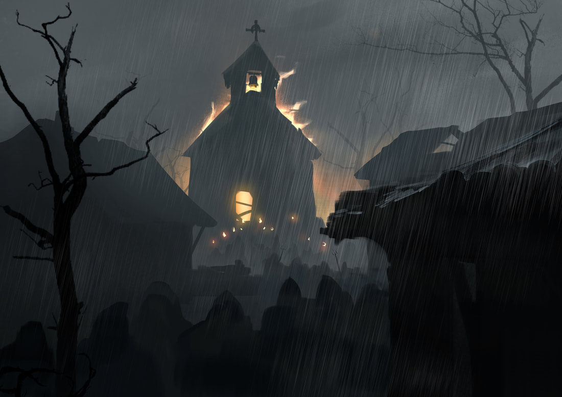 Trying to achieve a more painterly and loose look.  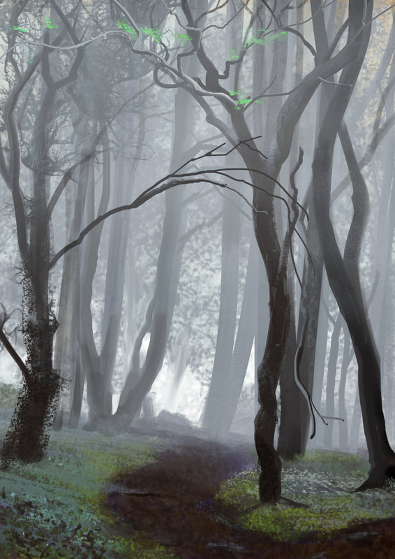 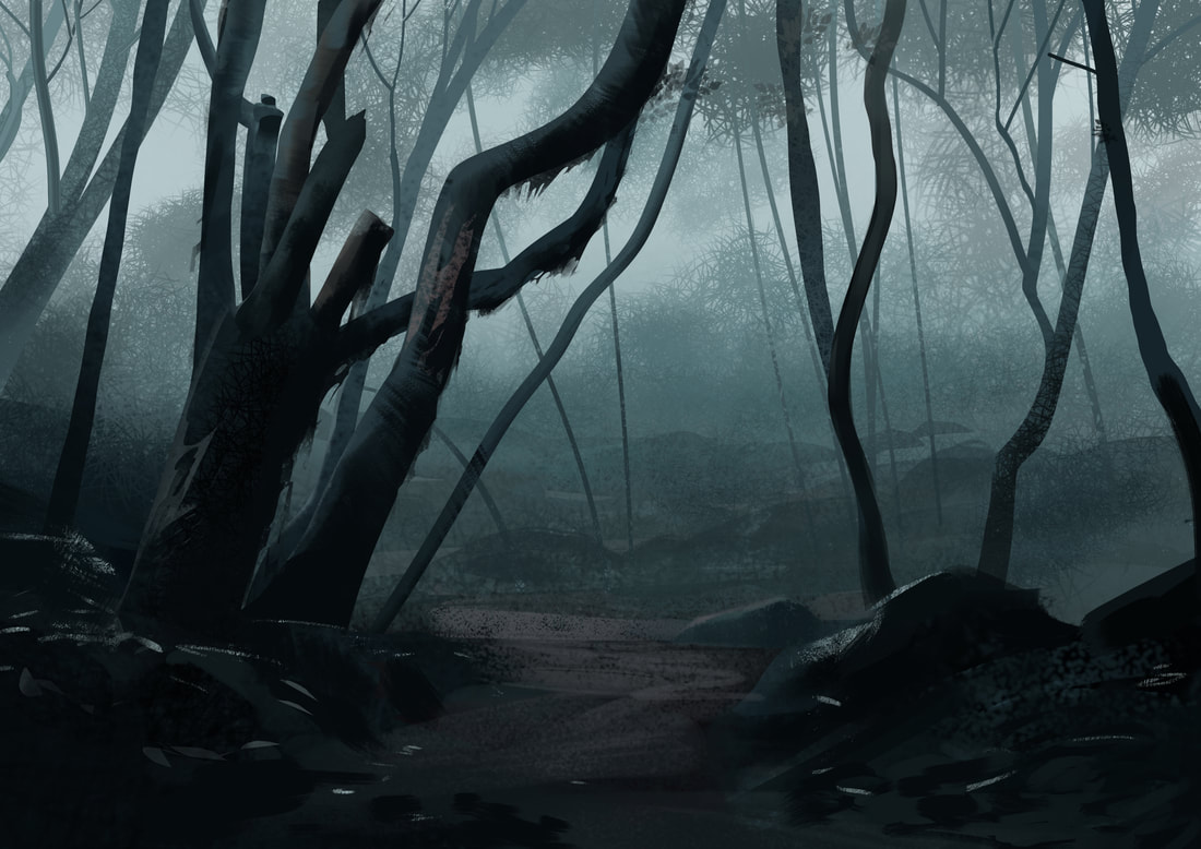 Focusing on planes and simple brushes. 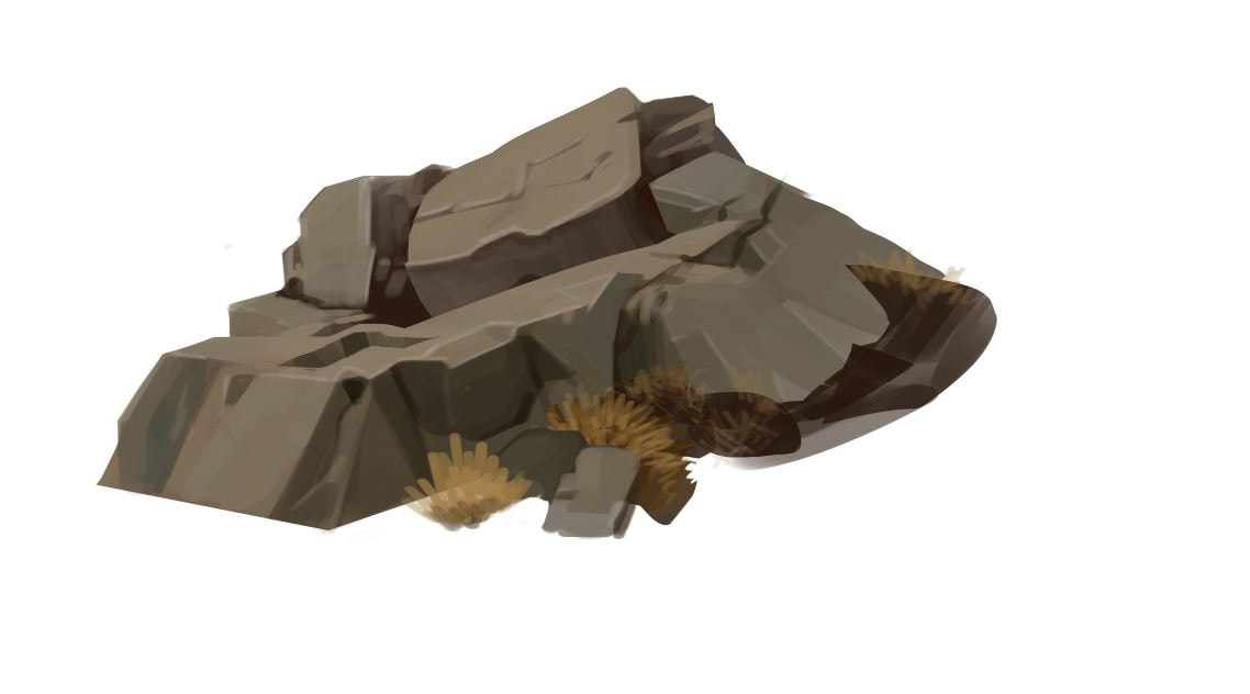 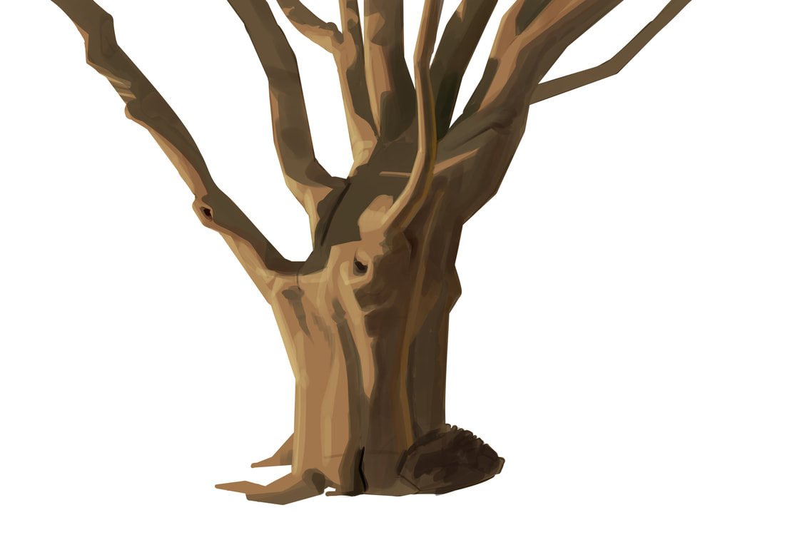 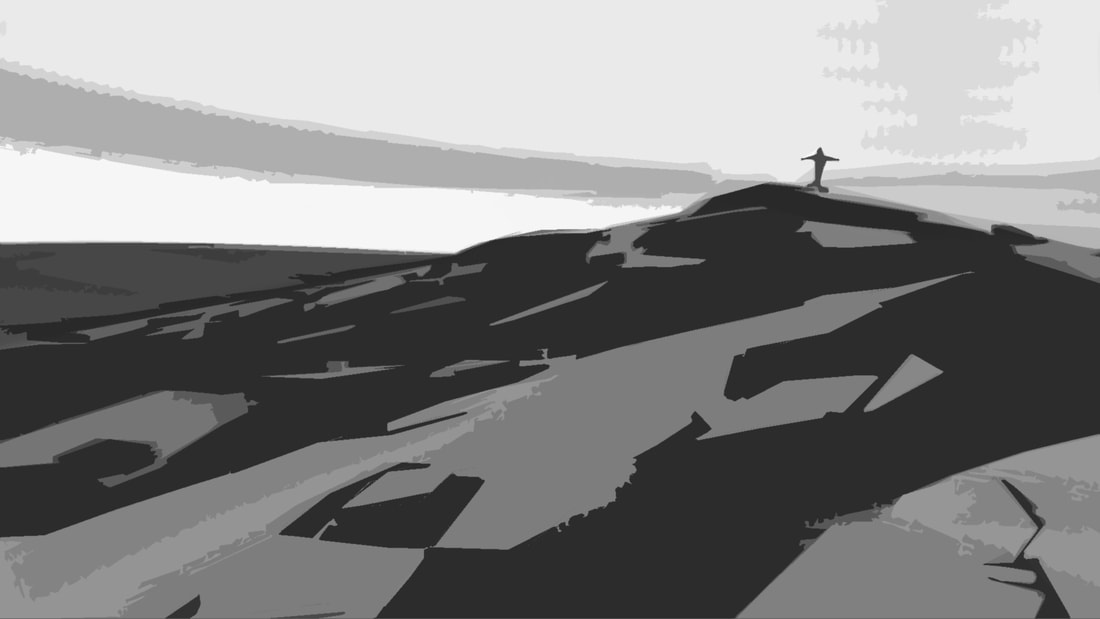 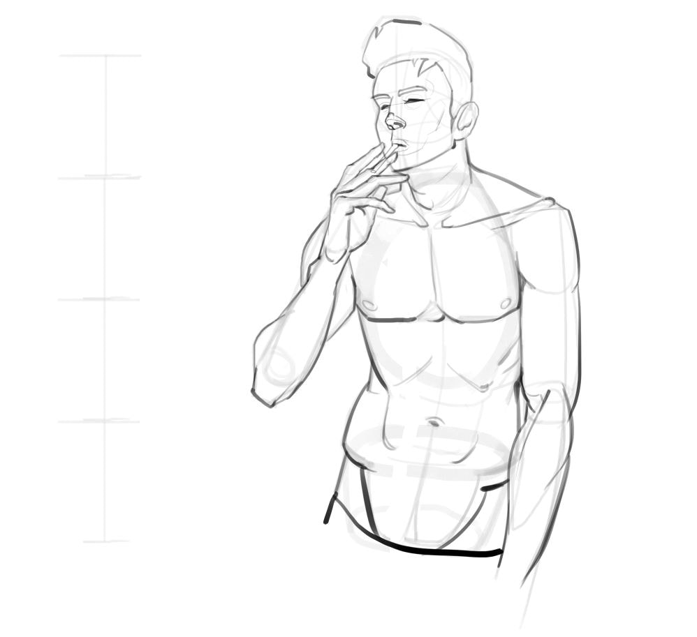 Focusing on brush efficiency and simplicity. Establishing a clear hierarchy of edges seems key. Hardest for highlights, softer for modelling. Was a quick one too, probably < 1 hr. 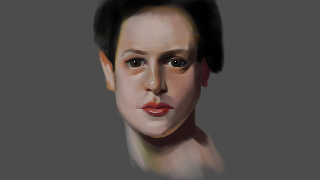 |
This is my blog. I will share information about workflow, my insights into image-making or just general thoughts and rants about being an artist. Archives
February 2024
Categories |

 RSS Feed
