|
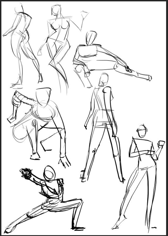
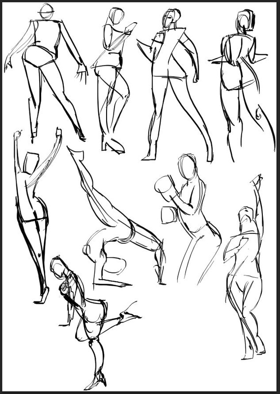
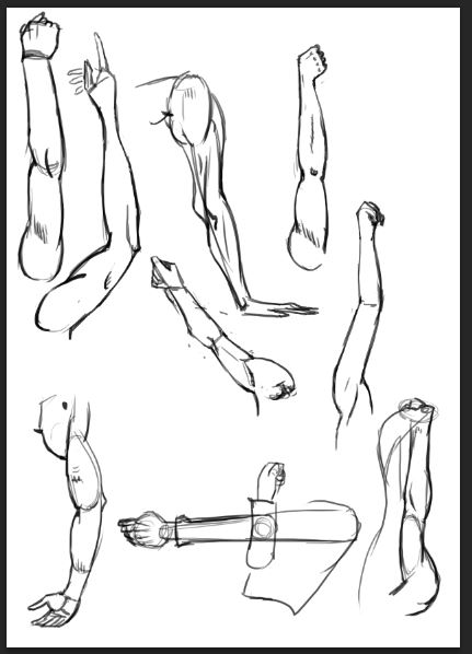
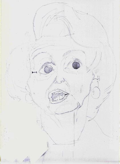
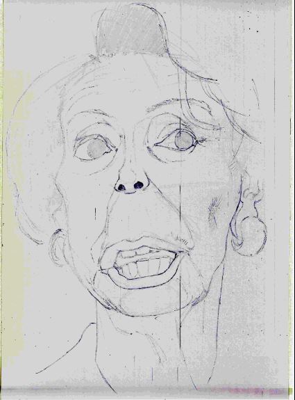
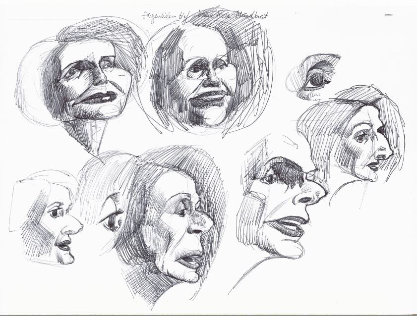
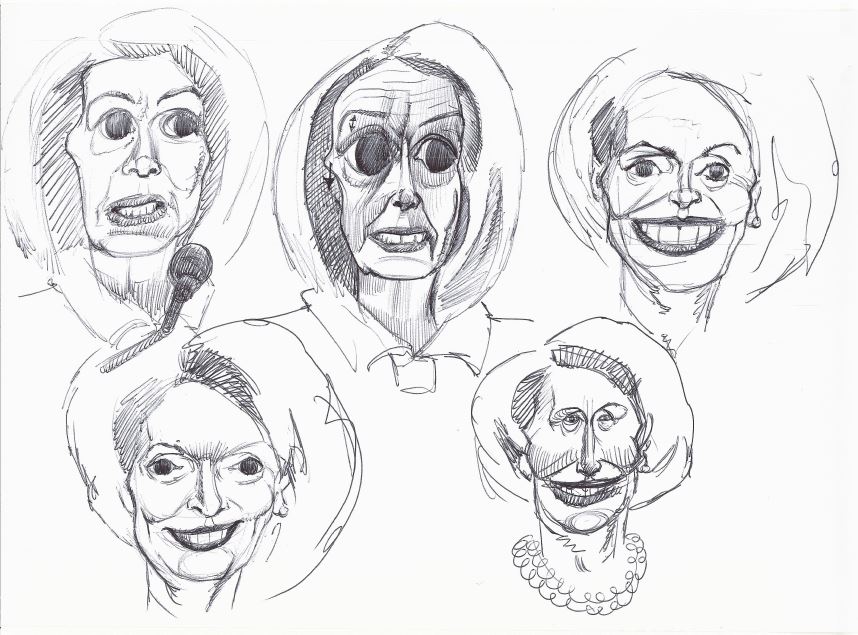
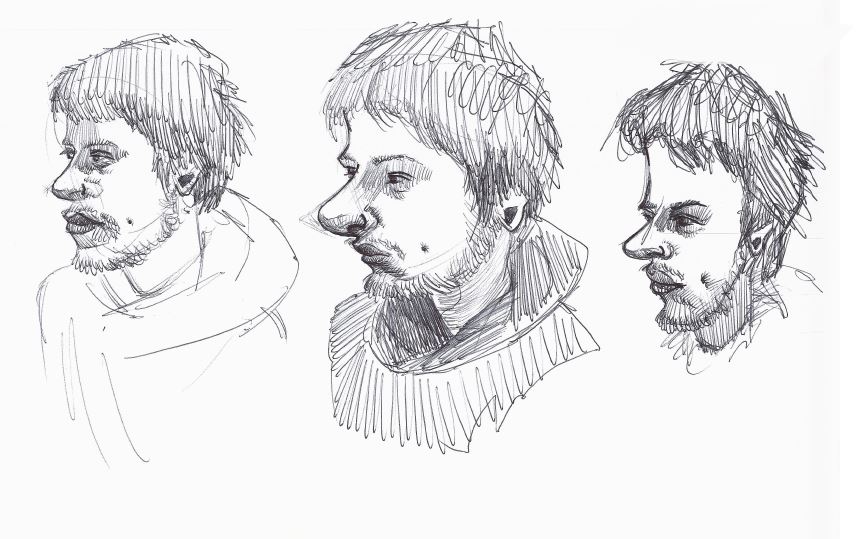
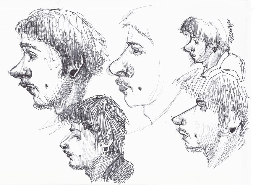
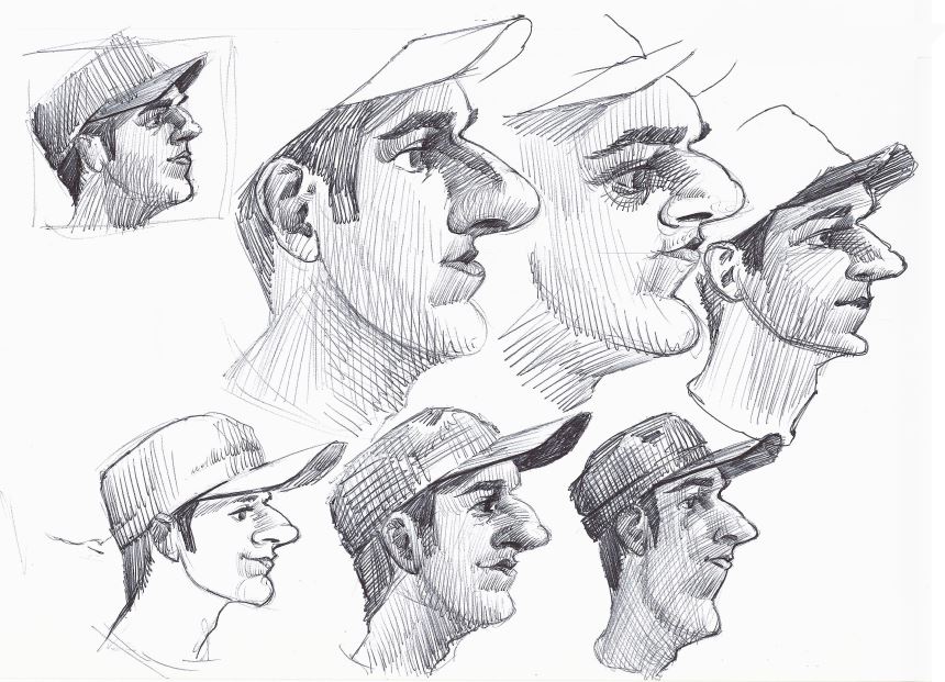
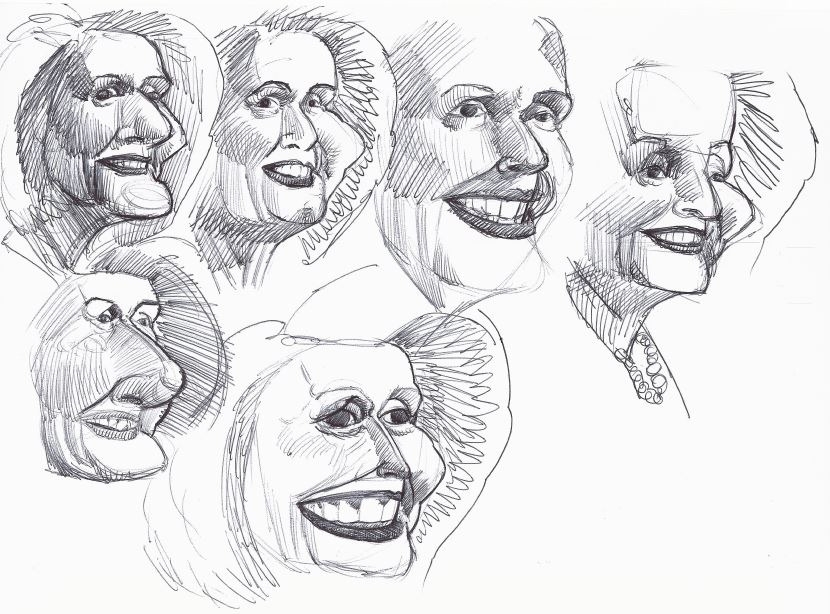
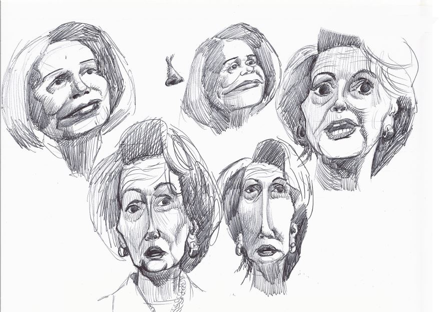
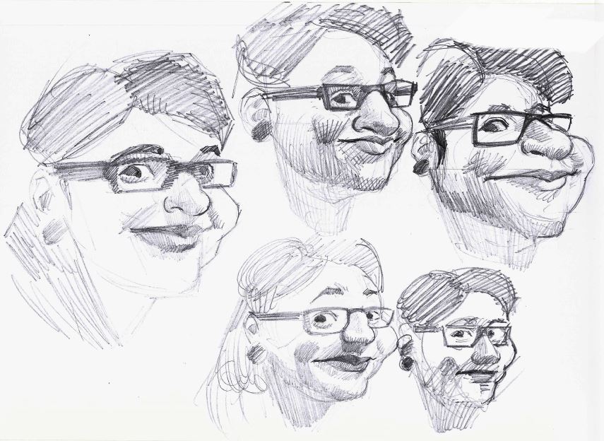
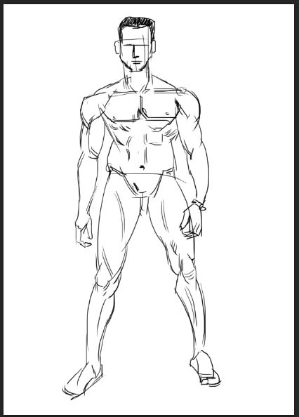
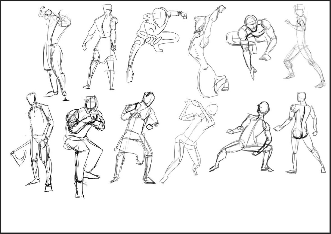
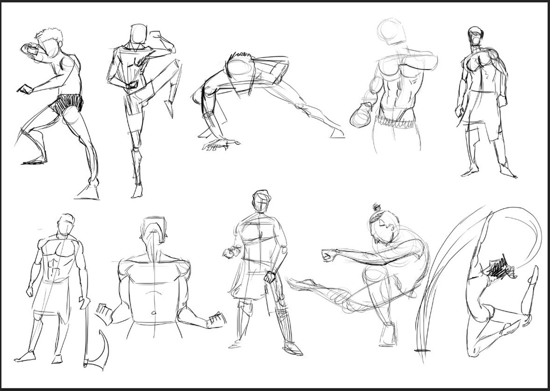
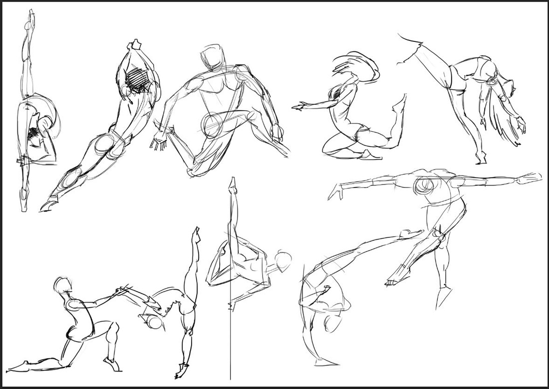
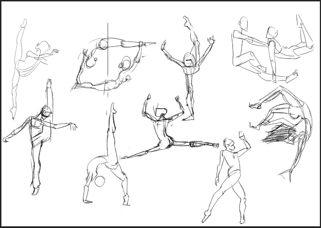
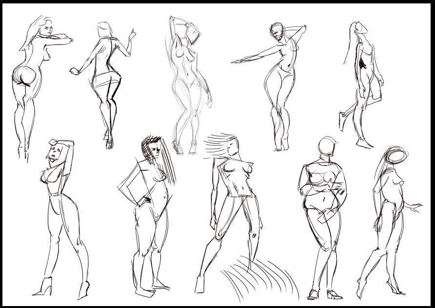
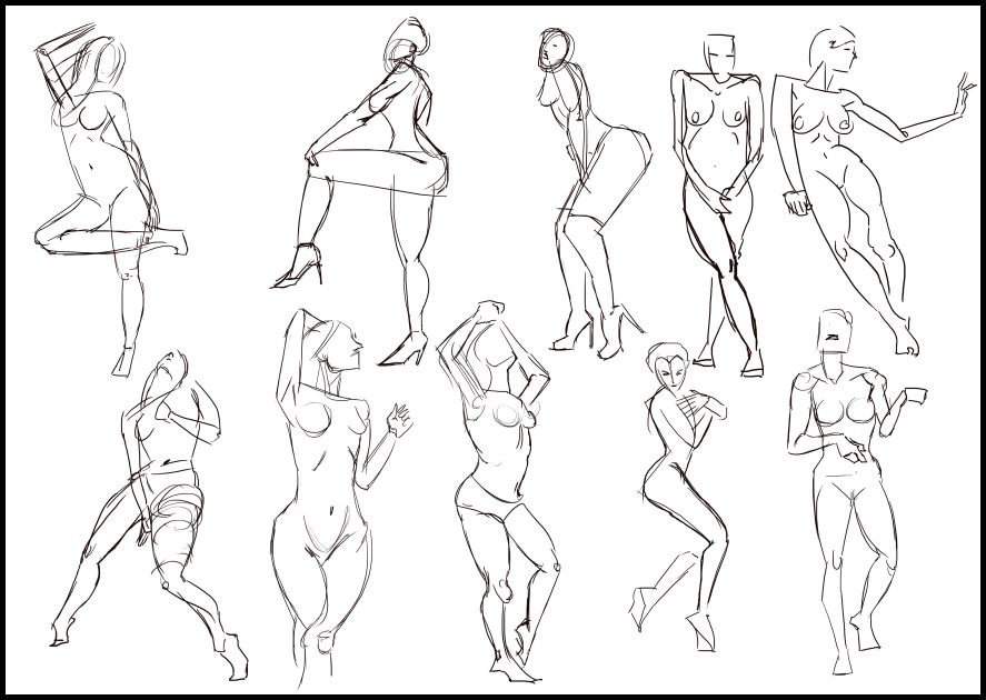
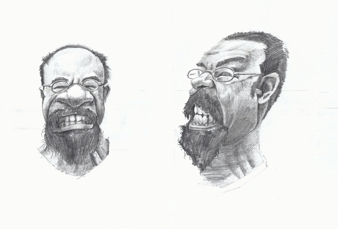
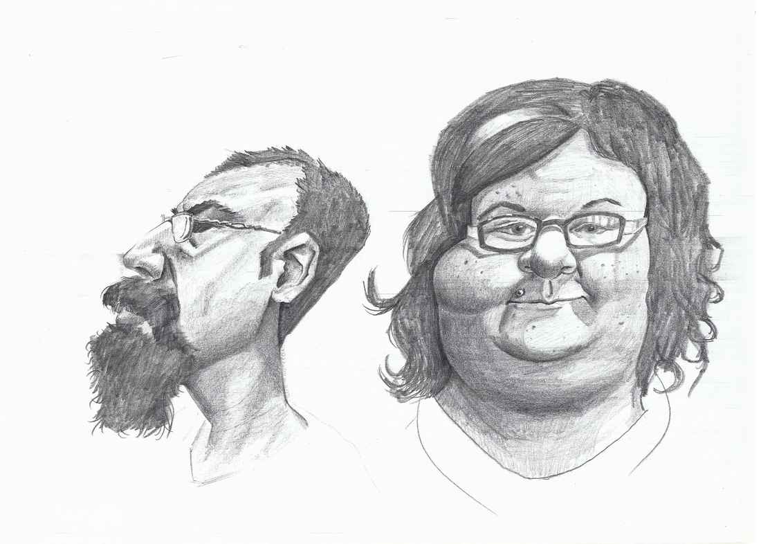
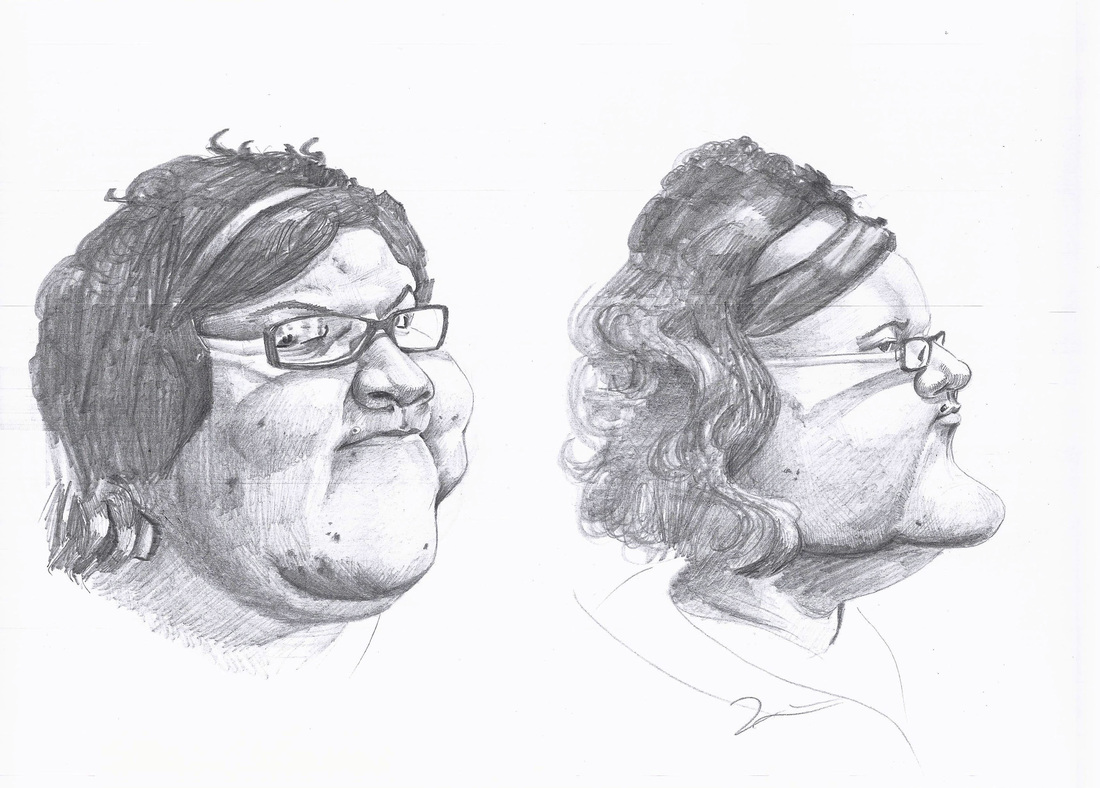
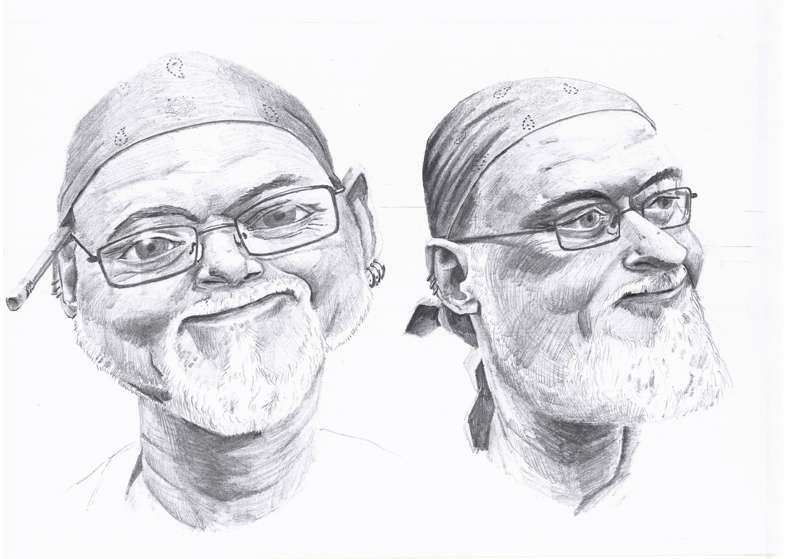
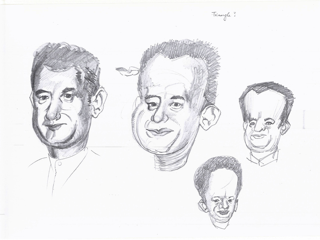
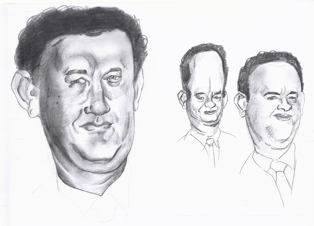
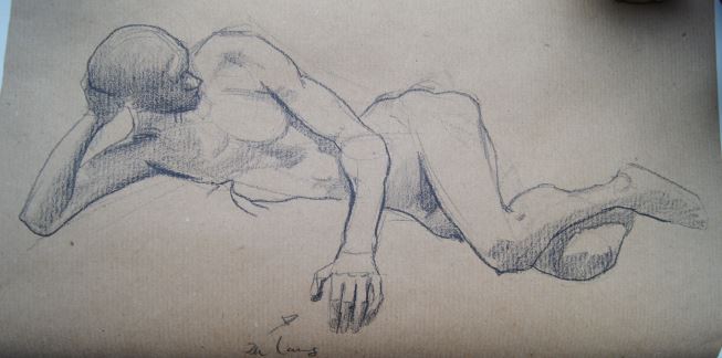
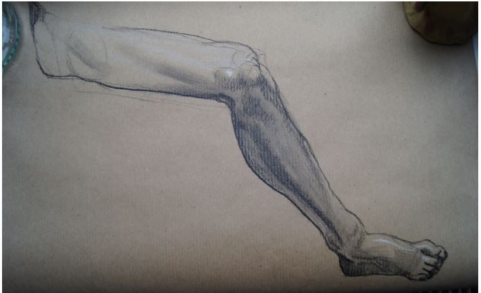
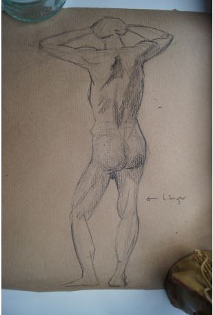
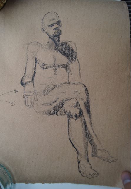
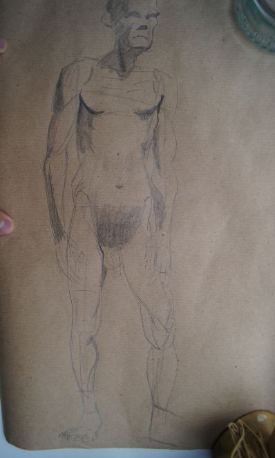
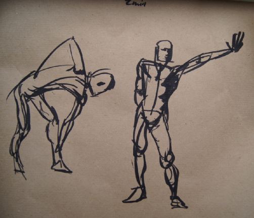
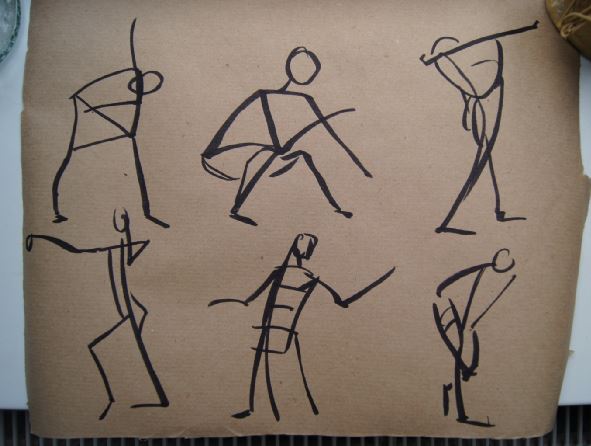
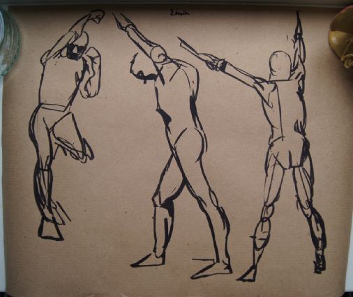
Hey everybody, these are the sketches and the final drawing for the second assignment of the Schoolism course I am currently enrolled in. I did more sketching this time and focused less on a final finish. It was hard to think about exaggeration but still maintaining likeness and paying attention to structure, but also a lot of fun. When doing the final I tried a technique I learned while doing the first assignment. It is basicly taking pencil-dust that I get from sharpening and smudge with the tip of my finger the basic big shapes in. It worked really good with the Tom Hanks picture, but with Nancy it was like: "where are my lines?!" So after covering all my lines with the pencil - dust I fought with the drawing always thinking of starting over. Maybe I should have, but I ran out of time. So I am not too happy with the end result. Things to consider in the future: if someone has dark eyes, make them really dark; make eyes the same size, when seen from the front; zoom out to get the weight easier; when the forehead is small, the chin is usually bigger and the other way around; exaggerate what is there; don't invent shapes, look closer and take your time; sketch longer if necessary; exaggeration is not only making stuff bigger! And here is something to listen to while working: 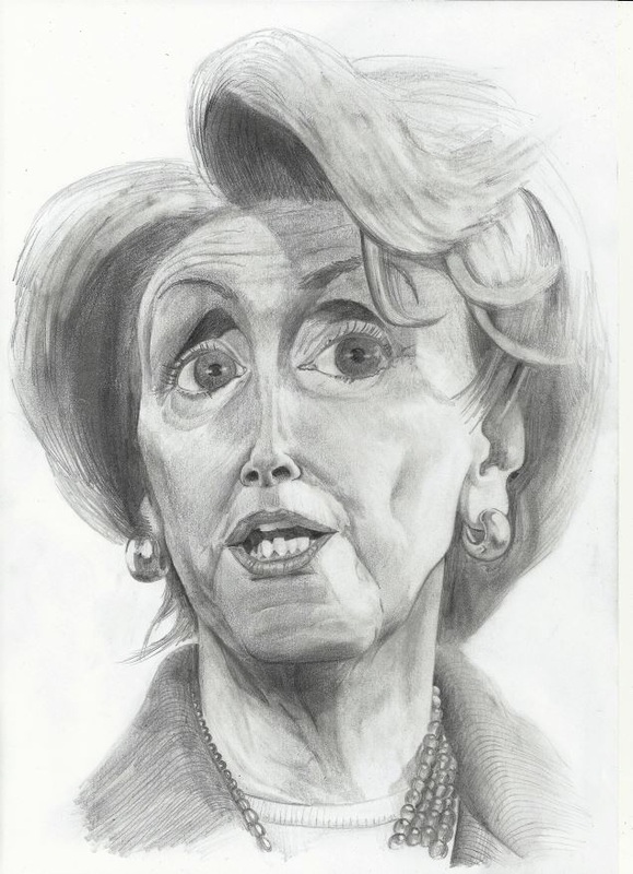
Oh and also I will do the Logo for "Dungeon League", the fantasy-soccer-game I am doing all those coloration-jobs for. :)
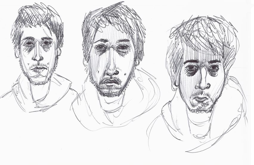
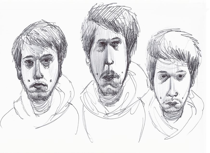
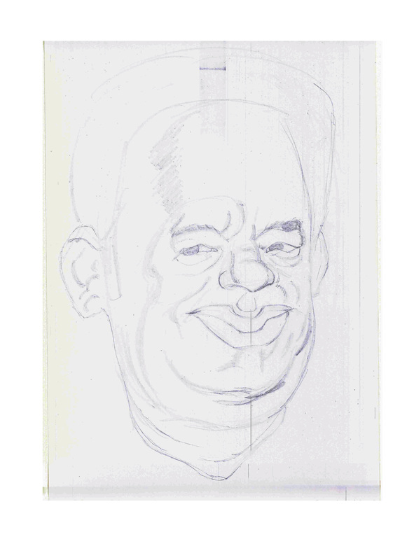
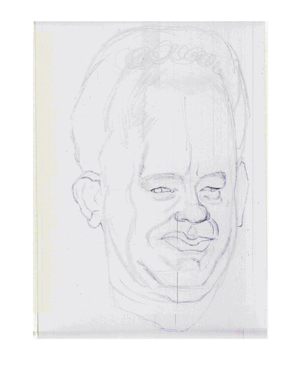
Cya soon Flo Hey guys, this is my newest portfolio piece. I learned, that in order to understand the structure of something better, it makes more sense to do a lineart drawing than a painting of it. That way I look past the surface and really focus on the masses and shapes that make the object. It's pretty obvious actually but hey ... everything makes more sense in retrospek. So there you go: my cordyceps zombie. And here is the real-world inspiration for this: https://www.youtube.com/watch?v=XuKjBIBBAL8  I got the okay to post the assignments for the Jason Seiler Course I am taking right now. I kinda messed up the final but I received great feedback on it. It was mainly concerning missing structure in the face and that some of the features don't line up right. I will post the second assignment soon. 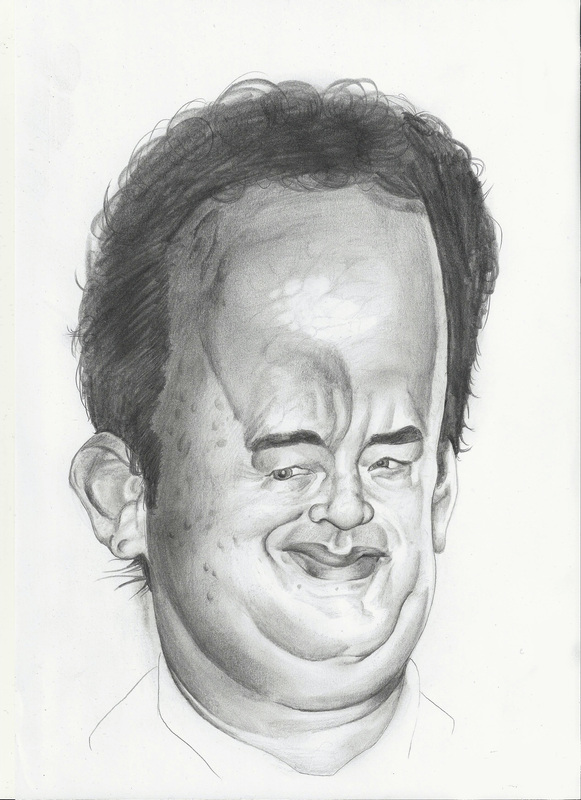 
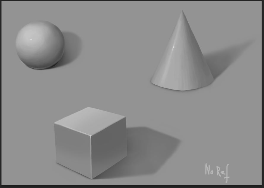
ca. 30 min I would say. I don't know if my technique is very elitary, I just add layer over layer like I would do it in Photoshop. But hey, it is a lot of fun for me and for now I like the result.
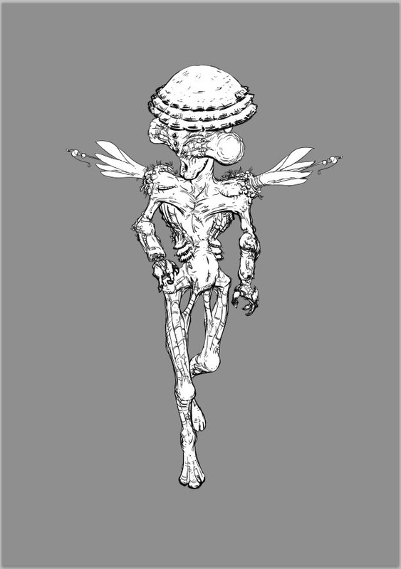
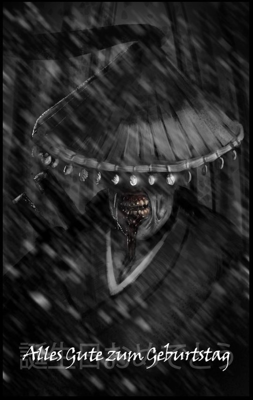
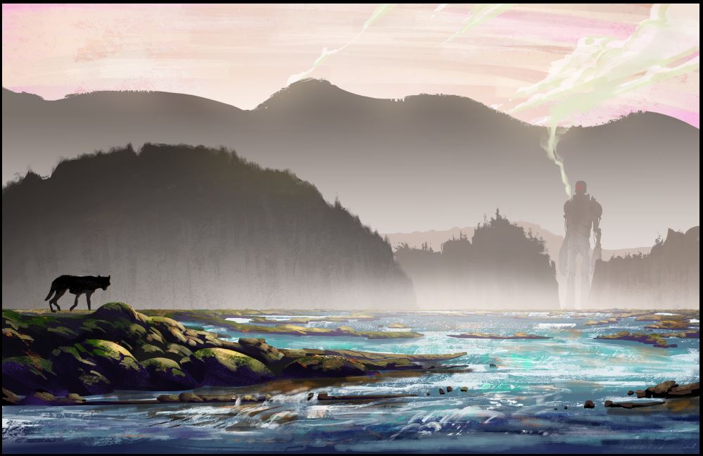
I finally got around painting the peppermill I bought in Istanbul. If you get a chance, you should totally go there, it is just such an awesome city. And if you are there ask for the bar called "Haymatlos". We went there one night and it was really great. 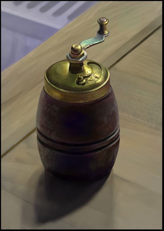 I need to work on proportions and also do one that is longer than 15 min. my entry for a character challange, the topic was: The enduring, alienated, unjust explorer from an unusual family line. I am not 100% if I hit the target, you can decide. :) the alien thing is just some design and lineart practice the last is an illustration for a friend's birthday 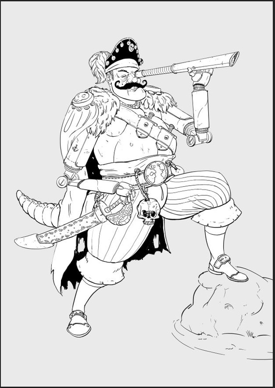
|
This is my blog. I will share information about workflow, my insights into image-making or just general thoughts and rants about being an artist. Archives
February 2024
Categories |


 RSS Feed
