|
Hey guys, so finally I think I have something informative to talk about, so I take the time and write a little post again. Hopefully little, so people actually read it. If you are struggling with values, which at some point I think everybody does who does painting and drawing (I still do), then maybe I can help you a little. 1) seperate the light side from the dark and keep each seperated throughout the painting 2) values are numerized to make them easier to handle. In Photoshop black is 0, white is 100. 3) to make the seperation easier, use only a limited range of values (Jonathan Hardesty uses 2 for the darks and 3 for the lights, so try it out, since he knows what he is talking about) 4) if you use Photoshop, it helped me a ton to make my value ramp web-safe. That way, Photoshop simplifies the value range for you to 0 (black), 20, 40, 60, 80, 100 (white) 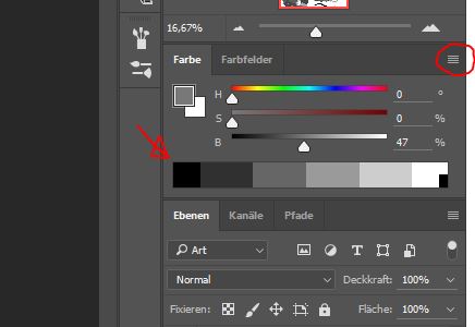 To make your value ramp web-safe, click the 3 little lines on the right and simple check "make ramp web-safe" (I am using the German version so maybe it is called a little different, but you'll figure it out) Now you can easily use a 10 (or even 0) and a 20 value for the darks and say 40, 60 and 80 for the lights. If done correct, you don't need detail to make stuff look "right". It will look right because the big forms are reading like they are supposed to. I did this small study to clarify this point. I kept the light and dark side very seperated and didn't mix the values in each side with the values of the other side. It helped in keeping the study simple and readable. 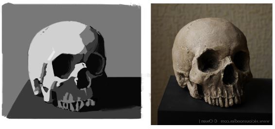 Some of the values I used might be off, but since it was my goal to have a clear read of the form, that's okay.
So that's it for now, try it out and do a little value study and post it in the comments. All the best, Flo
0 Comments
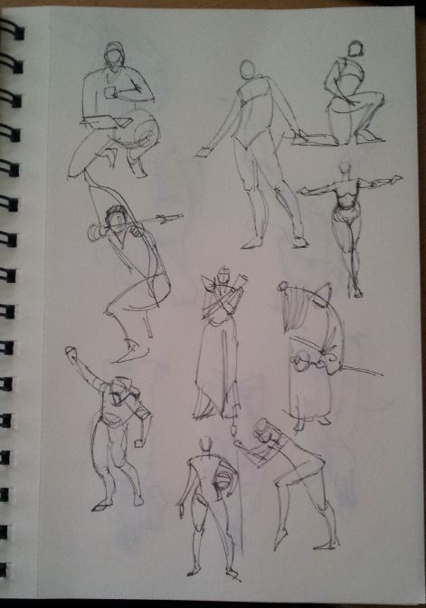
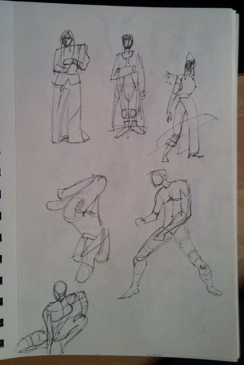
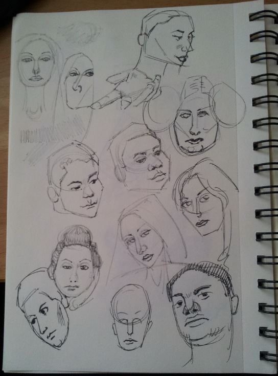
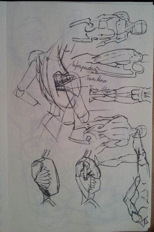
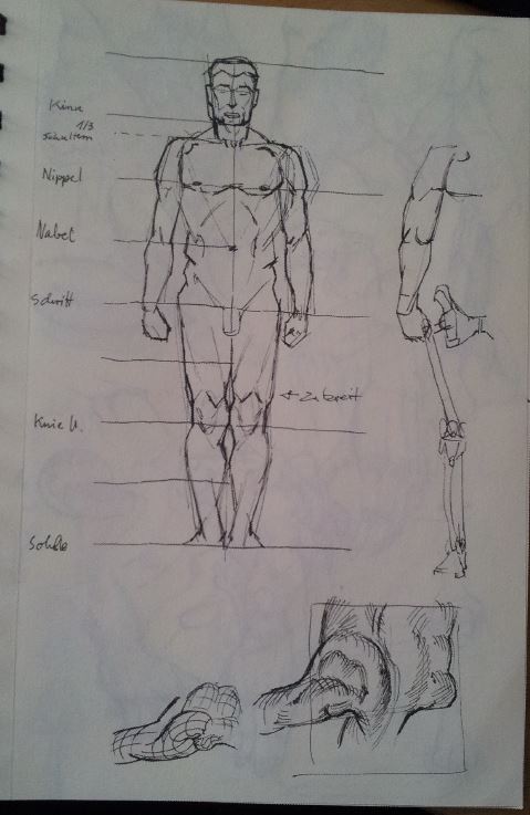
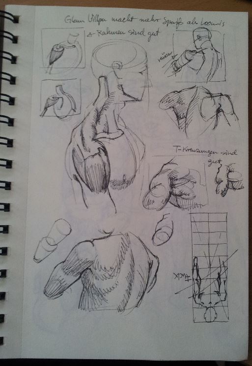
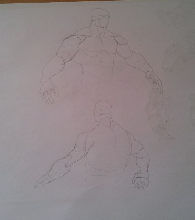
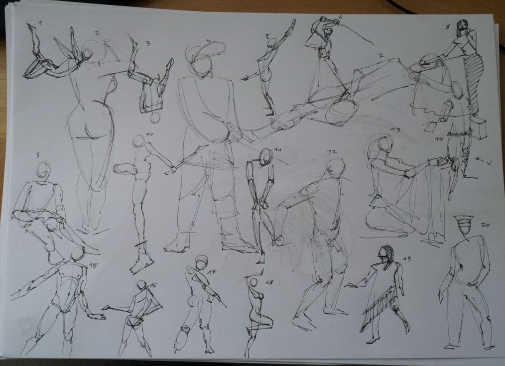
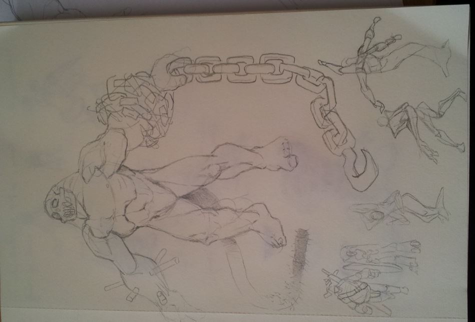
Here is the assignment for week 6, study of Bouguereau's "Dante and Virgil in Hell". I love that piece. Creature design, perfect anatomy, strong story, great comp, it has it all. It took some time to get it to this level and I still see mistakes, but I want to get to the next thing. The other thing is an illustration I did for myself. C and C very welcome. 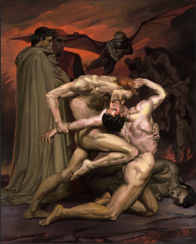 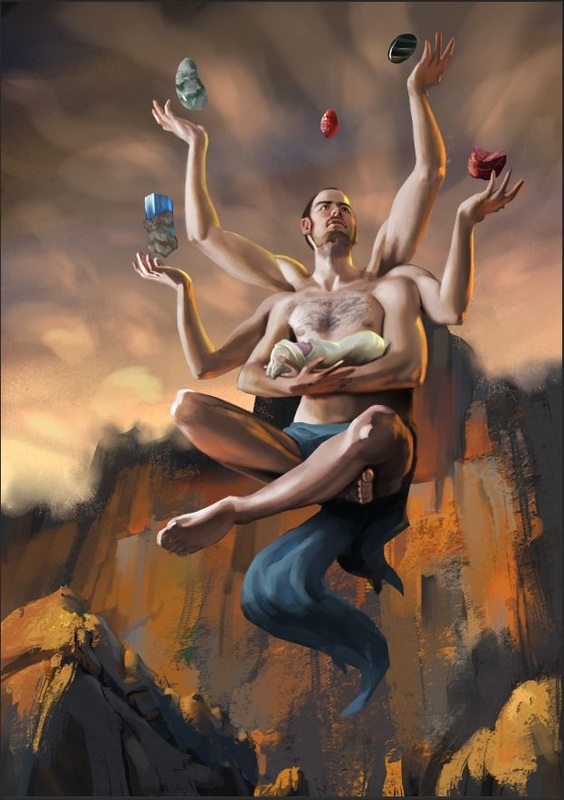 Inking and constructive drawing practice in PS.  After a lot of messing around with the technique I finally got my first 3D handpainted character done. On to the next :) 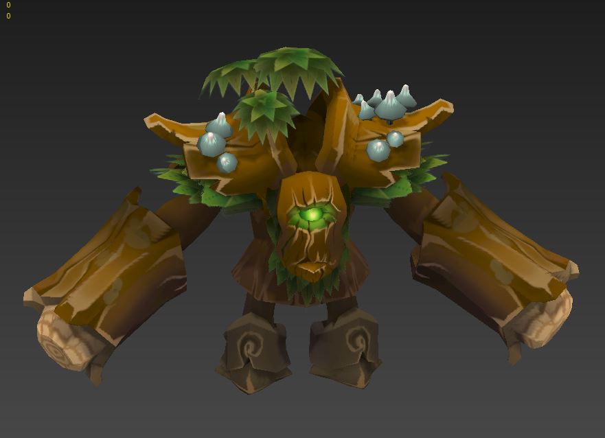 1min and 2 min gesture drawing. I finally feel like I understand what I am doing thanks to Proko! He is great btw and you should check out his videos, they are very well done and helpful. And funny in a kinda dorky but charming way. quick portraits a mix of Proko, Loomis and Glenn Villpu. Doing studies of Vilppu is really fun for me, I love his way of showing from through line. P.S. I know now that it is Glenn Vilppu (not Villpu as I wrote in the headline) but weebly's blog tool doesn't let me change it anymore. This tool is really buggy, so don't start using it.
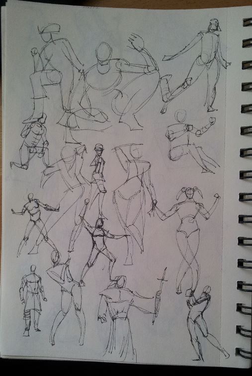
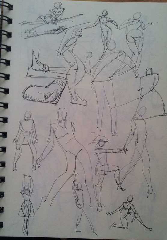
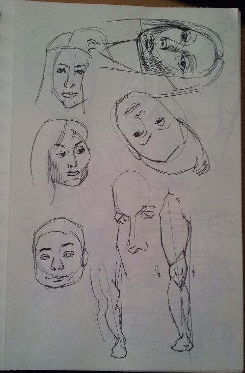
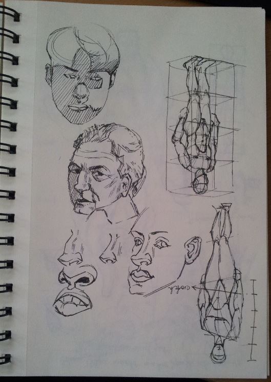
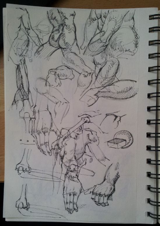
I used the techniques explained in this tutorial by the great Shaddy Safadi http://onepixelbrush.com/tutorial/tutorial-digital-painting-008-reem-room/ And here some more drawings, because drawing is my weak point and I have to tackle that. |
This is my blog. I will share information about workflow, my insights into image-making or just general thoughts and rants about being an artist. Archives
February 2024
Categories |
 RSS Feed
